SoundCloud Go purchase experience
The psychology of payment is a subject I’ve found interesting for a long time. On several occasions, I’ve analyzed the purchase experiences of e-commerce websites and payment services like Stripe, Venmo, and PayPal. I got to put my research to the test for SoundCloud Go, the newest paid subscription offering at SoundCloud.
Role
The subscriptions team put me in charge of creating the architecture for the payment experience and designing the checkout experience on web and Android. This role required a person who could not only create visual designs, but also think about the systems behind them and articulate design decisions to people with other skillsets such as marketing, legal, engineering, and product management. I took this as a chance to show my power as both a designer as well as a facilitator of communication and understanding.
Concept
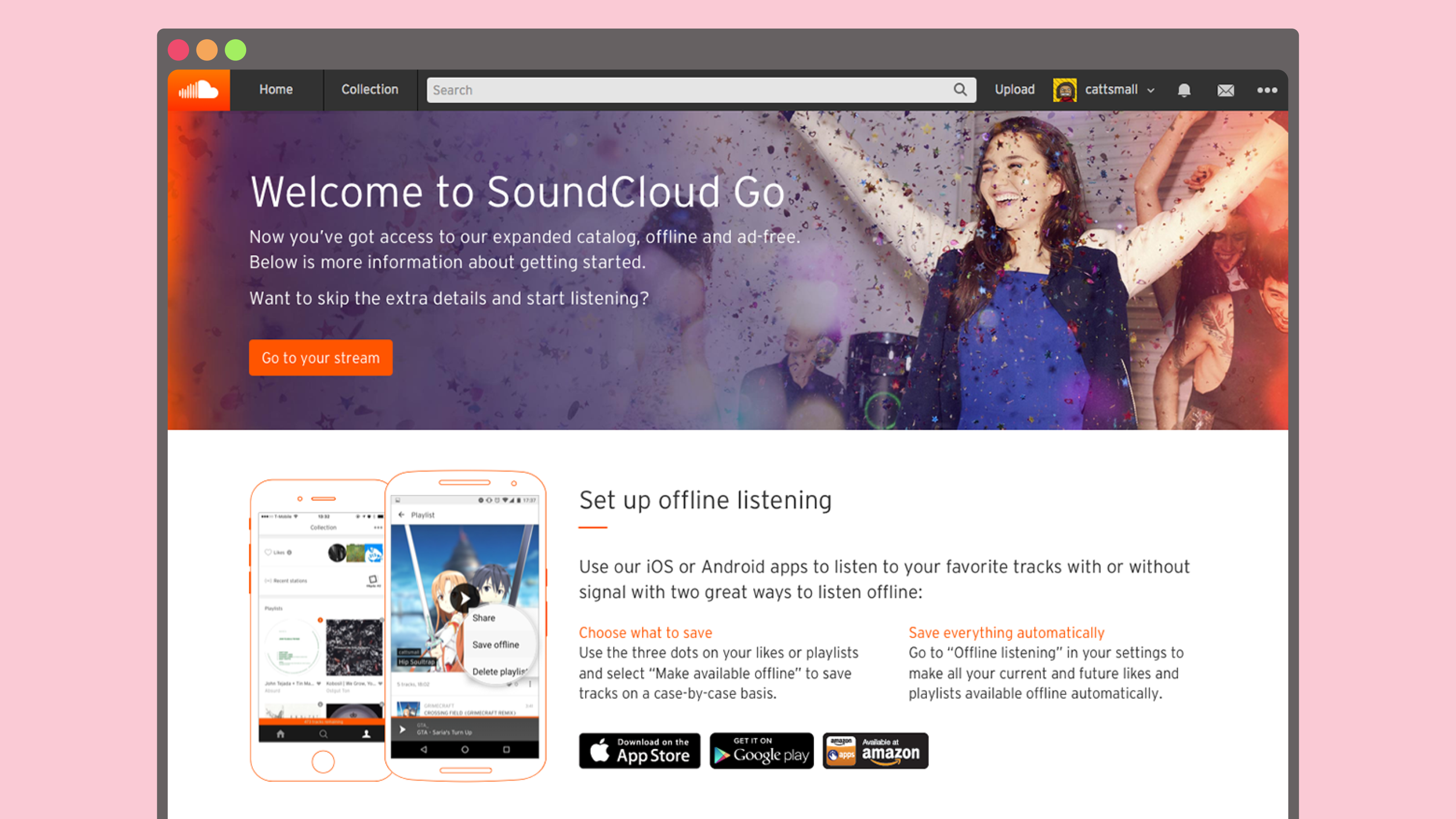
A subscription service for listeners was necessary for SoundCloud to financially compete and survive as an audio platform. Once the first deal was signed, we began working on what would later become SoundCloud Go. Even from the beginning, we knew the value propositions would be offline listening, no interruptive ads, and an expanded catalog. One of the most sensitive parts of a new project is the payment experience: it directly affects user conversion. I was asked to lead its design.
Ideation
After agreeing to work on the project, I identified some goals for the design with the product manager and legal team. We wanted the experience to feel like it belonged within SoundCloud, let people know what to expect from SoundCloud Go, and abide by international laws. All of this needed to happen while enabling people to convert as quickly as possible.
With these goals in mind, I created some basic sketches. These started discussion amongst the various groups involved in launching SoundCloud Go.
 Tiny digital sketches.
 Second version of a digital sketch.
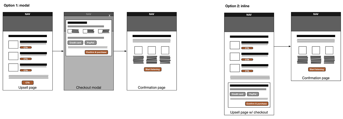
Alignment
People were still unsure of how exactly the full experience would work. There were so many different cases to consider. For example, what various errors did we need to show, and how would we handle geoblocking? With these questions in mind, I created a user flow of the entire purchase experience.
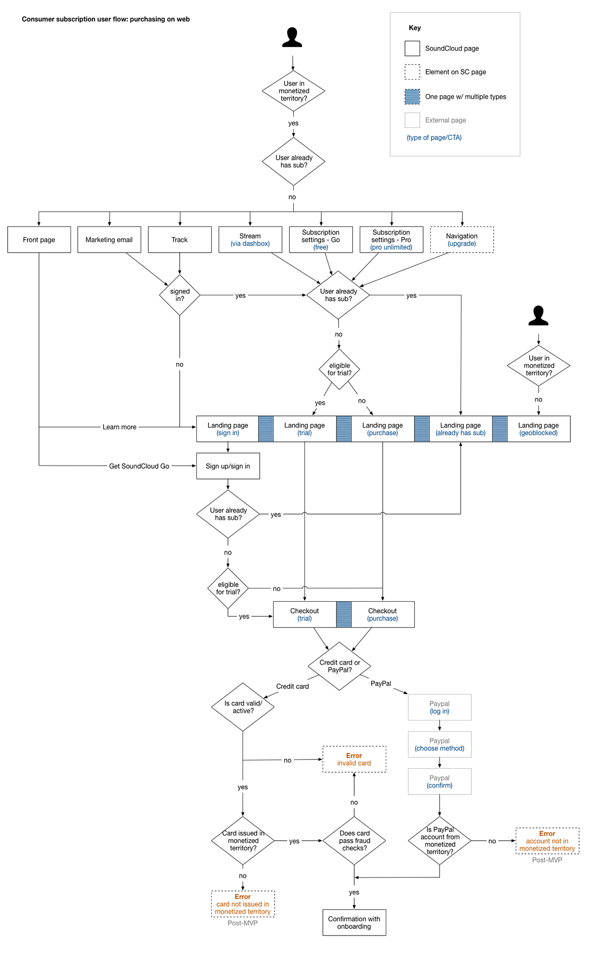
It took about twenty iterations before product management, engineering, design, and marketing could all agree on the flow. The work was worth doing because everyone finally understood how people would move through the process of subscribing to SoundCloud Go. Using the diagram as a reference, marketing was able to clarify the pages they needed to build as well. Next, I moved forward by creating some mockups based on the marketing designer’s grid system and SoundCloud’s design guidelines.
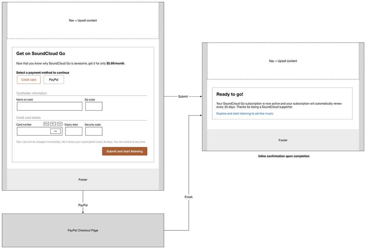
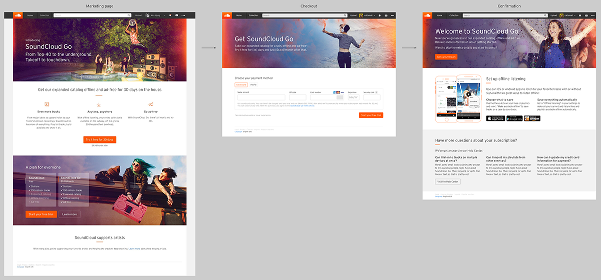 The marketing design (far left) next to the checkout and confirmation pages.
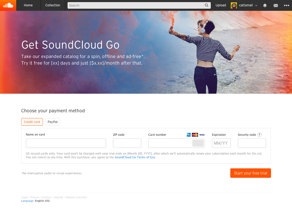 Close-up of the checkout page.
Restrictions
Throughout the design process, I encountered a lot of technical and legal restrictions that required many iterations upon the design. As an advocate for people as well as a designer balancing business needs, I fought to ensure that the conversion experience was positive while also technically feasible and legal.
A lot of copy changes occurred throughout the design process, but one I fought as hard as possible was the idea of changing the “Start your free trial” to say “Purchase” in order to meet certain requirements in other countries. This could confuse people – they’re not purchasing anything yet. In the end, we agreed to have it say “Purchase” only in the countries that require it according to legislation.
Another restriction was on the technical side. Due to being short on time, we had to remove credit card number spacing from the app and split the expiration date field into two. In future versions, the form will allow people to convert even faster than before.
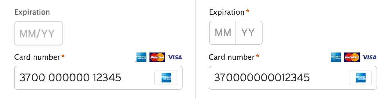 The ideal version (left) versus the compromise (right).
Android experience
During the process of building the purchase experience, the team discovered that Google did not restrict in-app purchases like Apple. In order to offer a lower subscription price on Android, I adapted the checkout design for mobile.
With mobile came one formidable challenge: data. Custom fonts and images quadrupled load times. To combat this, I removed the header image and defaulted to Android’s system font – it’s also sans-serif, so it wasn’t too noticeable.
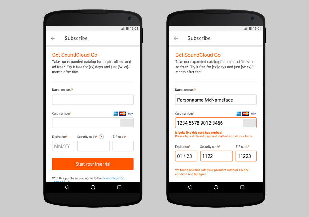 Mockups of the checkout page in addition to various error states.
I collaborated with an engineer to make sure the experience felt as integrated into the app as possible. The result is an interface that hopefully takes less than a minute for most users to complete.
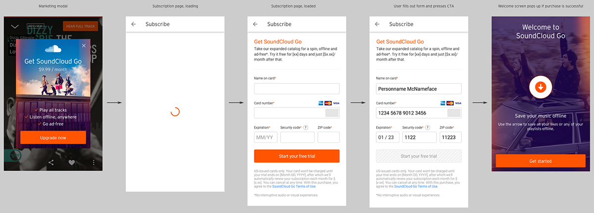 The mobile purchase flow.
Conclusion
Designing the SoundCloud Go checkout page was an amazing experience. I got to not only collaborate with talented people, but also participate in important and healthy debates that resulted in great design solutions for our users. I’m looking forward to further iterations that make the design even better.
Want to talk?
Got feedback, looking to suggest a future writing topic, or want to invite me to speak at your organization? Send me a message and I'll get back to you as soon as possible!