Etsy Payments
When I joined Etsy’s Payments team, payment processing on the platform was at a pivotal moment. PayPal, which was at one point the only transaction system available on the platform, hindered Etsy’s member support agents’ abilities to fully resolve customer support issues. Transactions made through PayPal could not be refunded through Etsy, which frustrated customers and sellers.
To combat this customer problem, Etsy created a payment service called Direct Checkout. A mishap by Direct Checkout’s transaction processor, WorldPay, unfortunately delayed sellers’ disbursements several times in 2016. In response, sellers began to severely distrust the idea of accepting payments solely through Etsy. The company decided to create a new payments service named Etsy Payments in order to make the Etsy purchase experience more trustworthy, seamless, and secure.
Role
I was the sole product designer for the Etsy Payments experience. Due to the complicated nature of the project, Etsy needed a systems-thinking designer who could facilitate conversations including a variety of people with other skillsets such as product management, marketing, legal, engineering, brand design, and product education. It was a huge opportunity to level up my leadership skills, and I happily accepted the task.
Concept
Etsy Payments would include new features such as more integrated payments management and the option for more frequent deposits. Additionally, more transaction processors would be added to prevent WorldPay issues from occurring again. Sellers in eligible countries who previously only accepted PayPal would have a total of 2 months to register for Etsy Payments before their shops were frozen. Ineligible sellers would not be affected by the change and therefore still be PayPal-only.
I had two parts of the experience to consider: messaging sellers about the change, and enabling them to register for Etsy Payments. Etsy’s seller community is sensitive to change, and communicating the benefits to this mandate was key to ensuring that seller sentiment and usage of Etsy’s platform weren’t irreparably harmed.
Ideation
I worked with the team to identify our goals. We hypothesized that sellers needed to understand the benefits of Etsy Payments in order to take action before the registration deadline. With these goals in mind, I began to look into past Payments research from the Etsy archives.
Through my studies, I learned that many sellers didn’t feel comfortable or confident about their business finances. They also didn’t feel a sense of trust and clarity when it came to Direct Checkout, especially not after the disbursement problems—confirming our hypothesis that sellers needed to feel informed before registering. Using this research as our guide, we created sketches for a registration process that could inform and support our nervous sellers.
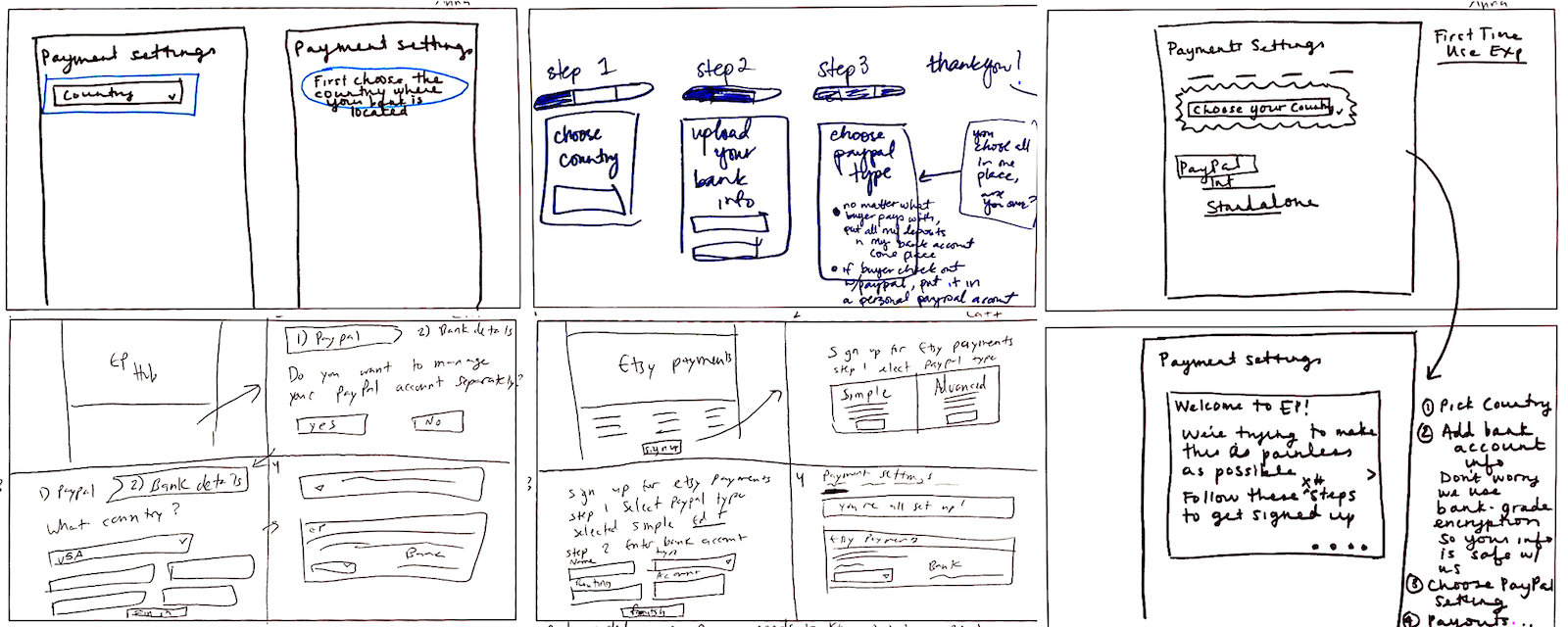 Sketches from our ideation session.
Alignment
Our sketches helped me create a user flow diagram. Identifying all the potential use cases was crucial for making sure my product manager, product marketing manager, product education writer, and engineers agreed upon our co-created requirements. This diagram was edited many times before it felt complete.
In total, there were five marketing page user states to consider:
- Direct Checkout only (with “integrated” PayPal
- Separate PayPal account (“standalone”) and Direct Checkout
- Standalone PayPal only
- Ineligible countries
- Logged-out
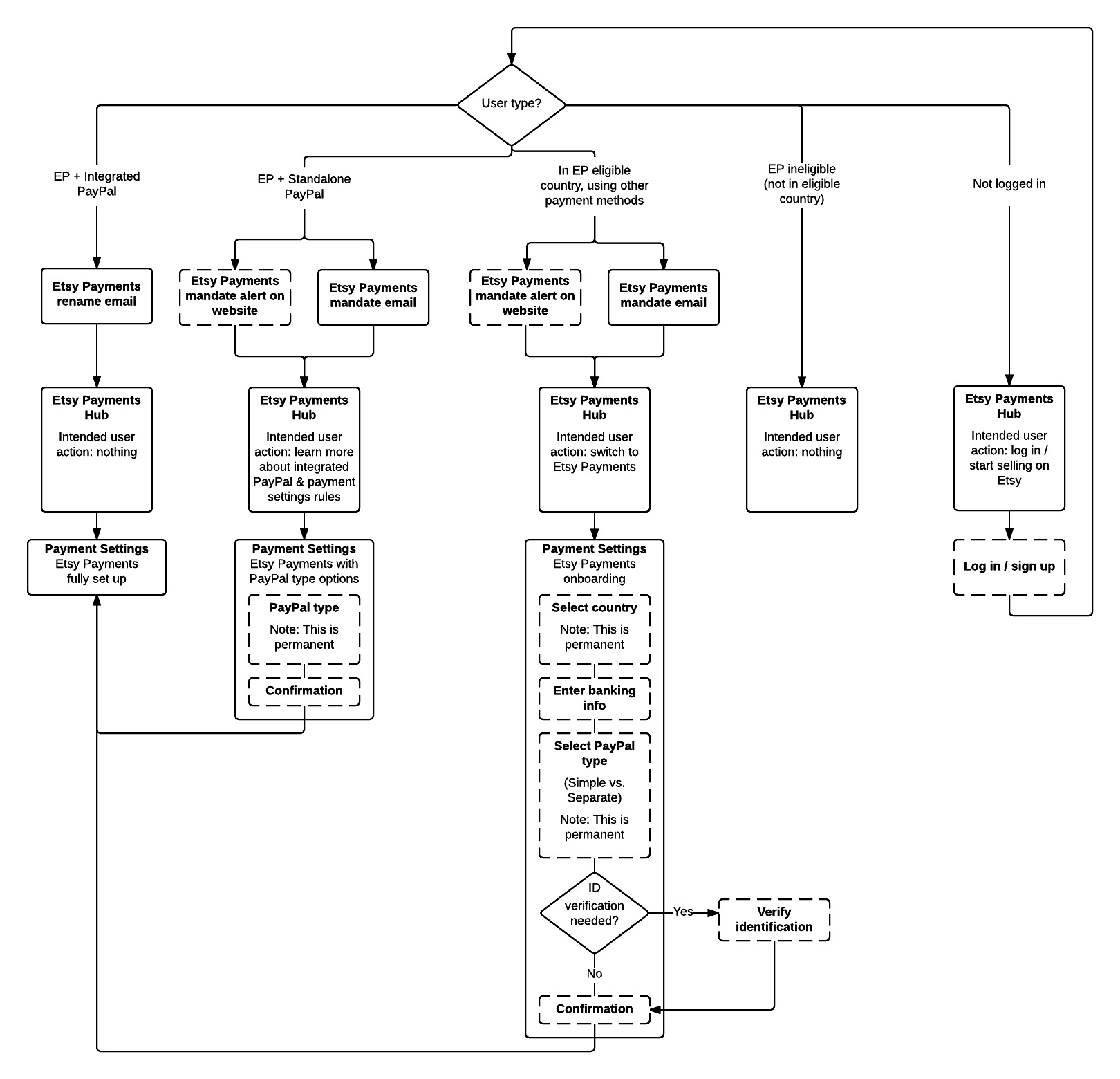 Full user flow with five user states.
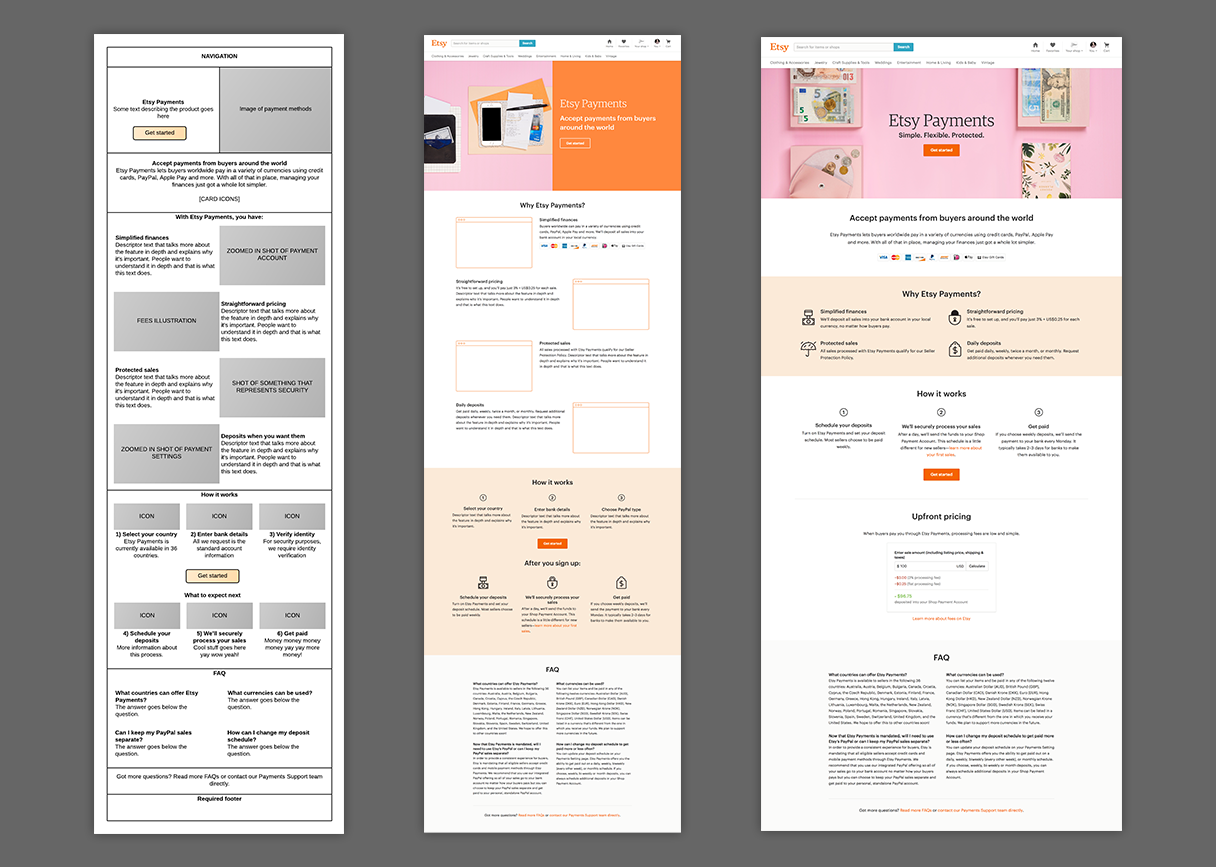
Once we agreed on the five user states, I created a diagram with content blocks to show what I thought each version of the marketing page should communicate. After many conversations with my product manager, product marketing manager, and product education writer, the ordering was confirmed. The initial iteration of our communication strategy was formed using this diagram as a guide.
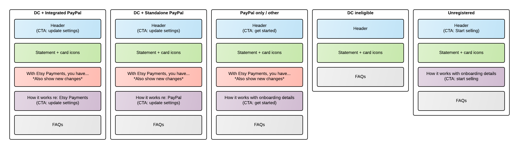 Marketing content blocks for each user state.
Next, I started to do competitive research to understand the landscape of payments marketing experiences. I looked at several other platforms in similar spaces to ours, then narrowed down to two companies: Amazon and Shopify. Amazon’s page was short and simple with large imagery. Shopify’s included device imagery and huge numbers.
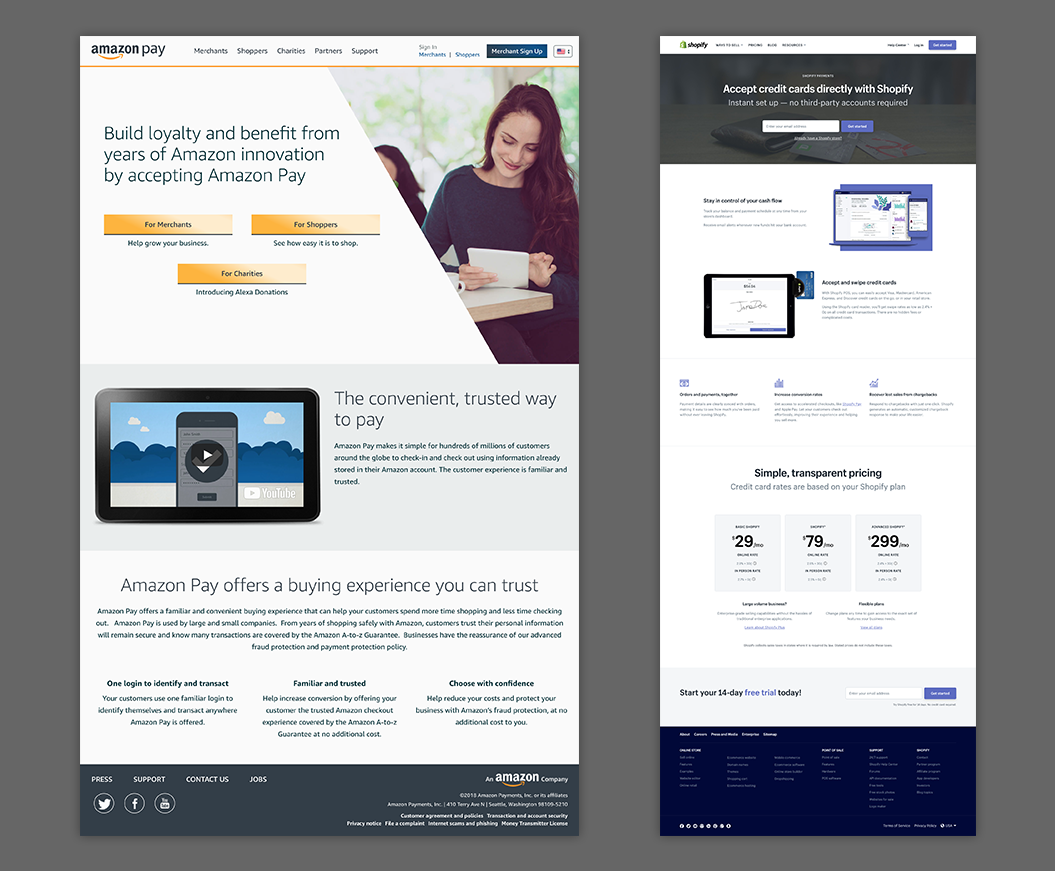 Amazon and Shopify’s pages.
Considering our skeptical audience, I knew we would need to take a slightly different approach. I created a wireframe showing my initial thoughts. With the help of a brand designer and feedback from my team, I began to flesh out the page. The value statement and features were highlighted first, followed by a few other ideas that needed usability testing.
 From initial wireframe to polished marketing page.
Registration iterations
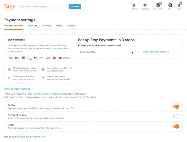
While the marketing page was being completed, I was also leading the modification of Etsy’s registration process and payment account experiences to support Etsy Payments. There were already existing designs, but they needed heavy edits. Not only were pages referencing Direct Checkout, but they were also using an old design system. I prototyped examples of refreshed experiences that might feel more supportive to skeptical sellers.
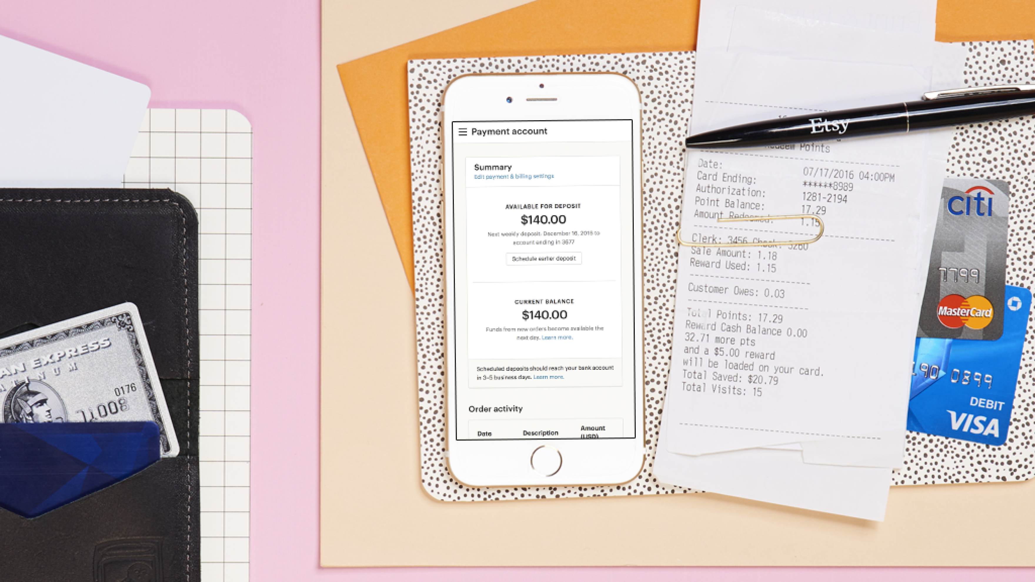
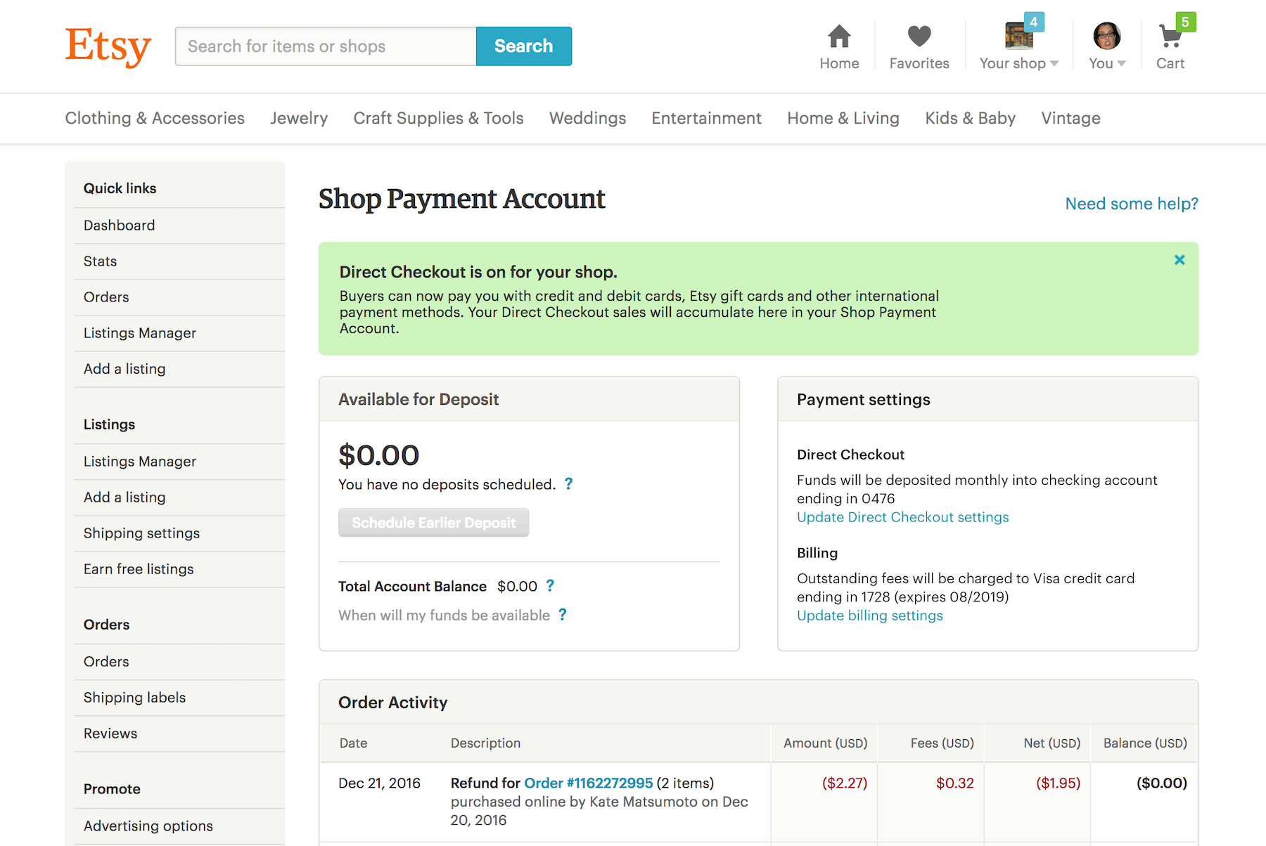 The old payment account.
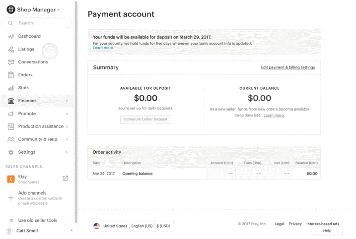
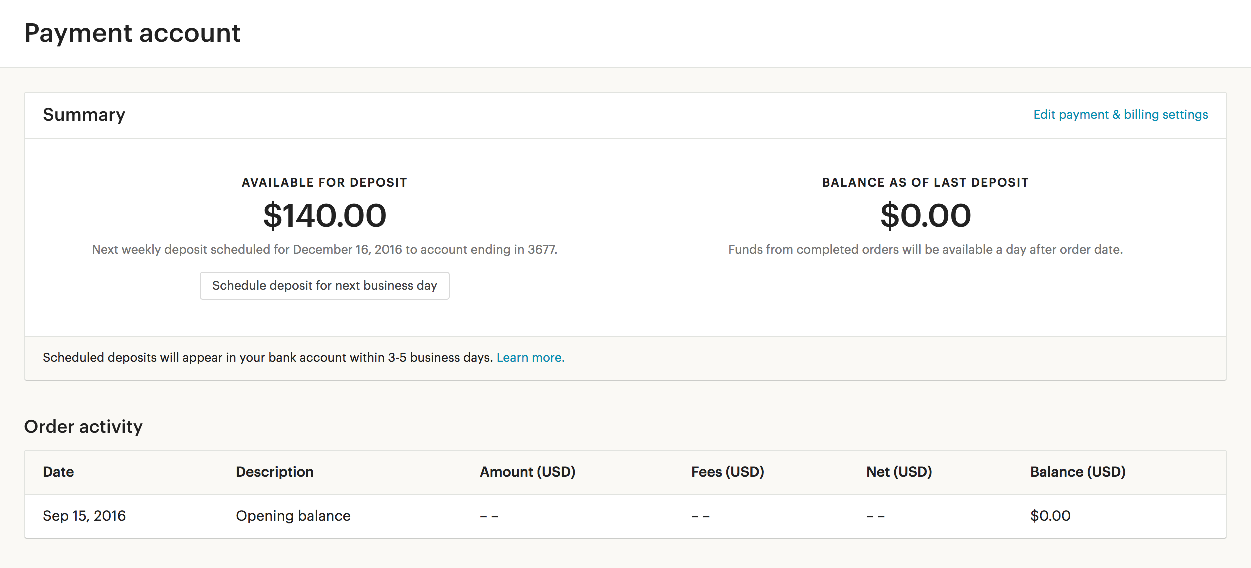 The new payment account reduced cognitive overload. We later continued to iterate on this experience.
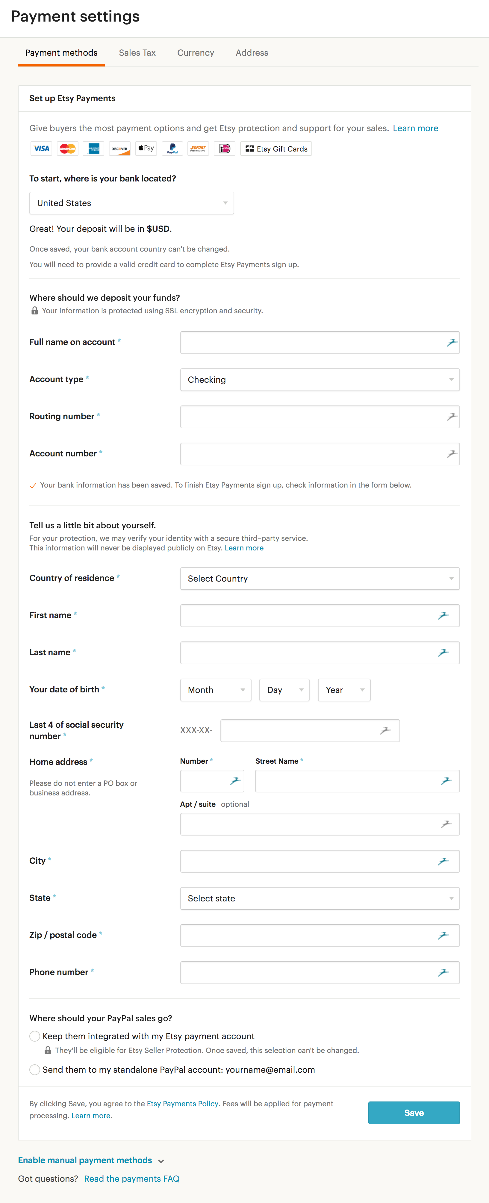
 First iteration of the new onboarding flow. A step-by-step process was less overwhelming, but cut due to scope.
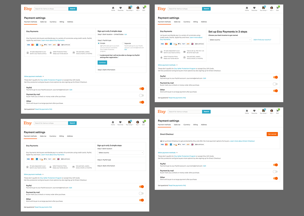 More registration flow iterations.
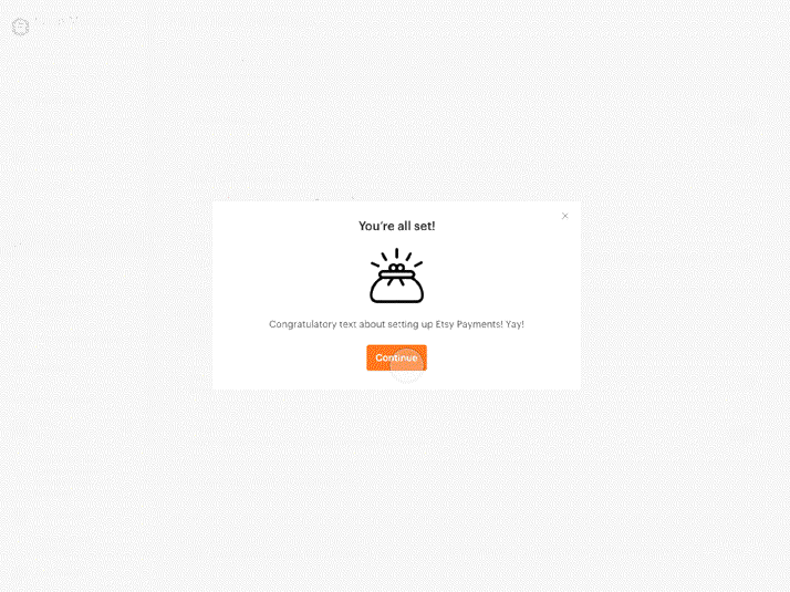
 An introductory modal window that was also cut due to scope.
Usability tests
We conducted usability tests on my prototypes with eight users from across the United States. Our goal was to understand how successful the page was at communicating Etsy Payments’ value to sellers, as well as see how a prototype of the registration experience would perform. We also wanted to understand how sellers felt about Amazon and Shopify’s payments pages.
The result: sellers wished for more straightforward language than we were providing. Many sellers wanted more direct information about why Direct Checkout was becoming Etsy Payments, and they didn’t know that the changes they were being asked to make were permanent. Testers also had a mixed reaction to the color pink on our pages.
Most sellers did not like the Amazon page because it had too little information. Shopify’s to-the-point approach was lauded, which underscored our learnings. I made heavy edits to the marketing page—and removed some features that did not perform well such as a fee calculator.
 The upper part of the final marketing page.
Sellers also gave us helpful feedback about the registration process and payments settings experiences. Most of them thought the wording we used was clear. Overall, they were happy to see their payment settings in one area and were excited to have the option for a higher deposit frequency. My team was excited to have such positive feedback about the usability as well as upcoming new features.
Restrictions
Like most designers, I am ambitious in my user experience requests. I was hoping that the Etsy Payments onboarding design could become one step ahead of, not just on par with, the rest of Etsy’s design system. Unfortunately, our team was quite small so many refinements and delightful interactions had to be cut.
 Final onboarding experience with all states. While the page is still long, it is also easier to navigate than the previous iteration.
Gladly, we were still able to include affirmative feedback after people registered for Etsy Payments. While it wasn’t as dazzling as a fully animated experience, it let us celebrate sellers’ recommitment to being on Etsy in a small way. The copy affirmed that they were finished registering and nothing else needed to be done, which was a concern we learned about through usability testing.
 The prototype for a simplified confirmation.
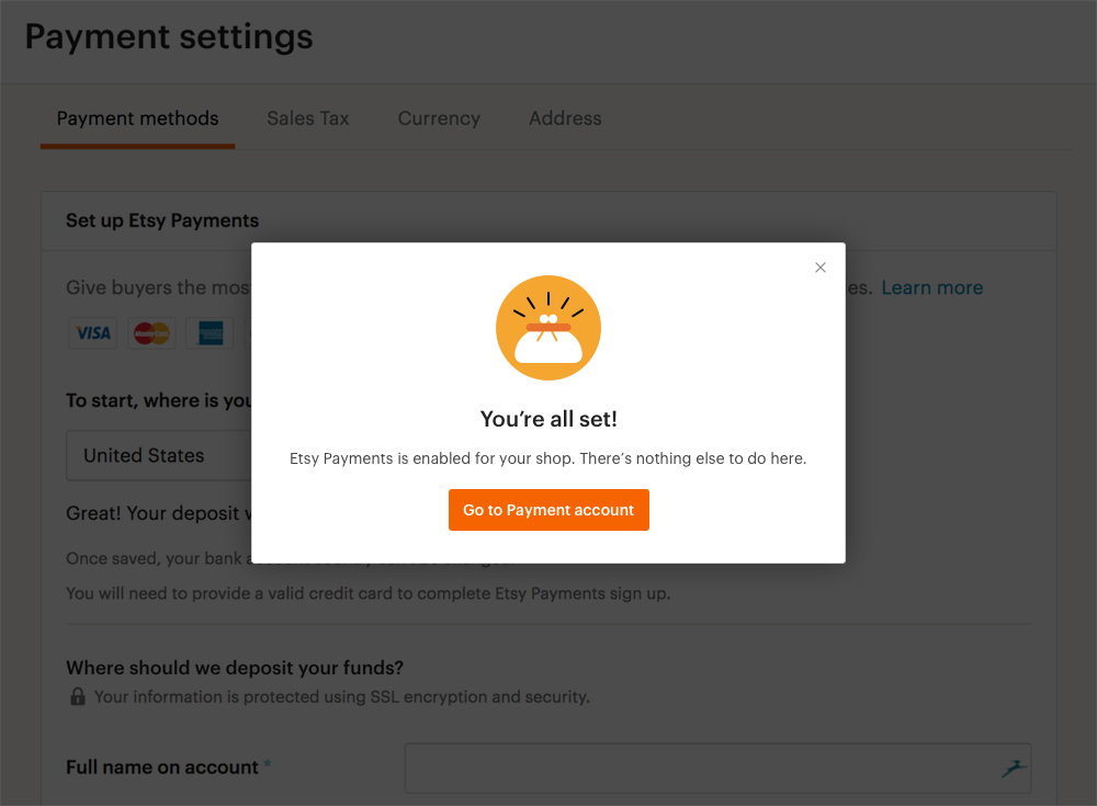 The final modal window sellers saw when they finished registering.
I worked meticulously with my team’s engineers to make sure the registration and payment settings experiences looked good on screens of all sizes. At the same time, Etsy transitioned from blue buttons to orange. The new designs were updated automatically since they used Etsy’s design system.
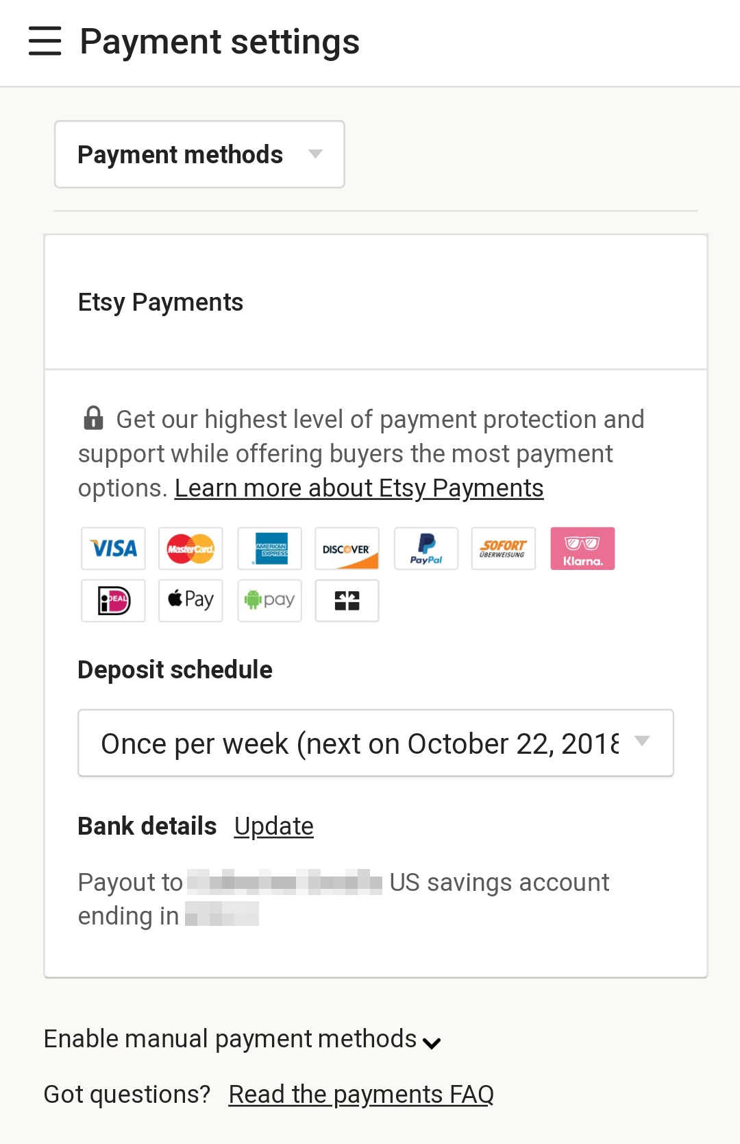
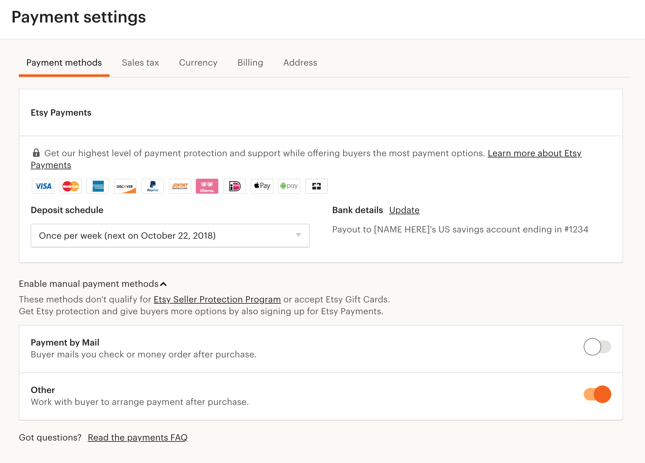 The live payment settings page.
 Responsive mobile version.
Conclusion
Etsy Payments was announced in April of 2017. The mandate was made official at the end of May 2017. While sentiment was initially mixed, many sellers saw an increase in purchases. Some sellers defended Etsy Payments in the seller forums because it felt more secure to shoppers who were apprehensive about PayPal.
Working on a feature that positively affected the lives of many people was a dream before this project. Finances are a major part of the lives of the creative people who sell online. Thanks to the work we did, it’s easier than ever for shoppers and sellers to make secure transactions on Etsy.
Want to talk?
Got feedback, looking to suggest a future writing topic, or want to invite me to speak at your organization? Send me a message and I'll get back to you as soon as possible!