The new Etsy Stats
Etsy’s Stats product was maligned by sellers after a 2017 redesign that removed information they found crucial. My team was tasked with making a better Stats product that included a clearer breakdown of where shoppers were visiting from, which items were most successful on which platforms (especially social media), and how much buyers from each traffic source spent. With a small team of engineers and a short timespan for delivery, we weren’t able to redo all the existing data at the depth necessary to provide sellers with the level of insight they needed.
Due to these constraints, the team built and launched a new experience for a subsection of sellers’ shop data. This experience lived separate from the existing Stats and — unlike Stats — used industry-standard definitions for its data points. Many sellers found it to be only partially usable because the data from our new product, Search Analytics, had numerical discrepancies when compared with the existing Stats.
After the unsuccessful launch, leadership acknowledged that the team wasn’t set up to succeed. Rather than disbanding the team, they invested more in our work the following year. This time, we fully delivered on the promise to get Stats right.
Role
I was the lead designer on this project. I collaborated heavily with a user researcher, Brian Greene, and several Product Managers across three squads. Several additional Product Designers who worked in relevant product areas also occasionally contributed to this work.
User need
This project needed to fulfill the same customer goal as Shop Analytics:
As an active seller on Etsy, I need to understand the outlook of my business and identify potential actions I can take so I can grow my shop’s revenue.
Discovery research
My researcher and I conducted in-person interviews to understand what sellers would want from a better Stats overview. This research included card sorting exercises with sellers to assess their priorities. We asked them to organize a variety of data points by importance, then told them to pick their top 3. I also included a parking lot for cards that weren’t important and data points sellers didn’t understand.
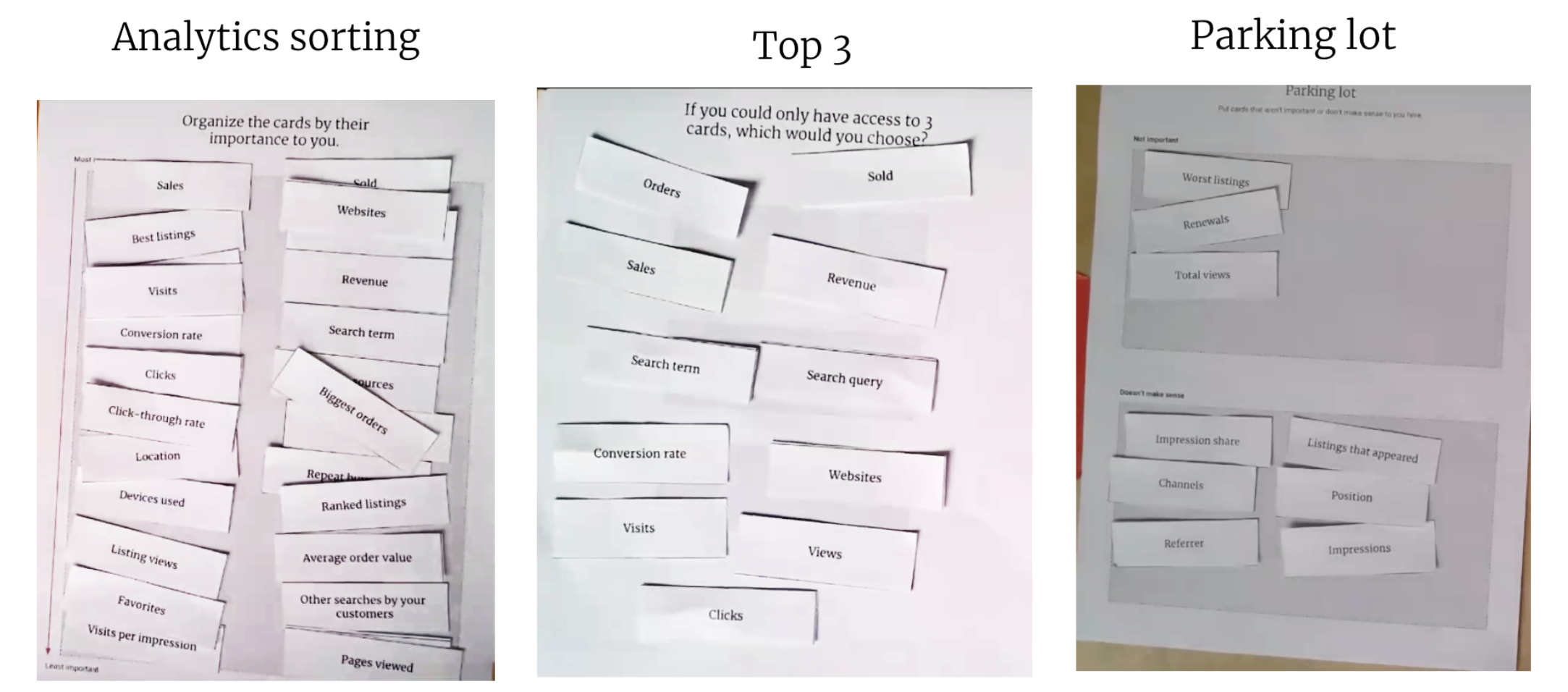 Card sorting exercises performed with sellers to assess needs for shop stats.
Sellers cared most about the following data:
- Orders
- Sales
- Conversion rate
- Revenue
- Visits
- Search queries that led to visits
- Traffic sources where visits came from
I used this information to create low-fidelity layout ideas. We realized there were a few potential directions for displaying data, and we didn’t know how useful sellers would find charts. These ideas were tested in more research so we could gain confidence about how information was prioritized.
 Several of the low-fidelity layouts I put in front of sellers after the card sorting.
Design iterations
The low-fi research taught us that sellers use charts to assess changes over time. They also thought average order value was useful for individual traffic sources but didn’t need to know the overall number; shop-wide AOV is less actionable. I took that research and created mid-fidelity prototypes.
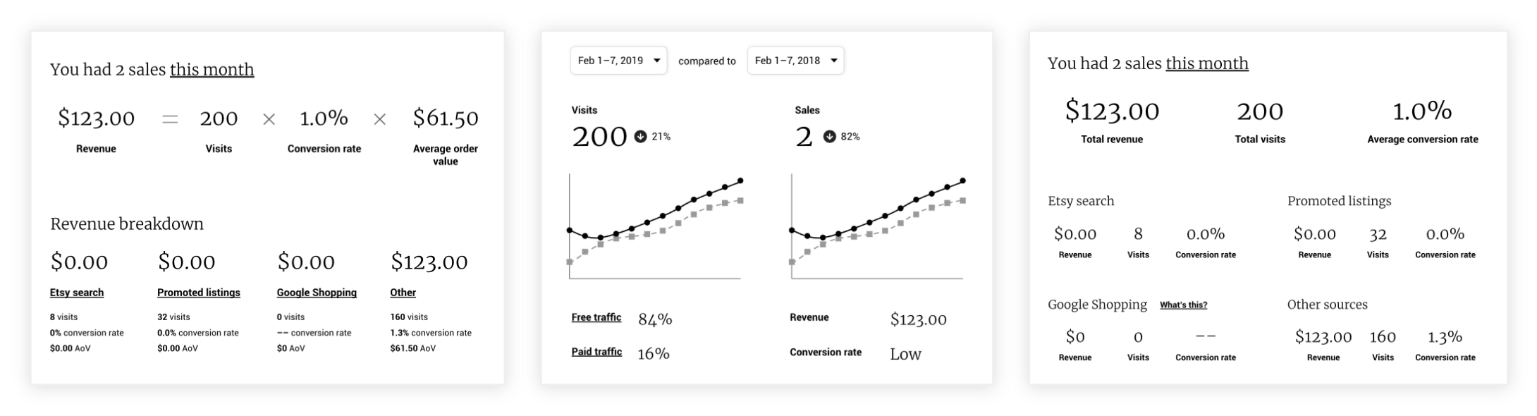
 Mid-fidelity ideas I tested after more seller feedback.
I put those prototypes into another round of testing to understand the best direction for our product. We learned that surfacing unused tools was an easy way to give sellers insight about growing their revenue. This showed us that relatively simple suggestions could be valuable as long as they were relevant. I created a singular vision prototype to test how well the final planned featureset would perform with users.
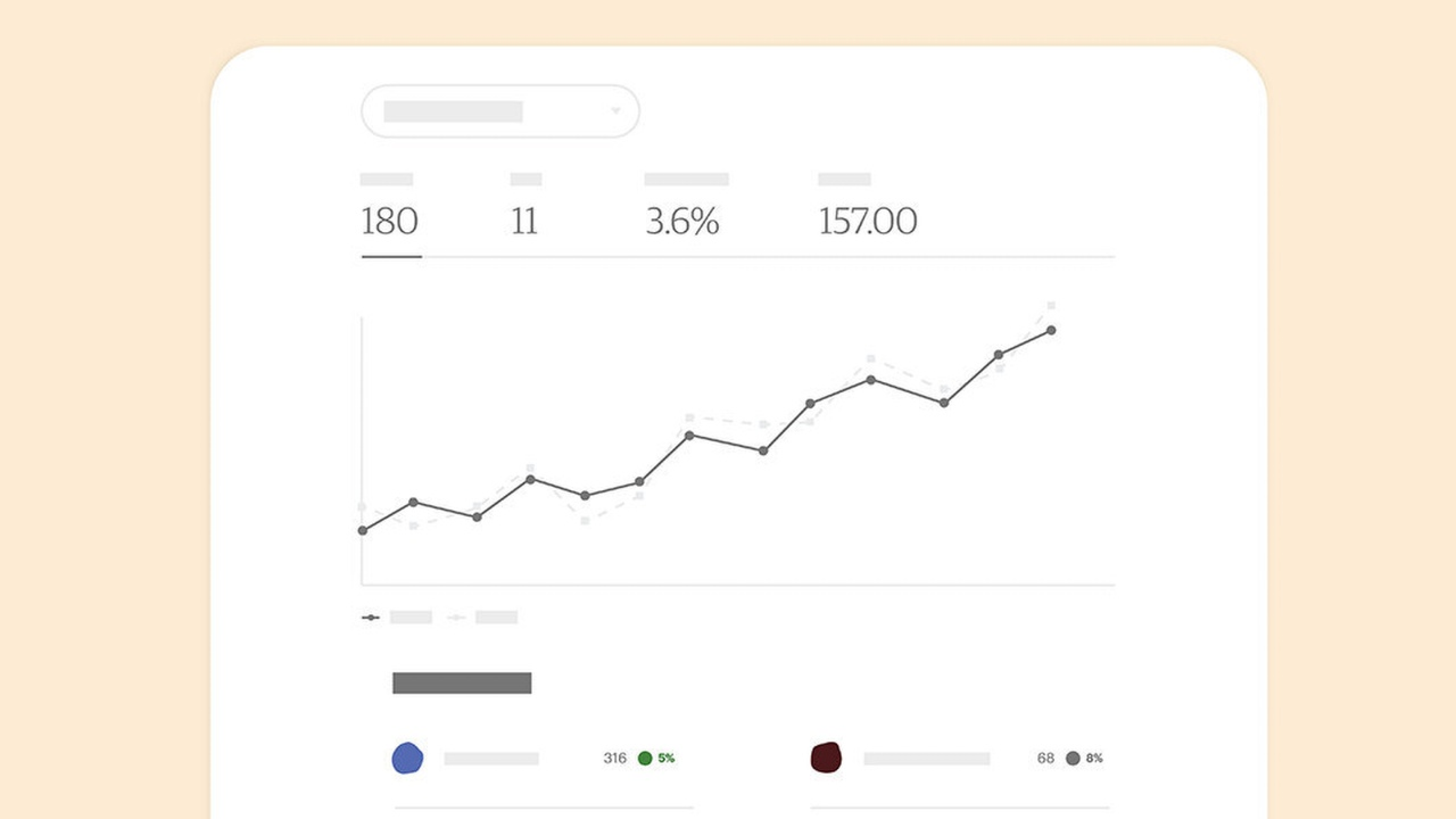
 A low-fi north star design based on earlier research.
Sellers found the summarized headlines useful but also wanted the ability to do more in-depth information analysis with less clicking. They also preferred the larger chart in the new design to the old charts because the old ones didn’t include year-over-year comparisons. In total, 8 of 10 participants found the new design more valuable.
After all the customer feedback, we were confident in our solution for a better Stats. The future version of Stats would include a top-level summary of a shop’s traffic. Next, we would show the top four numbers that matter to a shop: visits, orders, conversion rate, and revenue. Each of those data points would include a year-over-year comparison and chart visualizing the change over time. Sellers would be able to adjust the comparison timespan to any period of their choosing.
Additionally, the future version of Stats would include recommendations to improve visibility and a breakdown of the traffic sources that brought potential buyers to their shop. Sellers would be able to see the top four data points for each traffic source, as well as their average order values.
We decided it might be worth including a separate section for ads and discounts to call out additional data points that weren’t included in the traffic sources table. These data points exist within other parts of Etsy’s Shop Manager. Sellers expressed frustration about not being able to see this information in one place.
The two last sections would be modifications of existing experiences. First, we’d show a summary of the search terms that brought the most traffic and link to a full list of search terms. Lastly, we’d summarize the top three listings that brought traffic and link to a full list of those. The goal of these sections was to provide an actionable, concise summary of what they needed to know to improve their shop.
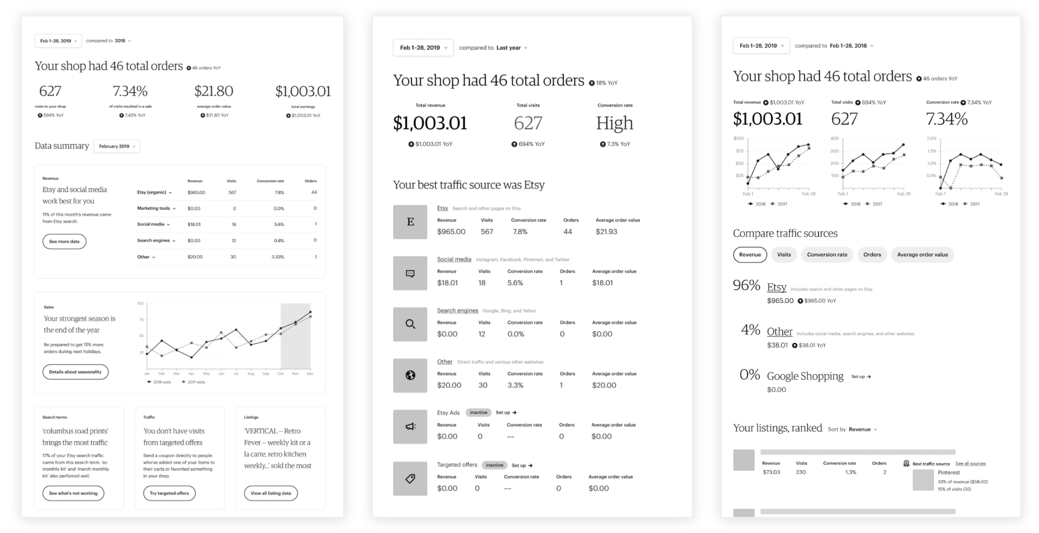
 The high-fidelity north star design I created after testing the low-fi one.
Transition planning
I pared down the north star to something we could build between July and October based on engineering capacity. Once again, I proposed that we transition sellers slowly and do a beta test before launching the product to two million people. My direct PM and Engineering Manager asked me to write a proposal with my thoughts. I shared a fully-considered proposal within a few days.
![]() The plan I created to transition sellers from the current stats experience.
The plan I created to transition sellers from the current stats experience.
I recommended we transition the existing design to the layout in my new design (but with the old UI). During this time, we could build the new version and beta test it privately. When the team felt confident, we could flip the switch and roll out the new UI. Everyone agreed with the approach.
Build
First, we made subtle changes. This included changing the background to white and updating the backend to include more traffic sources. Many sellers found the additional data useful. We then removed redundant or hardly-used modules and added new ones to match the redesign’s layout. Some sellers complained, but most people didn’t notice that the low-usage modules were gone.
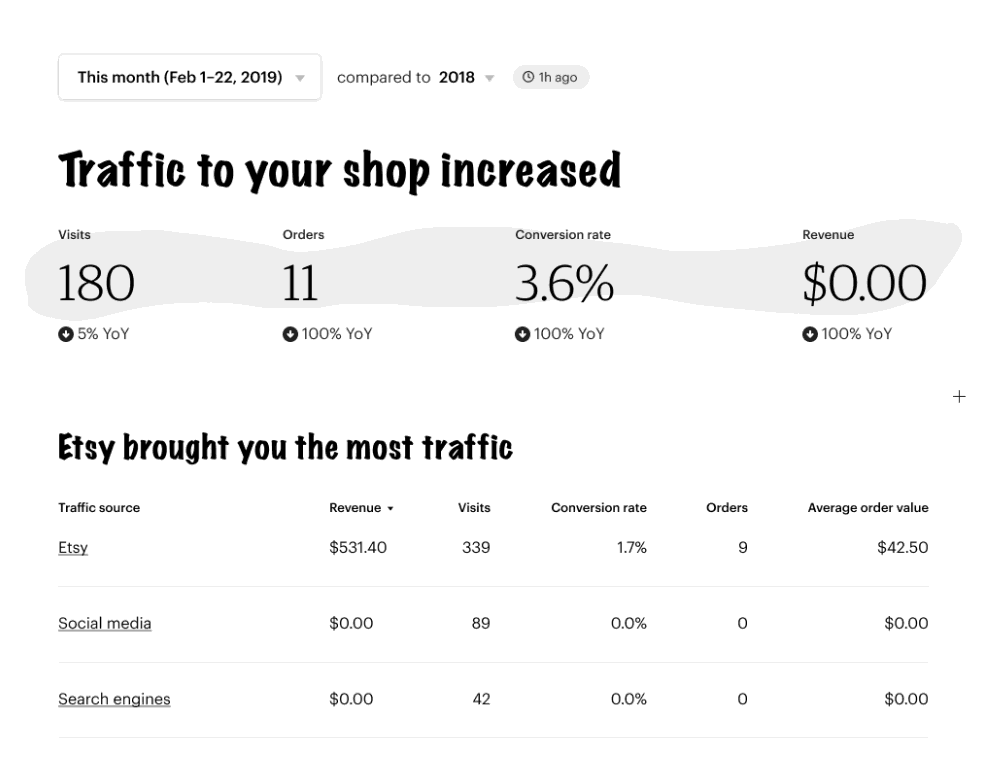
![]() Left to right: the previous stats experience; background change and more traffic sources; removing redundant data.
Left to right: the previous stats experience; background change and more traffic sources; removing redundant data.
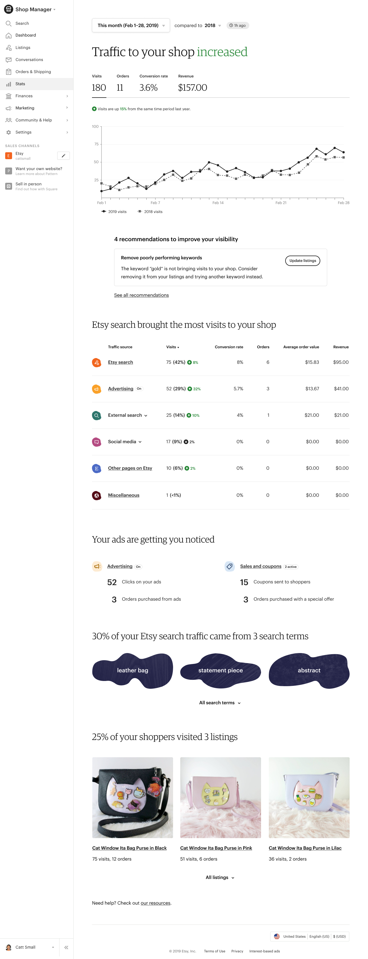
![]() A screenshot of live shop data as the team built changes according to the plan.
A screenshot of live shop data as the team built changes according to the plan.
During the transition, the team also built a new shop analytics experience. We finished enough of the new design by September to start beta testing with 100 sellers, and we invited more sellers to the beta over time.
Mockups for the first release of the new stats on web and native.
Those sellers gave us lots of feedback such as needing the ability to compare today’s data to other time periods, and the ability to choose custom date ranges for which to see their data. We included several of the most-requested features and put the less-needed ones in the backlog for after launch.
Our final featureset included four key metrics: visits, orders, conversion rate, and revenue. Sellers got a detailed breakdown of traffic sources used to find their shop; initially this breakdown started with visits, and we planned to eventually include all key metrics and AOV. Listings were ranked by key metrics.
 The final live experience, which was also mirrored on the apps.
Launch
In October, we launched the new stats for all 2 million+ sellers. There was little to no confusion from sellers and many of them actually liked the changes. 520,000 active sellers used the product in the span of a month. Additionally, simple in-product recommendations added 25,000 monthly active Etsy ads (Google Shopping) users.
Conclusion
It took two years, but I was able to make a major impact and turn Etsy’s Stats product into a valuable experience for sellers. This process taught me the importance of perseverance. I saw the benefit of beta testing products when they have major behavioral impacts, especially with a user base of 2.5 million people. I also learned the value of advocacy, ways to navigate spheres of influence, and the importance of failure when it comes to being successful.
Want to talk?
Got feedback, looking to suggest a future writing topic, or want to invite me to speak at your organization? Send me a message and I'll get back to you as soon as possible!