Sales and coupons on Etsy
In 2017, Etsy realized they were missing a huge opportunity to natively incorporate sales into the platform. While sellers could create coupons for buyers, there was no way to put items in your shop on sale. This led to the creation of third-party sales products for Etsy, many of which charged sellers money. A first-class sales feature would save sellers money and allow for a more consistent buyer experience.
This project was a massive undertaking that involved many departments across the company. While it was driven by a seller-focused team known as Marketing Services, several buyer-focused teams shared their input and loaned us engineers. Sales and coupons (or as we called it, “scoupons”) was an opportunity for me to work outside my comfort zone and collaborate with new people.
Three work areas were identified as part of the project. First, sellers needed a way to create sales via an experience that fit with the existing coupon creation flow. Secondly, sales needed to be reflected on Etsy sellers’ shops. Finally, we needed to create a sale and coupon redemption experience to support millions of buyers.
Role
I was one of three Product Designers on this project. My core focus was on the mobile and web experience for sale and coupon redemption experience. This was one of the most critical parts of the flow because it involved making changes to the checkout process. My experience with Etsy Payments made me a great fit for this work.
User needs
My part of this project was meant to fulfill the following customer goals:
- As a buyer who is interested in purchasing items from an Etsy seller, I need to know when items are on sale so I can make informed decisions.
- As a buyer who has received a coupon code from an Etsy seller, I need to submit the coupon so I can receive my discount.
Competitor audit
I started with an analysis of sale redemption experiences on other e-commerce websites. I looked at sites like Ebay, Walgreens, Instacart, and Overstock.
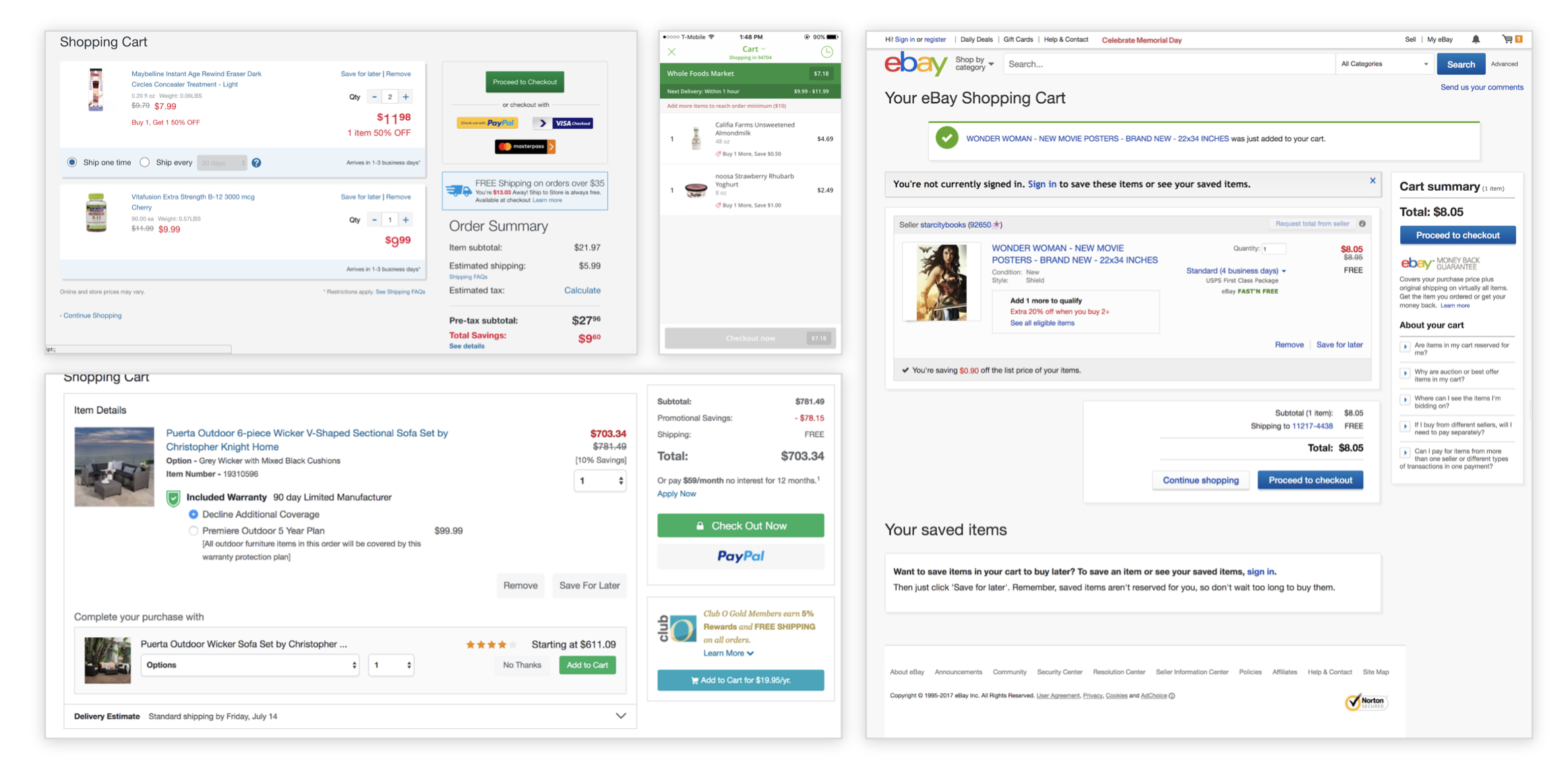 Competitive research examples.
Most services highlighted a change in price and the amount saved by redeeming the sale or coupon. They also showed a visual confirmation of the sale or coupon being applied. I turned this research into a map of the discount touchpoints.
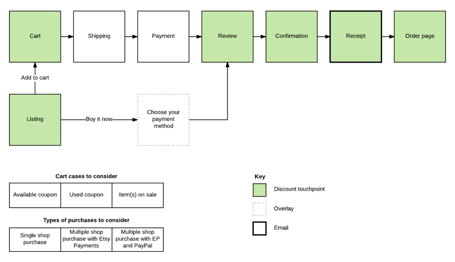 User flow of checkout areas that would be affected by our changes.
Alignment
I shared the above analysis with my Product Manager and aided product thinking by illustrating how potential feature choices might affect the customer experience. For example, I created documentation that shows how the rules we created would work for buyers trying to purchase items from shops with sales and coupons.
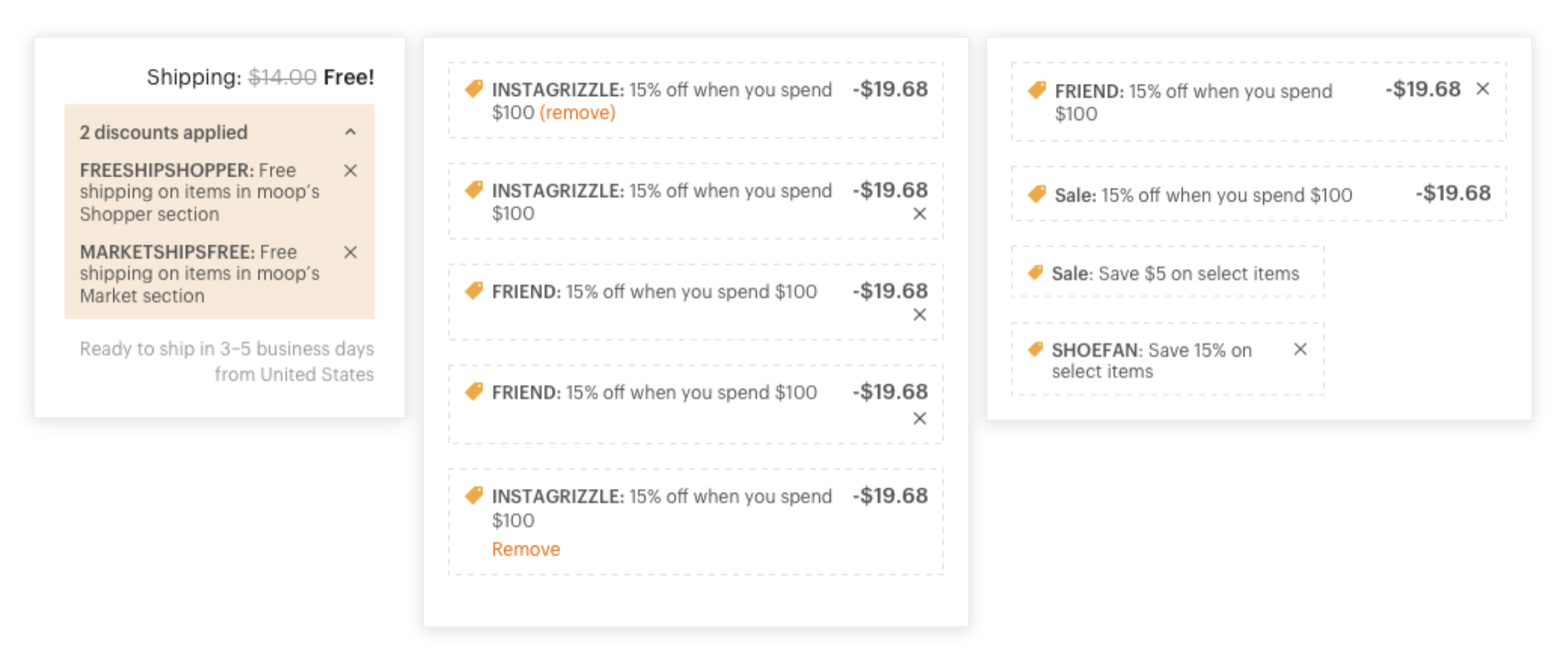
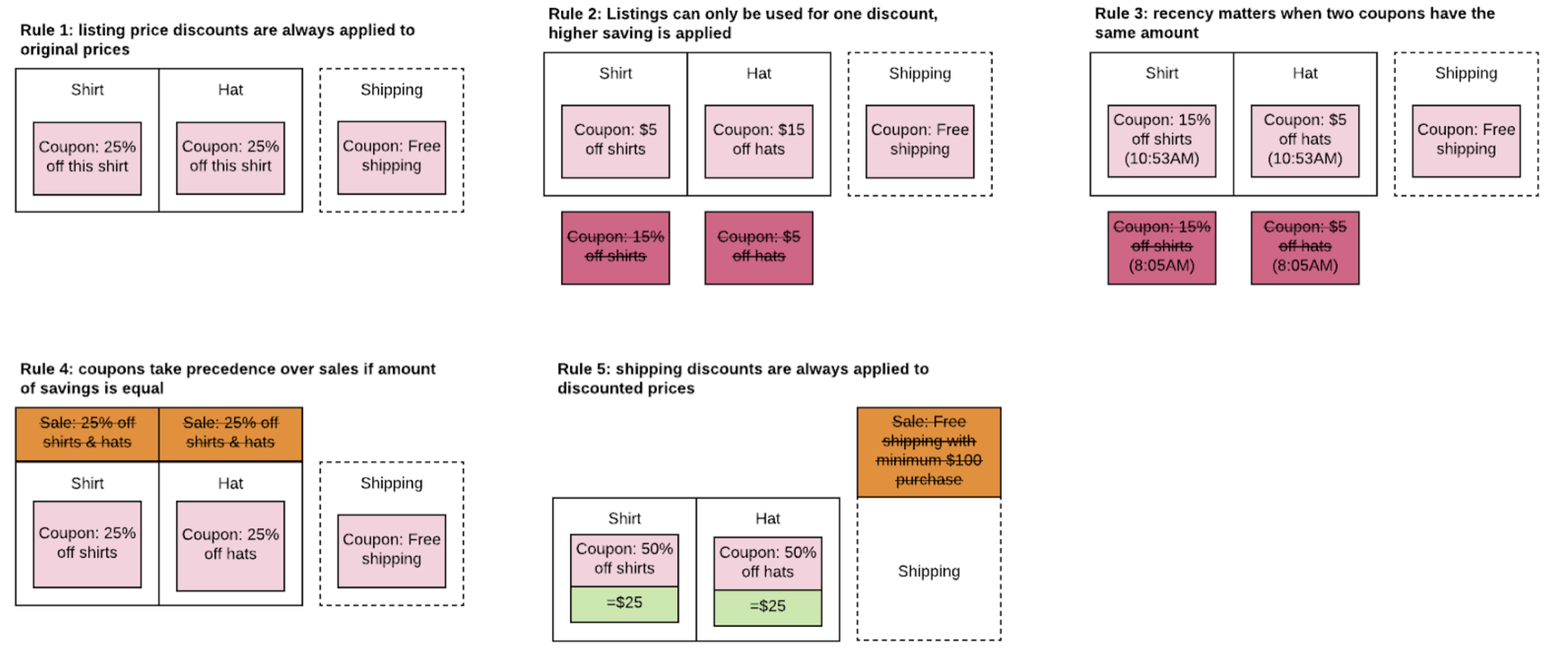 Final proposal for discounts and rules around stacking.
We decided on several core features for sales and coupons (which we referred to as “discounts”):
- Sellers can create discounts based on pricing and shipping
- Discounts can require a minimum purchase amount
- Price-based discounts can take a percentage or fixed-dollar amount off
- Different types of discounts can be stacked, but the same type (i.e. price cuts) cannot stack in one order from a shop
Visual design
I then created a variety of design iterations to show how we might display discounts in the cart. During this process, I explored many potential interaction designs as well as UI treatments. In collaboration with the other designers on the project, we decided to use a green tag icon with a description below the item and strikethrough text to denote the adjusted price.
 Some of my many iterations for displaying sales and coupons in the cart.
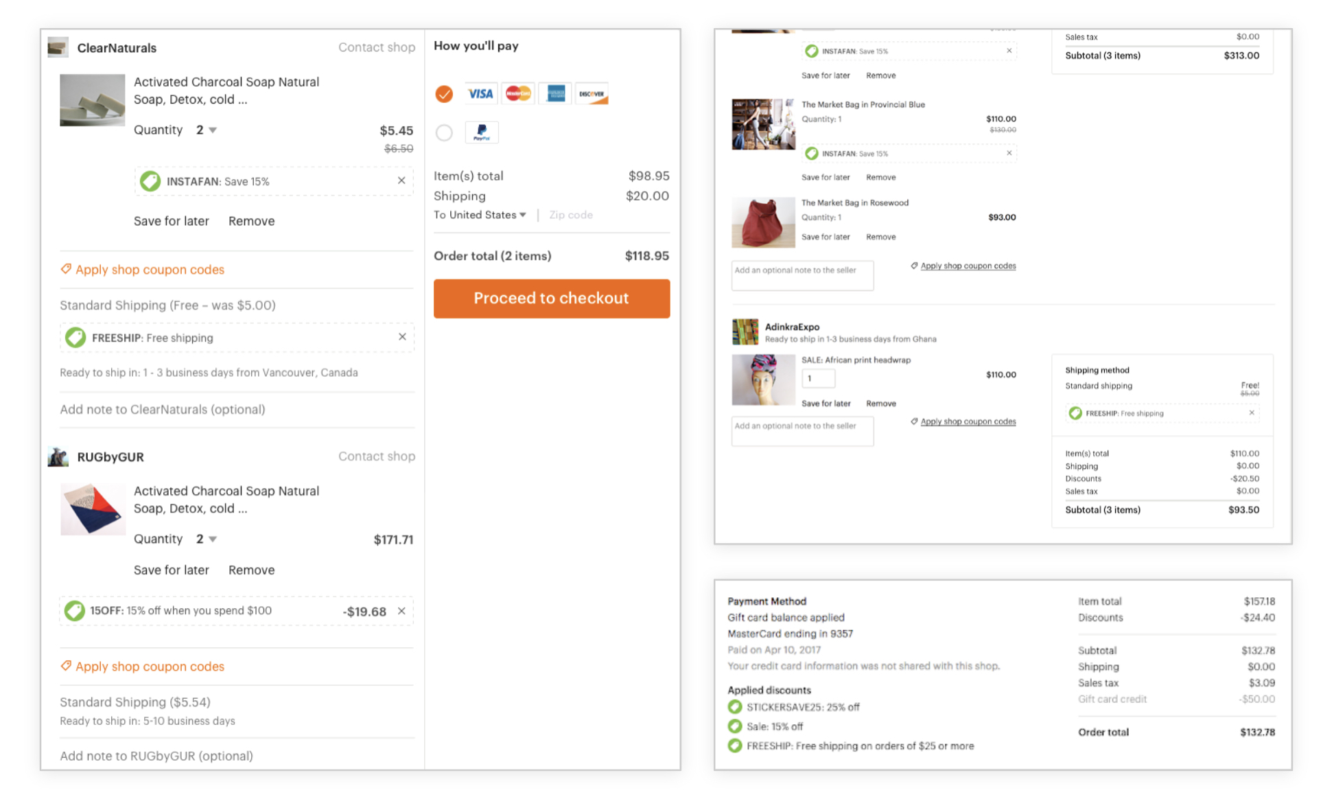 The final experience in cart, during checkout, and on receipts (clockwise from left to right).
I also redesigned the coupon redemption process across web and mobile, including error states. These designs also affected the global design system for errors in terms of colors and text placement in relation to the form field.
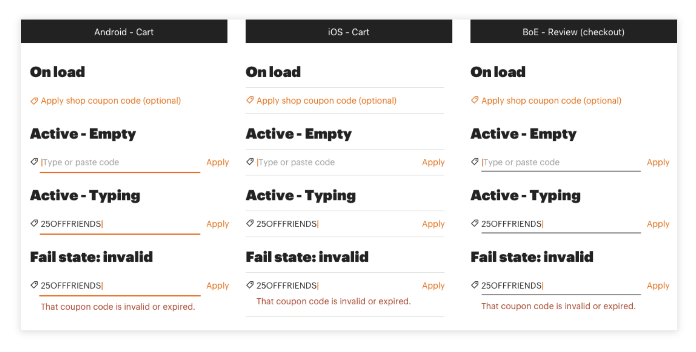 Coupon redemption on mobile in the cart and during checkout.
Since this work was fairly straightforward, we decided not to conduct user research. I worked directly with engineers and was available to answer questions. The designs were implemented as intended across web, mobile web, and Etsy’s iOS and Android apps.
Free shipping sales
After a successful design was created for the checkout experience, I then pivoted to creating a design for denoting a listing that had free shipping. This was more complex and required a lot of iteration because it affected another core experience: Etsy’s listing cards. I had to meet with a number of designers across Etsy whose work would be affected by mine.
There were several states for which I needed to account in my work:
- Free shipping sales without a minimum dollar amount spent
- Free shipping sales with a minimum spend
- Price-based sales
I also needed to consider both of our design systems (we were in transition) and what the copy would look like in other languages. Iteration upon iteration was done to make sure the experience fit everyone’s needs. We also tested the UI since it was a high-impact area and we were unsure about which direction to take.
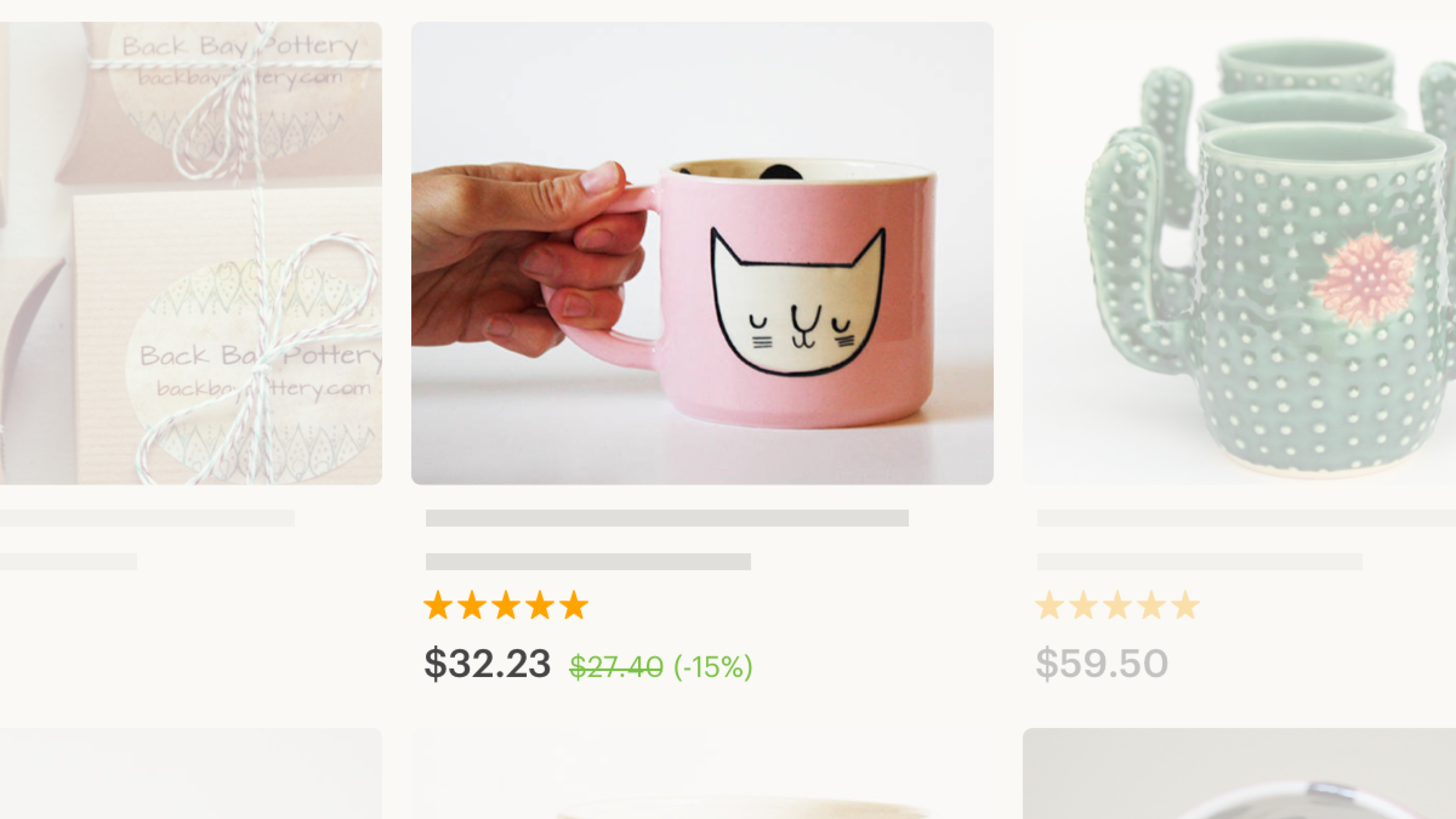
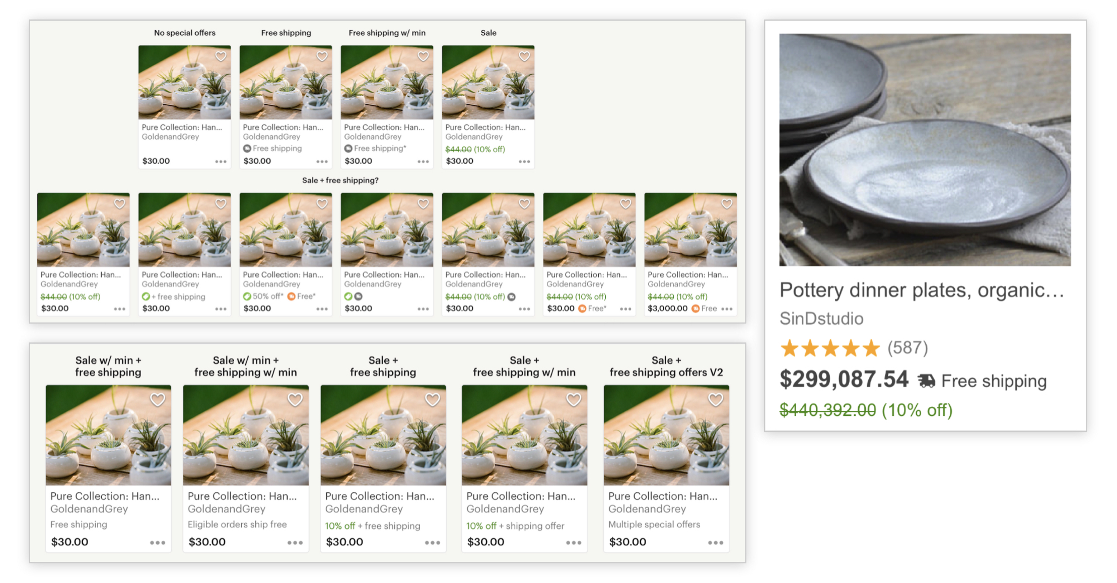 Some of the many listing card design iterations. Left: V1 listing card designs. Right: V2 listing card.
Through user research, we learned that buyers mostly focus on an item’s price. They didn’t notice the text-only versions of the free shipping badge, meaning an icon was necessary to get their attention. We also got confirmation that our copy choice would be understood.
Compromise
We had clear research results, but we were also collaborating with another team that had differing priorities. After a discussion about who owns the decision, we decided to let the other team choose whether or not to use an icon to denote that an item has free shipping. They decided against it, so we moved forward without an icon.
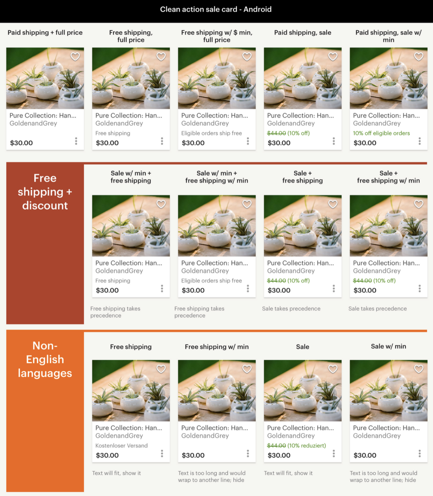 Documentation of the final listing card discount states.
I collaborated closely with engineers across web and mobile to ensure the features I designed were properly built up to standard. It was a fun experience that included some front-end coding of my own. We even accidentally broke Etsy’s listing cards on web because of German.
Launch
This project rolled out in September 2017. That November, Etsy had its first ever site-wide sale for Black Friday and Cyber Monday. The next quarter, Etsy reported $1 billion in gross merchandise sales for the first time. $120 million of that came from discounted listings.
Conclusion
This project showed me the power of multiple teams working together. I am thankful that I could collaborate with so many talented designers. After launch, my seller-focused team handed the work off to the buyer experience side and I shifted to another project.
Want to talk?
Got feedback, looking to suggest a future writing topic, or want to invite me to speak at your organization? Send me a message and I'll get back to you as soon as possible!