Using AngularJS, SCSS and Twitter Bootstrap to rapidly prototype user experiences
AngularJS, commonly referred to as Angular, is a very powerful framework that allows you to create web apps using static HTML templates. Angular allows you to choose what appears on the screen depending on different conditions. Due to its dynamic nature and ease-of-use, Angular can be seen as a replacement for traditional wireframing software. It also helps you to understand data structures and better communicate with developers, which will make you a more well-rounded designer.
In this tutorial, I will share the way I rapidly prototype using Angular, SCSS, and the Twitter Bootstrap framework. You can view/fork the project on GitHub and follow along OR build it from scratch using the instructions given throughout the post. I hope that you will feel confident enough by the end of this post to continue tinkering with Angular on your own!
I will cover the following in this post:
- Setting up a Development Environment
- Javascript and SCSS Libraries
- Preparing the Architecture
- Building the Prototype
- Beginning to Use SCSS
- Using Angular with Static Data
- Delving deeper into SCSS
By the end of this tutorial, you should have a basic understanding of Angular, SCSS, and Twitter Bootstrap. I’m writing this tutorial with the assumption that you have at least a small amount of experience with HTML. If you don’t, that’s okay – please feel free to try it out anyway!
Setting up a Development Environment
Before we begin, we have to set up our development environment. A development environment includes the programs you’ll be using in addition to the file structure of the project. Since we will be using SCSS without Ruby on Rails, we’ll need a preprocessing program. I use CodeKit (Mac only, $30) but there are many other great options. I suggest Prepros, which is free and works for Windows and Mac. Once you have your program of choice, create a new folder with the following structure:
- Root folder (name it whatever you want)
- lib
- images
- scripts
- stylesheets
- scss
- lib
Javascript and SCSS Libraries
Once you have your preprocessing program and folder structure set up, you’ll need to download Angular, UI Bootstrap, and Bootstrap’s Sass Port.
UI Bootstrap was created by the AngularUI team in response to the fact that Angular and jQuery often step on each other’s toes and therefore can’t be used together very well. It includes the JavaScript components from Twitter Bootstrap but is written in pure Angular rather than jQuery. The Bootstrap team took the CSS from Twitter Bootstrap, broke it into .scss files, and aptly named it Sass Bootstrap.
Do the following to set up your JavaScript and CSS:
- Download the latest minified version of Angular and UI Bootstrap.
- Save both files inside of your scripts folder.
- Download Sass Bootstrap’s source files from GitHub. Copy the files in the vendor/assets/stylesheets folder and paste it into your scss folder (located inside of the stylesheets folder).
- Delete the _bootstrap-mincer.scss file.
- Go into the bootstrap folder and delete the extra bootstrap.scss file.
- Drag your scss folder into your preprocessor program (Prepros, CodeKit, etc), right-click sass-bootstrap.scss, and set the output to the stylesheets folder with the following filename: styles.css.
Now you’re ready to start styling and compiling!
Preparing the Architecture
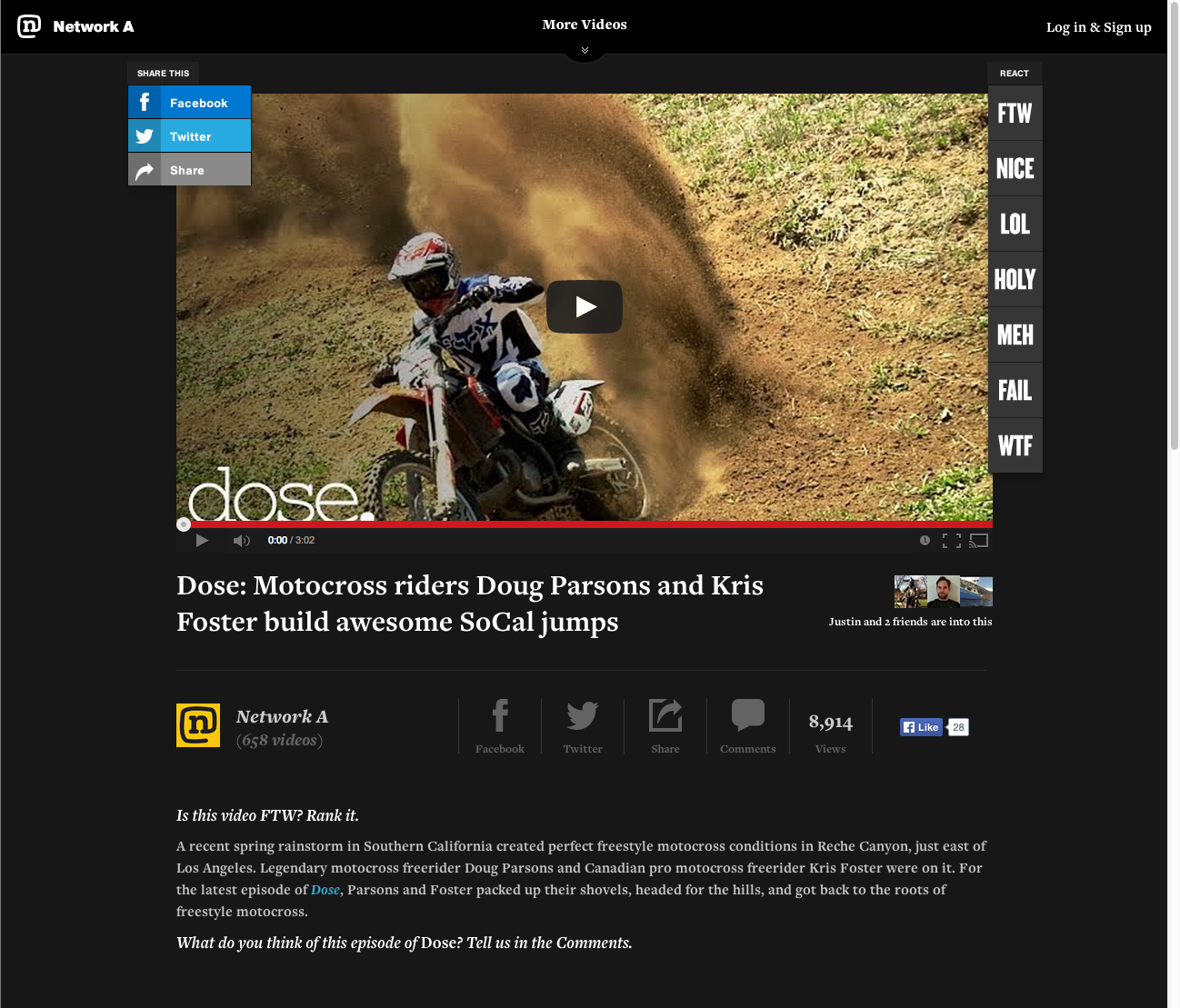
I will be building the prototyped version of a video page on Bedrocket’s popular sports website, Network A. You’re free to deviate and create your own design or follow along.
Jumping full-on into code without a plan can lead to frustration and less efficient use of time. Now that our code base is set up, let’s think about how the page will be built. Sketching or quick wireframing is great at this stage because it allows you to plan what code and styles to use when building the website in a free-form manner.
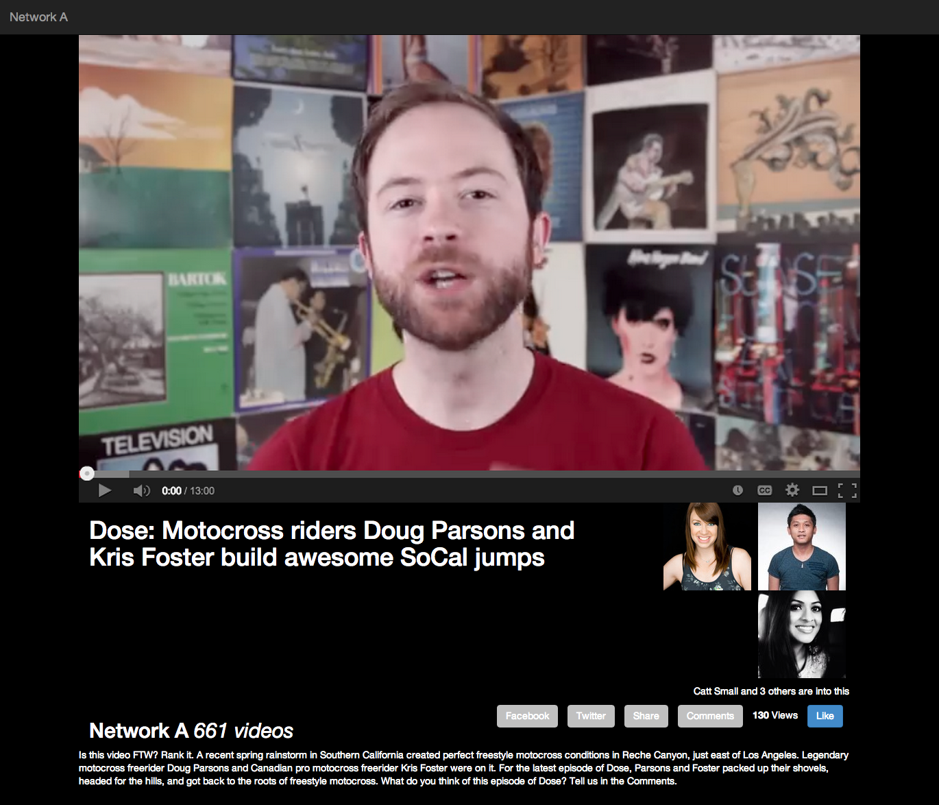
Here’s a screenshot of a video page on Network A:
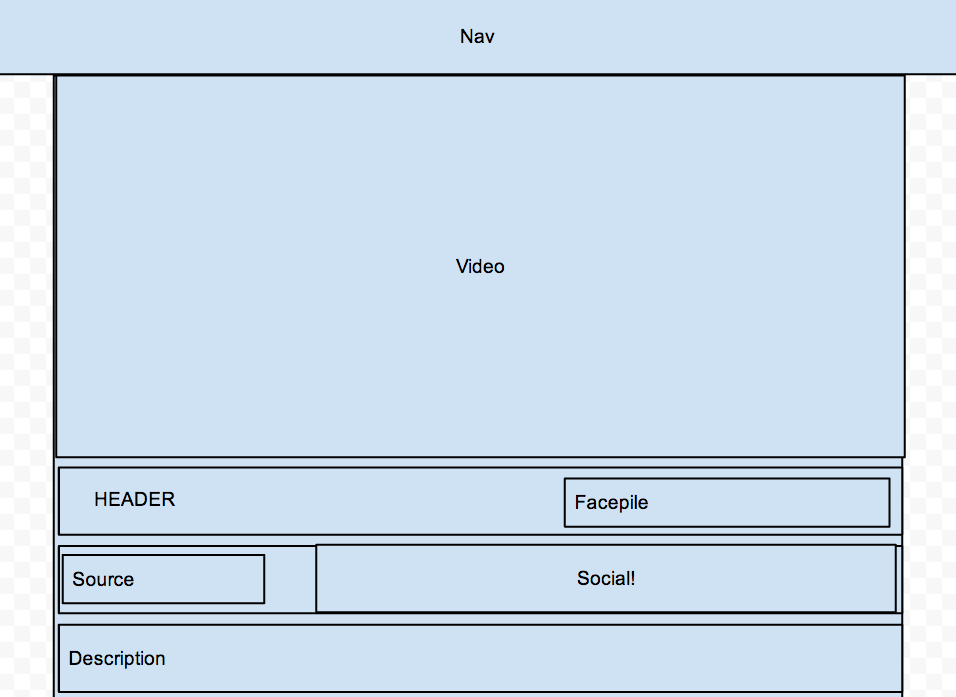
And here’s a quick wireframe I made using Google Drive to plan the architecture:
Building the Prototype
Now that we have our plan, we can begin to code. Start by creating and saving an index.html file in your root folder. index.html is the first file web browsers look for when you go to a URL. If you decide to put this prototype online, this will prevent you and other people from the frustration of having to remember a long, precise URL.
In your index.html file, type the following:
<!doctype html>
<html>
  <head>
    <title></title>
    <meta charset="UTF-8">
  </head>
  <body>
  </body>
</html>
This is the minimum amount necessary to get an HTML5 page up and running. (You actually don’t need the <title> or <meta> tags either, but it’s highly recommended so that there are no formatting issues.)
Next, create and save an app.js file and a controllers.js file in your scripts folder. Angular needs you to name and define your app before you can create templates – it’s sort of like knowing what a pencil is before you can write. Angular uses controllers to control (ha) what data is shown in different sections of your app. You can use one controller for the whole app or several different ones.
After you save your new JavaScript files, you’re ready to start including everything in your HTML. You’ll do this by linking your CSS and JavaScript files in the tag. Unlike most Javascript, Angular needs to be placed in the <head> tag so that it can put data into the templates before the HTML page finishes loading.
<head>
  <title></title>
  <meta charset="UTF-8">
  <link rel="stylesheet" href="lib/stylesheets/styles.css" charset="utf-8">
  <!-- Angular must be included in the head so that the templates work properly -->
  <script src="lib/scripts/angular.min.js"></script>
  <script src="lib/scripts/ui-bootstrap-tpls-0.10.0.min.js"></script>
  <script src="lib/scripts/app.js"></script>
  <script src="lib/scripts/controllers.js"></script>
</head>
Now that your files are linked, you need to define your app as I mentioned earlier. Open up your app.js file and type the following to define your Angular app:
var myAngularApp = angular.module('myAngularApp', [ ]);
Save and close the file once you’re done – we won’t need it anymore. Open your controllers.js file and define the first controller we’ll be using during this tutorial:
    myAngularApp.controller('appController', function ($scope) {

    });
JavaScript allows you to get and define properties of an object in two ways. One of those ways is called dot notation, and you can see it in the code above. Angular defines controllers ( 'appController' ) in relation to the app you name (myAngularApp). This allows you to have many apps and controllers if you have a large-scale site. In our case, we only need one of each.
Your controllers.js file is where the magic will happen later, so save it and keep it open. We’re going to focus on building the HTML template for a while. First, you’ll need to reference the app and controller you just made in your HTML. You can do that by opening index.html and modifying the <body> tag as follows:
<body ng-app="myAngularApp" ng-controller="appController">
Angular should now be ready to work with your HTML! The work we do next will all be happening between the <body> tags.
Let’s create a navbar using Bootstrap’s navbar class. We also want it to be black rather than the standard white, so we’ll also add the navbar-inverse class. Lastly, we want the navbar to stick to the top, so we’ll add the navbar-fixed-top class. I also threw in a link with Bootstrap’s navbar-brand class to act as a placeholder.
    <header class="navbar navbar-inverse navbar-fixed-top">
      <a class="navbar-brand" href="#">Network A</a>
    </header>
Next, let’s build a container for the video and the other information shown in the diagram. We will do this using Bootstrap’s container class.
    <section class="container">
    </section>
We’ll be using an image as a placeholder for the video, so go to YouTube or Vimeo and grab a screenshot of something you like to watch. I used a video from the PBS Idea Channel. Crop and save the picture of the video you chose in your images folder. I named my picture video.png. Next, create a <div> and give it a class so that you can reference it later. Include your image inside that <div>.
    <section class="video-container container">
      <!-- Video player -->
      <div class="video-player">
        <img src="lib/images/video.png">
      </div>
    </section>
Beginning to Use SCSS
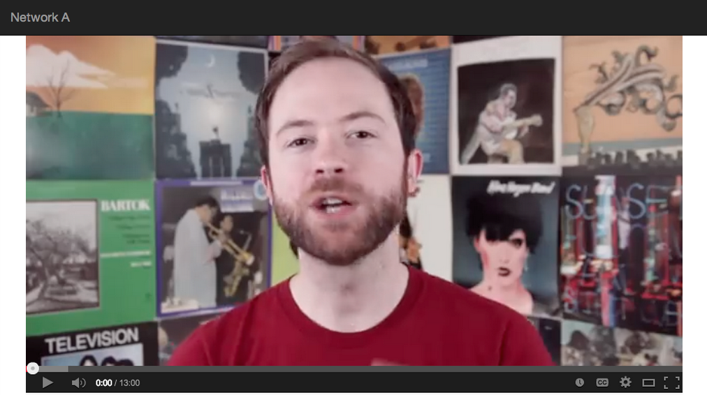
We now have the basic architecture done for our page, yay! If all goes well and you’re building the Network A prototype, you should be able to open index.html in your browser and see something like this:
You might notice that the background and text is the wrong color. The video is also a little cut off at the top. Let’s create an SCSS file that will allow us to add our own styles to the Bootstrap ones.
In your scss folder, create a file called _mystyles.scss. The underscore is part of a naming convention used to show which files are being imported into another SCSS file.
Once you have _mystyles.scss saved, open bootstrap.scss. Since bootstrap.scss is the file that imports, or gathers code from, other SCSS files, we will need to connect the new file to it. You should see a gigantic list of files that are located inside the bootstrap folder. Import your new file by typing the following at the bottom of the page:
    // My styles
    @import "_mystyles";
You don’t need to include the file type (.scss) because it already knows to look for SCSS files. Save your bootstrap.scss file and reopen your _mystyles.scss file. Your should now be able to write your own styles and see the effect on the front end. Let’s test this by changing the padding and default background and text color of the site:
    body {
      padding-top:51px;
      background: #000000;
      color: #ffffff;
    }
Reload index.html page in your browser and see if anything has changed.
Black (#000000) and white (#ffffff) are two colors we might end up using fairly often, so let’s create variables in order to reference these colors later. Variables allow you to refer to the same string of text throughout your files. Gladly, Sass Bootstrap comes with a _variables.scss file, which is located inside your bootstrap folder. Open _variables.scss and add the following to the Colors section:
    $black: #000000;
    $white: #ffffff;
You should now be able to reference $black and $white as color variables throughout your SCSS files. You’ll also notice that Sass Bootstrap comes with other colors that you can use and modify as needed according to your brand’s guidelines. If you change the value of the variable here, it’ll automatically be applied across your site. Wonderful, isn’t it?
We can now go back into _mystyles.scss and replace the hex colors with our new variables. It should look like this when you’re done:
    body {
      padding-top:51px;
      background: $black;
      color: $white;
    }
While we’re at it, let’s make sure the video screenshot is always as wide as video-player. Nested styles, a feature of SCSS, makes this especially easy – the following will target the <img> tag inside of video-player.
    .video-player {
      img {
        width:100%;
      }
    }
Save your file and open index.html file in your browser again. Hopefully you’ll see something that looks like this:
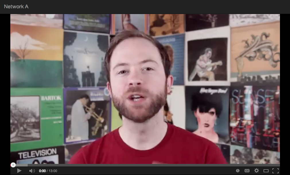
If you see something similar to the above image, hooray! You’re doing very well so far. If not, open your browser’s Element Inspector and see if there are any errors or incorrectly-linked files.
Using Angular with Static Data
Network A’s video pages allow you to not only watch a video, but also read a description, see who else liked the video, see where the video came from, and share it with your friends. Let’s add these areas to our prototype. The code below shows the way I created and named things in my prototype.
    <section class="video-container container">
      <!-- Video player -->
      <div class="video-player">
        <img src="lib/images/video.png">
      </div>

      <!-- Title + facepile -->
      <div class="video-header clearfix">
        <h1 class="col-md-8"></h1>
        <aside class="facepile col-md-4 text-right">
          <ul class="list-inline">
            <li></li>
          </ul>
          <p></p>
        </aside>
      </div>

      <!-- Source + social -->
      <div class="video-source-social clearfix">
        <h2 class="video-source col-md-4"></h2>
        <ul class="social-media-widgets col-md-8 list-inline">
          <li></li>
        </ul>
      </div>

      <!-- Description -->
      <div class="video-description">
        <p></p>
      </div>
    </section>
You’ll notice a few classes that start with col-md- throughout the code. Bootstrap comes with a 12-column grid system. I’m using the grid system to align elements similarly to the live version of the video page. Bootstrap also comes with text align classes, one of which I’m using on the element with the facepile class to align its text to the right, and a class that makes horizontal lists (appropriately called list-inline). Additionally, Bootstrap comes with a clearfix class that fixes layout problems caused by the float property in CSS.
We can now start to fill the template with static data via Angular. To begin, let’s reopen controllers.js. Angular uses JavaScript objects to supply data to HTML templates. We’ll create a scope object called video that will have a lot of different properties. Here’s the data I created for $scope.video:
    myAngularApp.controller('appController', function ($scope) {
      $scope.video = {
        title: 'Dose: Motocross riders Doug Parsons and Kris Foster build awesome SoCal jumps',
        description: 'Is this video FTW? Rank it. A recent spring rainstorm in Southern California created perfect freestyle motocross conditions in Reche Canyon, just east of Los Angeles. Legendary motocross freerider Doug Parsons and Canadian pro motocross freerider Kris Foster were on it. For the latest episode of Dose, Parsons and Foster packed up their shovels, headed for the hills, and got back to the roots of freestyle motocross. What do you think of this episode of Dose? Tell us in the Comments.',
        views_count: 130,
        source: {
          name: 'Network A',
          id: 1,
          video_count: 661,
          photo_id: 1
        },
        actions: {
          1: {
            name: 'Catt Small',
            id: 1
          },
          2: {
            name: 'Bob Dole',
            id: 2
          },
          3: {
            name: 'Johnny B',
            id: 3
          }
        }
      }
    });
$scope.video is comprised of a title, description, view count, source, and user actions. The video’s source and user actions are each further broken down into more list of properties. We will use all of this data to populate our HTML template.
Let’s jump into our index.html file and populate the <h1> inside of video-header with the video’s title. Angular will look for JavaScript variables inside of two sets of brackets and populate them with the requested data, so you’ll need to type it like this:
    <div class="video-header clearfix">
      <h1 class="col-md-8"></h1>
      <aside class="facepile col-md-4 text-right">
        <ul class="list-inline">
          <li></li>
        </ul>
        <p></p>
      </aside>
    </div>
If all goes well, you should see the video’s title instead of `` when you open index.html in your browser.
The next step is more complicated: Network A shows 3 images of people who interacted with the video (commonly referred to as a “facepile”). We’ll need images of real people before we can solve the problem, so go download 3 avatars from User Inter Faces, a site built solely for finding avatars to use in mockups and prototypes. Save each image in your images folder. Name them user-1.jpg, user-2.jpg, and user-3.jpg. This will allow us to find the image based on the user IDs we made earlier.
Once you have your images, let’s use Angular’s ng-repeat directive to fill the template with the correct data and number of items.
    <aside class="facepile col-md-4 text-right" ng-if="video.actions">
      <ul class="list-inline">
        <li ng-repeat="user in video.actions"><img ng-src="lib/images/user-.jpg"></li>
      </ul>
    </aside>
Angular’s ng-repeat directive looks at a list of items ( video.actions ) and splits them into singular items ( user ), then creates the number of required HTML elements and fills them with the data requested ( > ). Angular also has a directive called ng-src that allows us to include images dynamically based on the value of a variable. I used ng-src to link images via user.id.
Next, let’s add a line of text under the facepile that tells us a little about who liked the video.
    <aside class="facepile col-md-4 text-right" ng-if="video.actions">
      <ul class="list-inline">
        <li ng-repeat="user in video.actions"><img ng-src="lib/images/user-.jpg"></li>
      </ul>
      <p> and 3 others are into this</p>
    </aside>
`` looks up the user in the list of actions whose ID is 1 and spits out their name. If you reload index.html, you should see something like “Catt Small and 3 others are into this”.
Now that you’re familiar with how to populate HTML templates with data, can move on to setting up the video’s source and social media options. We’ll worry about styling things more once we have the structure set up. Jump to video-source and add in the source’s name.
    <section class="video-source col-md-4">
      <h2></h2>
    </section>
Next, fill out the social-media-widgets list with the options given. I used Bootstrap’s btn classes to quickly give the buttons some default styles.
    <ul class="social-media-widgets col-md-8 list-inline">
      <li>
        <button type="button" class="btn btn-inverse">Facebook</button>
      </li>
      <li>
        <button type="button" class="btn btn-inverse">Twitter</button>
      </li>
      <li>
        <button type="button" class="btn btn-inverse">Share</button>
      </li>
      <li>
        <button type="button" class="btn btn-inverse">Comments</button>
      </li>
      <li>
        <strong></strong>
        Views
      </li>
      <li>
        <button type="button" class="btn btn-primary">Like</button>
      </li>
    </ul>
Finally, jump to video-description and add the video’s description.
    <div class="video-description">
      <p></p>
    </div>
If everything works correctly, you should see something like this:
If you don’t see something like the above, use your browser’s Element Inspector to locate problems. Once you have everything in place, you can move on to styling things.
Delving deeper into SCSS
Now that you’ve populated your template with data, you can begin to add visual touches. The next steps will all happen in _mystyles.scss.
The first thing that needs styling is video-header. Network A’s video page has a border under the header in addition to different spacing. The following code uses nested styles to give video-header a gray background and reconfigure the spacing:
    .video-header {
      border-bottom:1px $gray dotted;
      padding-bottom:15px;
      margin-bottom:15px;

      h1 {
        padding-left:0;
      }
    }
Gladly, $gray is a variable provided by Sass Bootstrap, so we didn’t have to create it.
The facepile is also looking pretty messed up right now, so let’s improve that. The images are too large and are touching the bottom of the video, which means we should resize and shift them down a bit:
    .facepile {
      margin-top:30px;

      img {
        width:36px;
      }
    }
The video-source-social area could also use some love, so let’s remove the padding from the source’s name and stylize the video count. The social-media-widgets list items also need borders, and the buttons inside them don’t have a gray background. The following uses nested styles and variables to make this section of the prototype feel much more similar to the live version:
    .video-source-social {
      h2 {
        margin:0;
        padding-left:0;

        em {
          display:block;
          font-size:.9em;
          color:$gray;
        }
      }

      .social-media-widgets {
        li {
          border-left:1px solid $gray;
          padding:15px;

          .btn-inverse {
            background:none;
            color:$gray;

            &:hover {
              color:$white;
            }
          }
        }
      }
    }
Finally, the description could use a lot more spacing, so let’s add some padding.
    .video-description {
      padding:20px 0;
    }
Save _mystyles.scss and reload your index.html file in the browser.
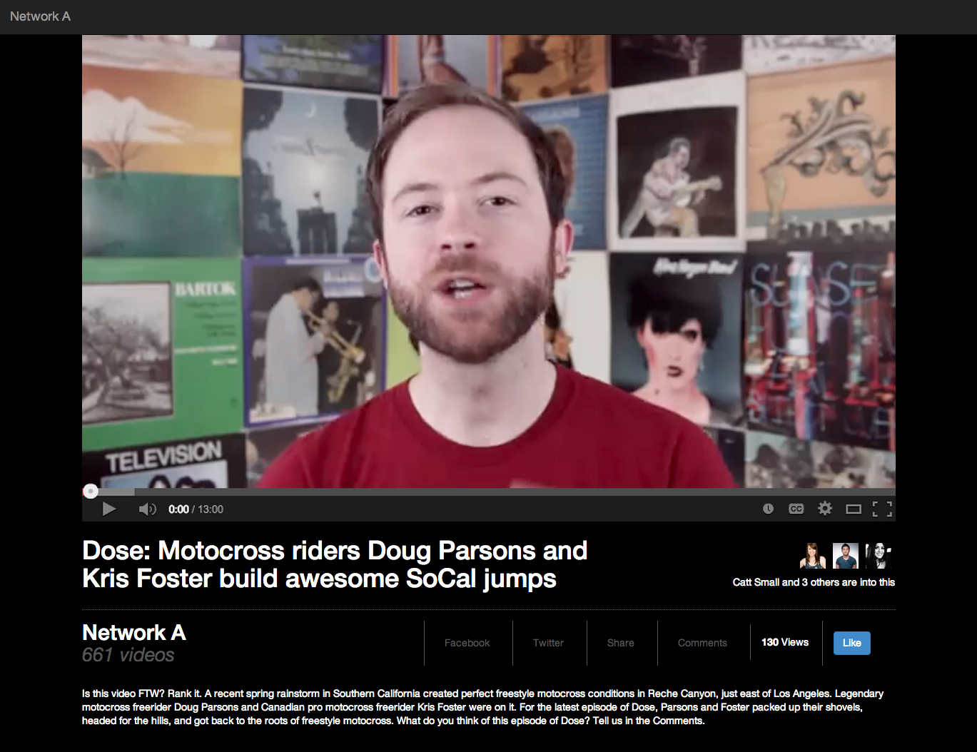
If it looks like the picture above, you’re done! Give yourself a high five for finishing this tutorial. If it doesn’t, try to look through your code and see where things didn’t go well.
Thanks for following along with this tutorial. I hope it taught you something about Angular, SCSS, and my development process. You can view my code here. Feel free to comment below or contact me if you liked the tutorial, have feedback, or run into any issues.
Until next time!
Upcoming talks
-
Staff designer: Grow, influence, and lead as an individual contributor
At some point in your career, you'll likely have to choose between senior individual contributor (IC) and design management roles. But what if you don't want to manage others? What if you’d rather continue as an expert contributor? In this talk, we’ll take a deep dive into staff/principal designer roles—a combination of team leadership and in-the-pixels design work—all without any direct people management. Learn how you can advocate for, grow into, and succeed in such IC leadership roles.
Want to talk?
Got feedback, looking to suggest a future writing topic, or want to invite me to speak at your organization? Send me a message and I'll get back to you as soon as possible!