Asana Goals 2-year vision
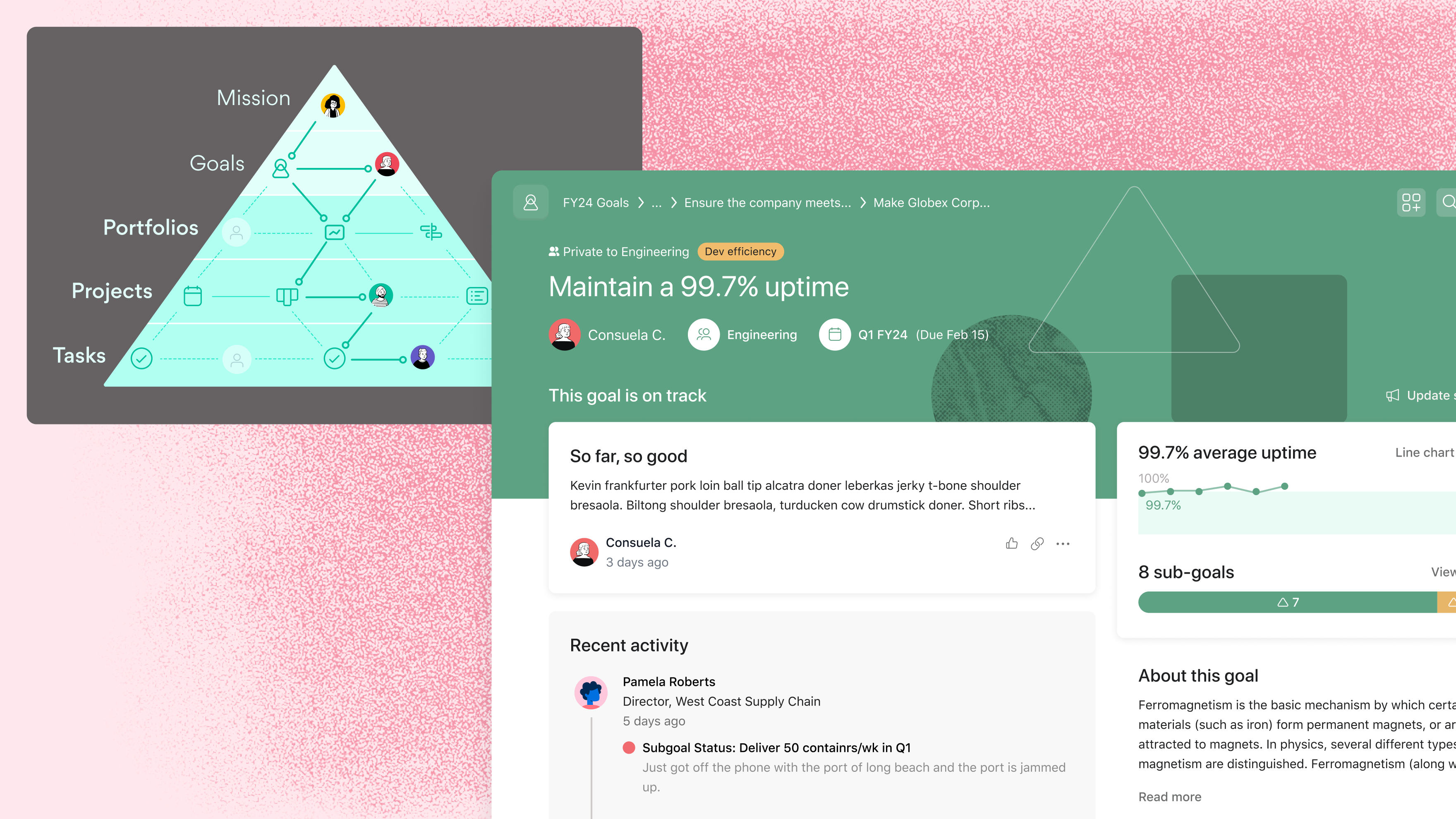
The initial version of Asana Goals launched in mid-2020. After the release, we had lots of ideas for improvements and received many feature requests from customers. We did not, however, have a way to prioritize our work beyond a short list of high-impact projects. I led the design of a multi-year product vision that I knew would give us the perspective we needed to deliver on — and exceed — customer expectations.
This work was done in collaboration with my Lead Product Manager and UX Researcher. Throughout the process, we included contributions from a new Product Designer who joined the team, our Product Engineers, and Product Designers on other teams. By the end of the project, we had a 2-year vision and feature prioritization principles that helped us move from a short-term roadmap driven by feature requests to an opinionated, multi-year outlook.
In this post, I walk through the process of creating this 2-year vision for Asana Goals. I also cover the design leadership work that followed the release of the vision, which broadcasted our latest thinking to other teams as we learned and refined the product. If you need more context about Asana Goals, read about my zero-to-one design process first.
Crafting a 2-year design vision
I split the work into phases, very similar to a design project:
- Discovery, in the form of an insights review
- Ideation workshops with the Goals team and partner teams
- Refinement in collaboration with my PM, UXR, and fellow Goals designer
- Launch to the company at a Design Review
This project took about six weeks to complete. I worked on this project in my spare time while delivering short-term improvements to Asana Goals.
Rediscovering customer insights
My UXR partner and I gathered insights from the six months of research done to release the original Goals product. We also reviewed all the customer feedback and feature requests received since the product’s release. I then enlisted the new Product Designer on the team to iterate on the user personas that were created during the original design process, which helped her onboard faster.
We learned that customers expected Goals to be much more integrated with the rest of Asana. The research told us people did not understand the connection between work and lower-level goals. We believed increasing the visibility of goals outside the Goals tab would result in more organizational alignment and increase the value of the experience for our customers.
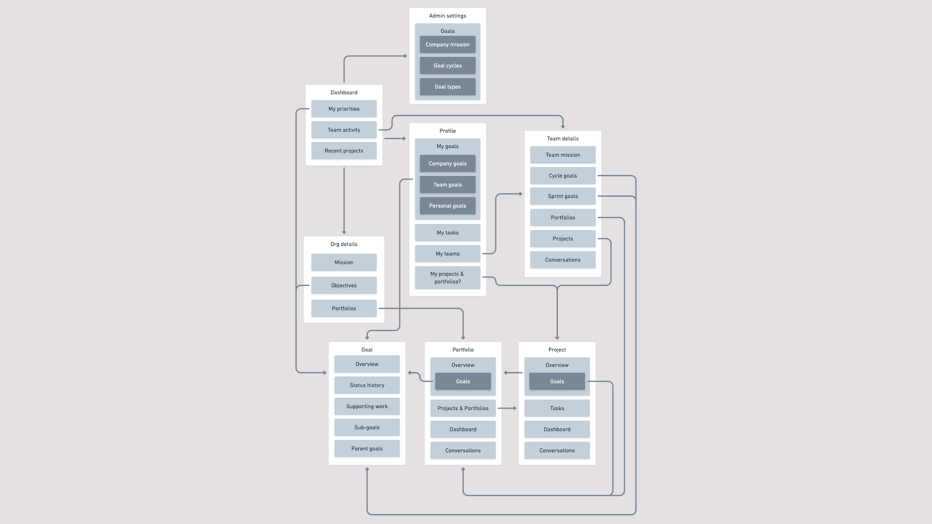 A proposed information architecture that better integrated Asana’s objects (including goals) — instead of reflecting our org chart.
Gathering ideas from across the company
With this information, I then organized a series of workshops with the Goals team and other Product Designers at Asana. I presented our insights and asked folks to illustrate ideas that would most impact the Goals customer experience. I submitted my own ideas to the workshops as well, then asked every participant to vote. By the end of the workshops, all teams were aligned on a potential direction.
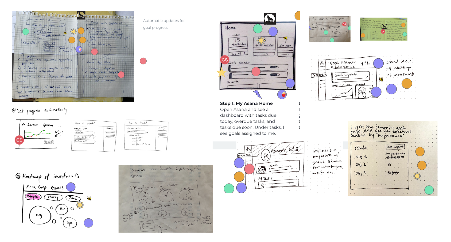 Sketches from different Goals vision ideation workshops, which included members of different teams.
At this point, we recognized the importance of having a combined design and product vision. My PM, UX research partner, and I decided to create one deck that was divided into parts. The first part would cover the business strategy and customer insights, and the second part would show how the strategy would come to life in the product experience. I managed the overall project timeline, contributed feedback to the first section of the deck, and owned the latter part of the deck.
Turning a feature set into a story
Product ideas are nothing without a compelling user journey, so I created the skeleton of a scenario in Dropbox Paper to figure out how all the ideas would fit together. I separated our ideas by the phases of goal management and mapped them to the personas that would use them. This draft helped me, my PM, and my UXR sharpen our initial direction. I then jumped into Figma and began to make a deck.
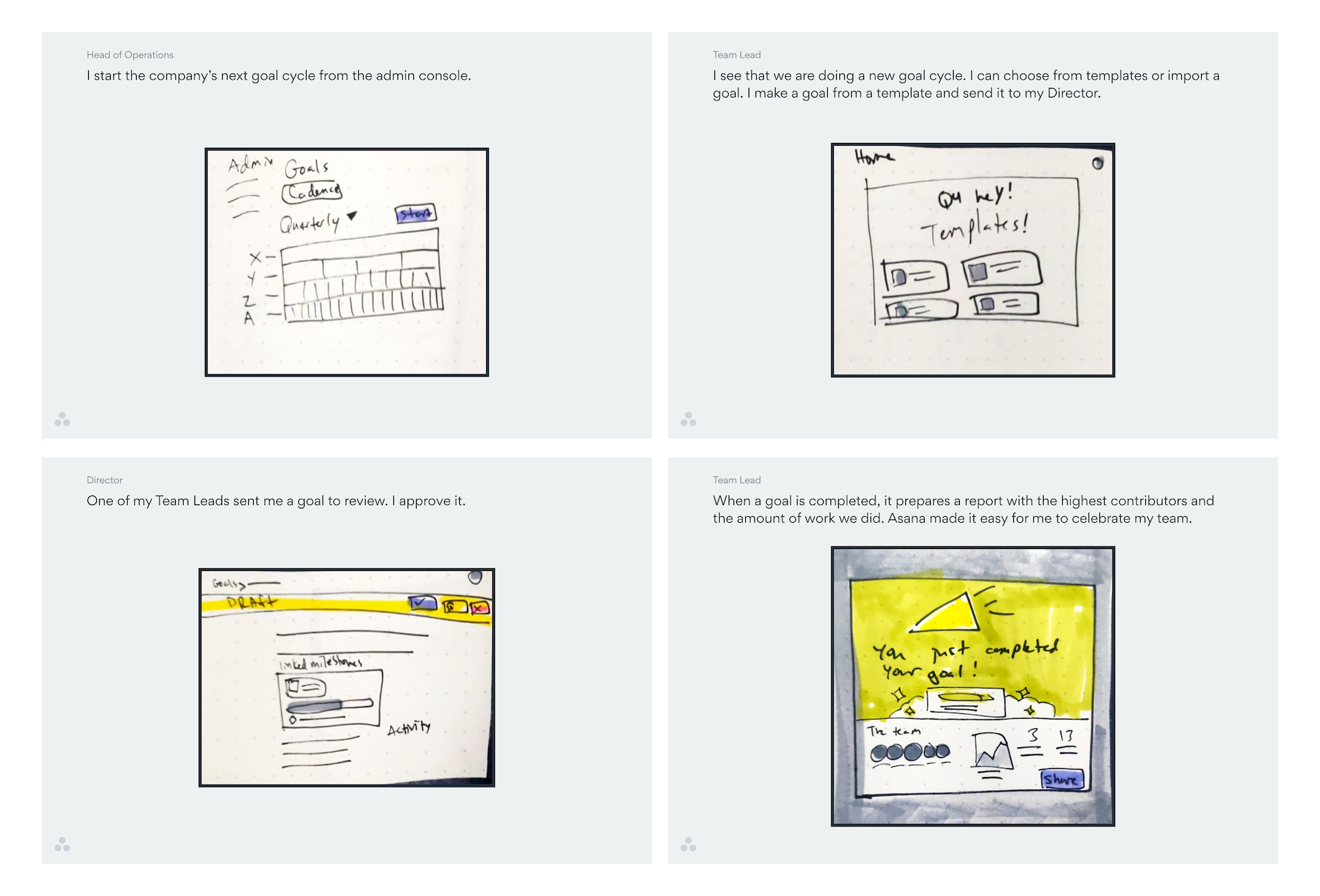 Placeholder sketches in the first draft of the vision deck.
As I iterated on the scenario through my work on the deck, I increased the fidelity of the designs. I brought the deck to design crits and incorporated additional feedback from other designers. This helped me to both strengthen my message and keep others updated about our progress. I also regularly met 1:1 with designers of other teams to see and hear new developments from their product areas, which kept my work from becoming stale during the refinement process.
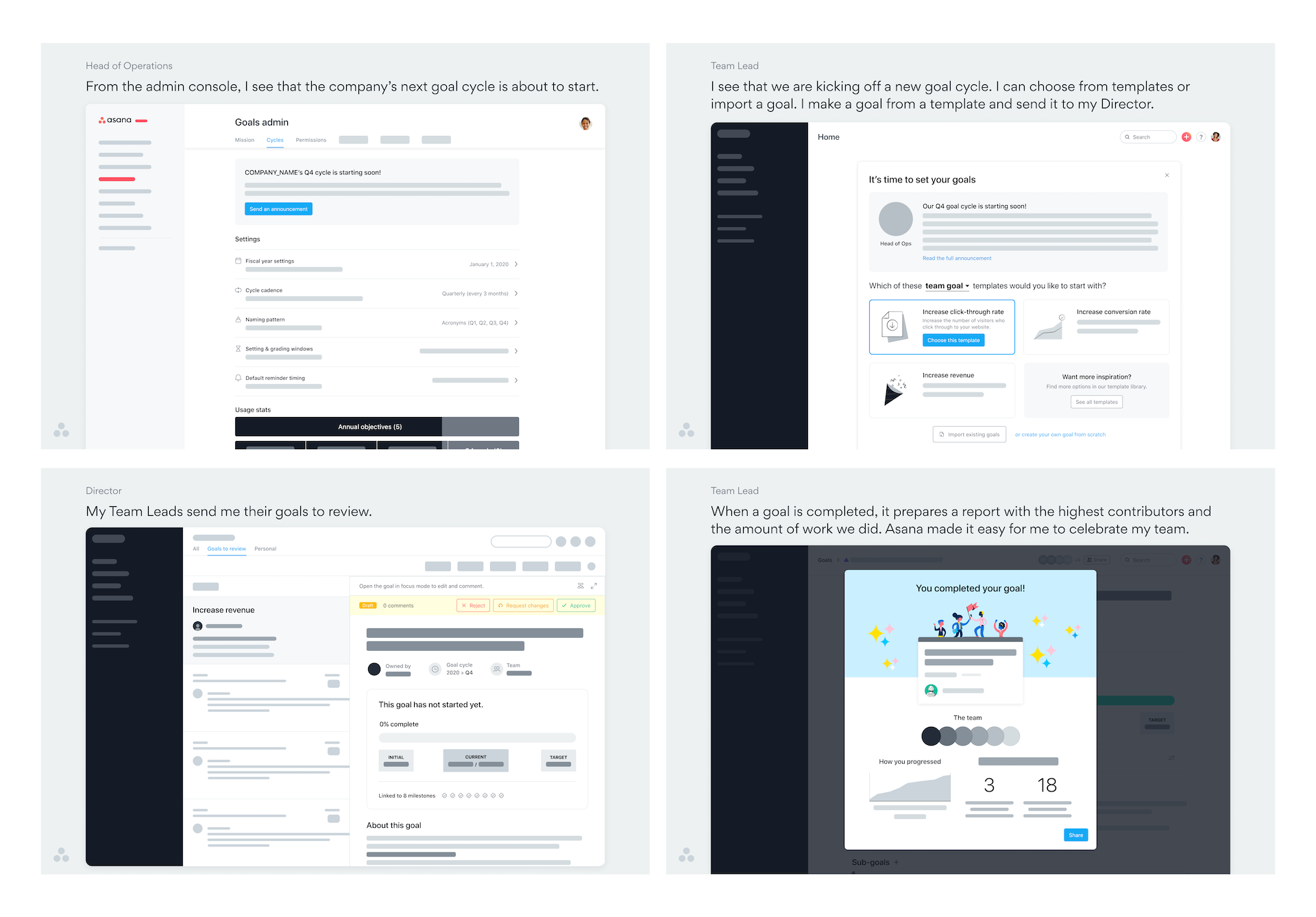 Mid-fidelity designs from the second draft of the deck.
By the end of the process, I split the scenario into three phases of goal management. This connected well with our customer insights and underscored the information from the business strategy portion of the deck. I also decided to start my portion of the deck with a walkthrough of how goal management works today so readers were primed to understand how our future world would make a large impact.
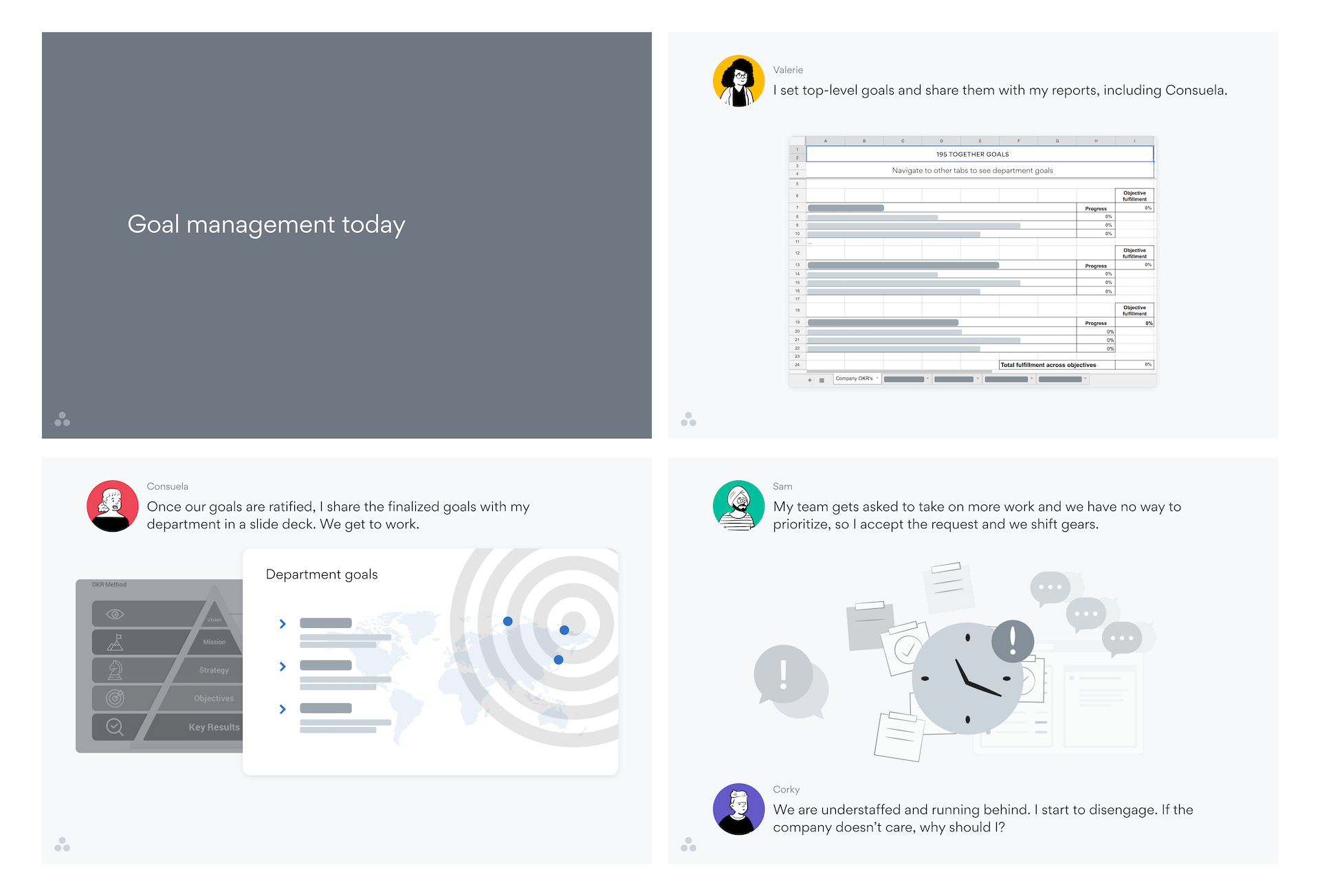 The first part of the design vision walked through the current-world goal management process of a fictional company.
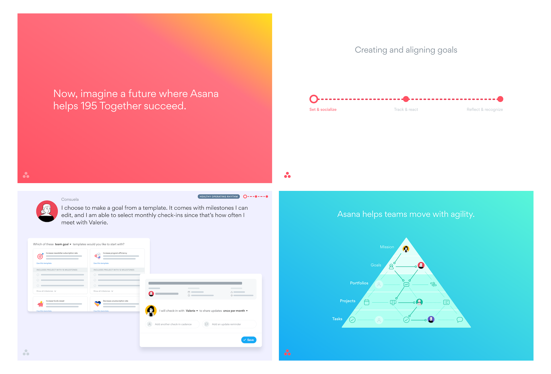 The second part of the design vision showed how a north star version of Asana Goals would help companies align their teams and move faster.
Finally, I led the creation of feature prioritization principles. In tandem with the illustrative vision, these principles helped my PM, tech lead, and I ensure we stayed on track with our vision while prioritizing customer requests. I included criteria that helped us know when we have achieved the outcomes behind the principles. The five principles added up to a memorable acronym.
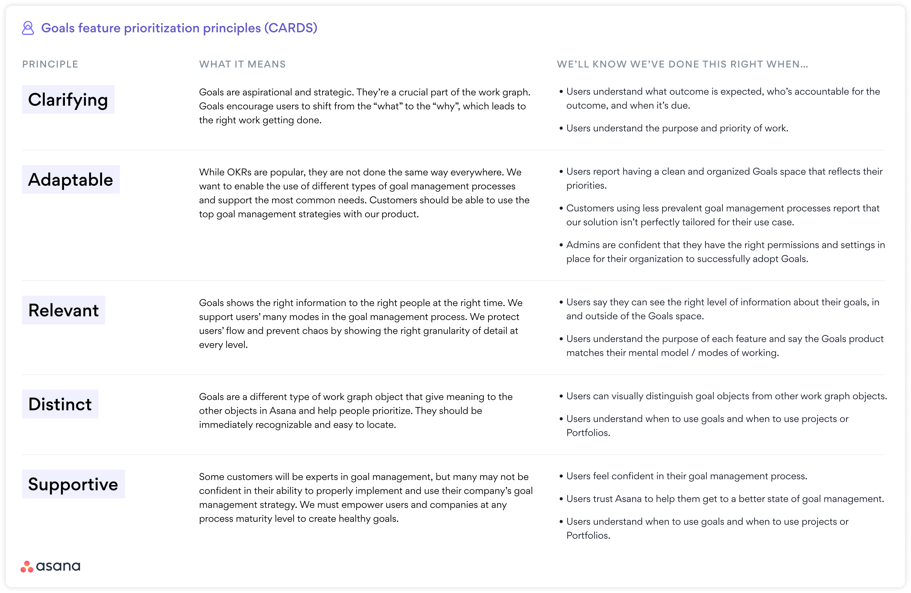
Launching the vision
My PM and I presented this vision to Asana’s Design, Product, Engineering, and Marketing leaders during a synchronous, hour-long Design Review. I also recorded a video walkthrough of the deck and shared it with teams across the company. Finally, I linked to the deck in various places within our company wiki so it was as accessible as possible. This multi-format communication method enabled us to advocate for our product area quickly and efficiently.
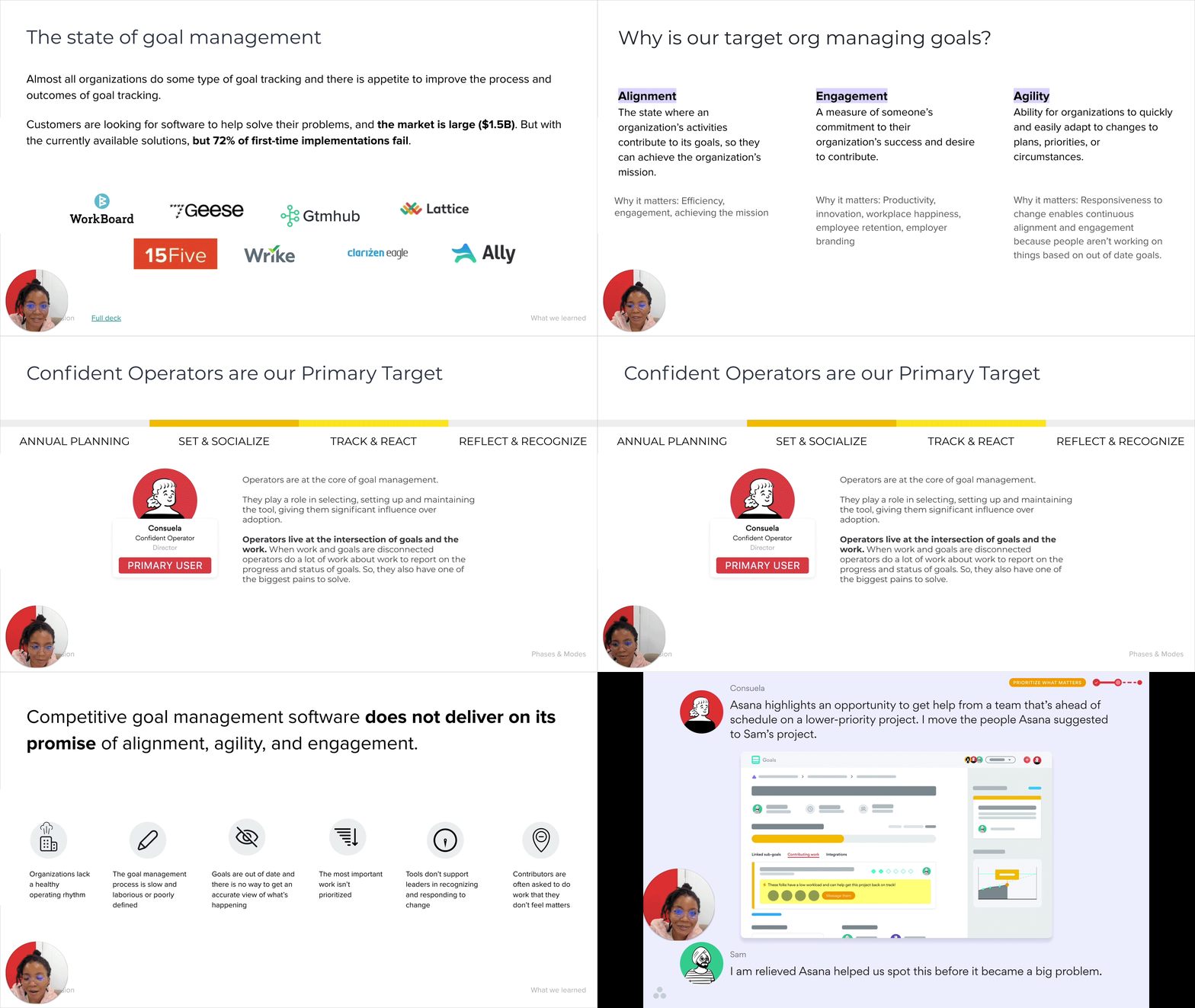 In my video summary of the vision, I walked through both the business strategy and our north star designs.
This vision heavily increased understanding of the Goals product within Asana and was said to be one of the “top 3 visions” the Head of Product had ever seen. The work we did part-time over the span of approximately 6 weeks helped us prioritize projects for the next year. It also led to the prioritization of goal management feature work by other teams.
Building on our vision as Goals expands
Over the next year, I continued to build on the vision by augmenting it with further insights we gathered as the product matured. First, my PM and I built on the idea of time periods and advocated for an experience that could be integrated into other parts of Asana. Next, I collaborated with my PM and UXR partners to refine our perspective on how goal management overlaps with organizational structures. Last, I led a cross-product series of collaborations to create a brand vision and visual experience principles for Asana Goals. Altogether, these iterations helped us advocate for Goals customers company-wide and align other product teams with our vision.
Advocating for the inclusion of time periods product-wide
At the Asana Goals launch, we did not include time periods such as quarters and half-years since Asana natively supports due dates. Customers quickly told us this missing feature blocked their full adoption, so we invested several months into building a solution that meshed with the rest of Asana. We recognized an opportunity for other teams to benefit, so I worked with my Product Manager to create a compelling vision in April 2021. This feature was in beta for several months and fully launched to customers in August 2021.
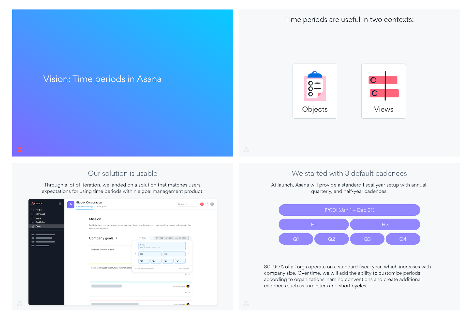 Several slides from the time periods vision deck.
Once again, I jammed with other Product Designers during the creation process. When it was finished, I shared the vision widely and presented the final vision to several teams with relevant overlaps. Those teams have yet to implement time periods in the areas we proposed due to other, higher priorities.
Helping companies organize their goals
After creating the vision for time periods, I shifted to thinking more deeply about how goals can best reflect the structures of the organizations they live within. I facilitated a conversation with my PM and UXR partners to assess the impact of the goal management system we built and measure how well it meshes with org structures. I started with a review of recent user feedback, then used live implementations of the product as inspiration to model the current world of goal management in Asana.
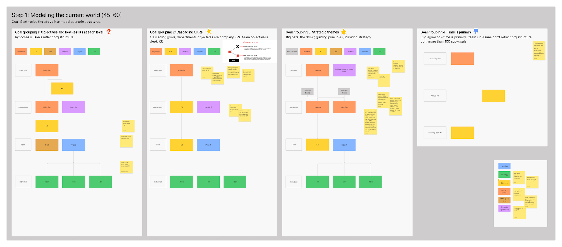 The workspace for our modeling exercise. We identified four ways to organize goals, then chose two as our targets.
We prioritized the different models based on our target customer. I then facilitated the creation of user journeys so we could identify pain points in the process. Through these exercises, we learned that Asana doesn’t support all the types of goals users expect to input. There’s also a disconnect between company and team objectives, which makes it hard to cascade goals in our system.
 User journeys for our two target goal management structures.
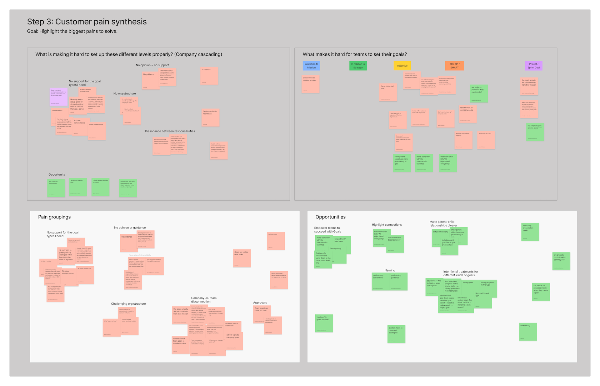 Pain point and opportunity synthesis from our initial research and journey maps.
After highlighting opportunities, I facilitated a sketching session with more members of the team. We ideated on ways to help customers best organize and structure their goals in Asana. Several themes repeatedly popped up when I compared my sketches with others’, so I grouped the results by theme instead of having teammates vote.
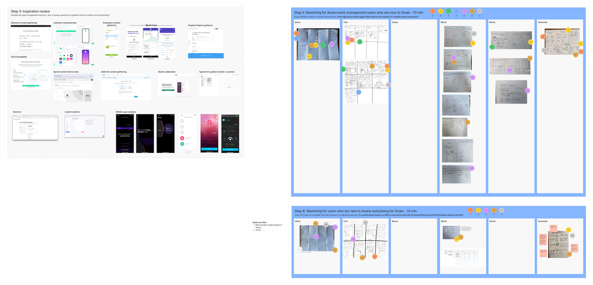 Results from our asynchronous inspiration-gathering exercise and live sketching workshop.
I summarized the results into a presentation, which I used to propose new feature ideas and request additional support for the product team. At that point, we only had one other designer on the team and she was transitioning into management. Without more design support, we would not have the capacity to make some of the larger, more impactful changes necessary.
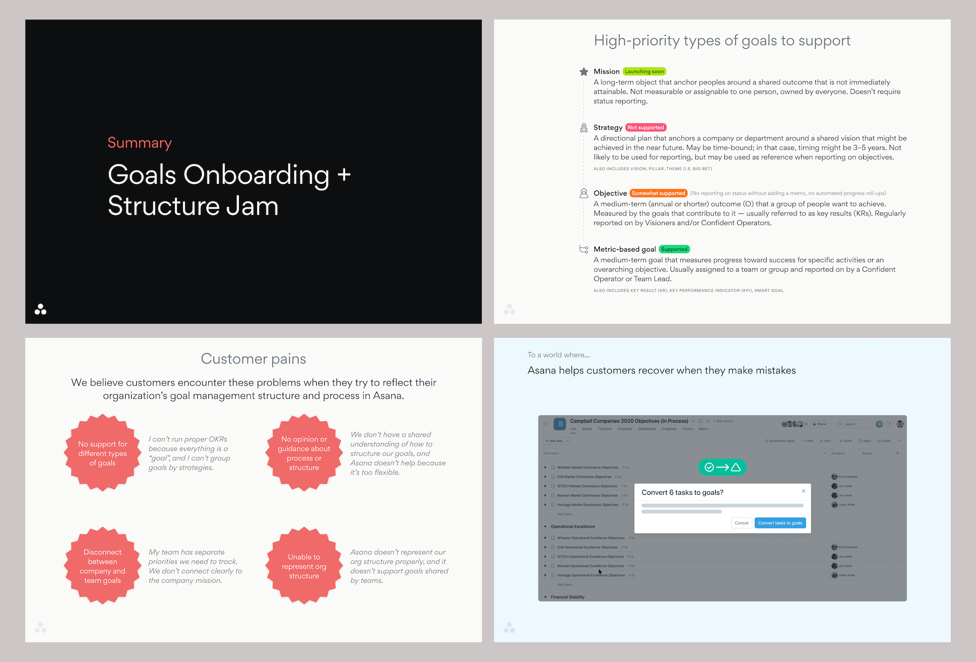 The final deck included proposed tracks of work and a summary of what we learned.
This proposal helped the organization understand the work necessary to make Asana Goals a stronger product offering. It also resulted in additional part-time design support for the team. The extra support gave us the boost we needed to balance larger project plans with quick UX improvements.
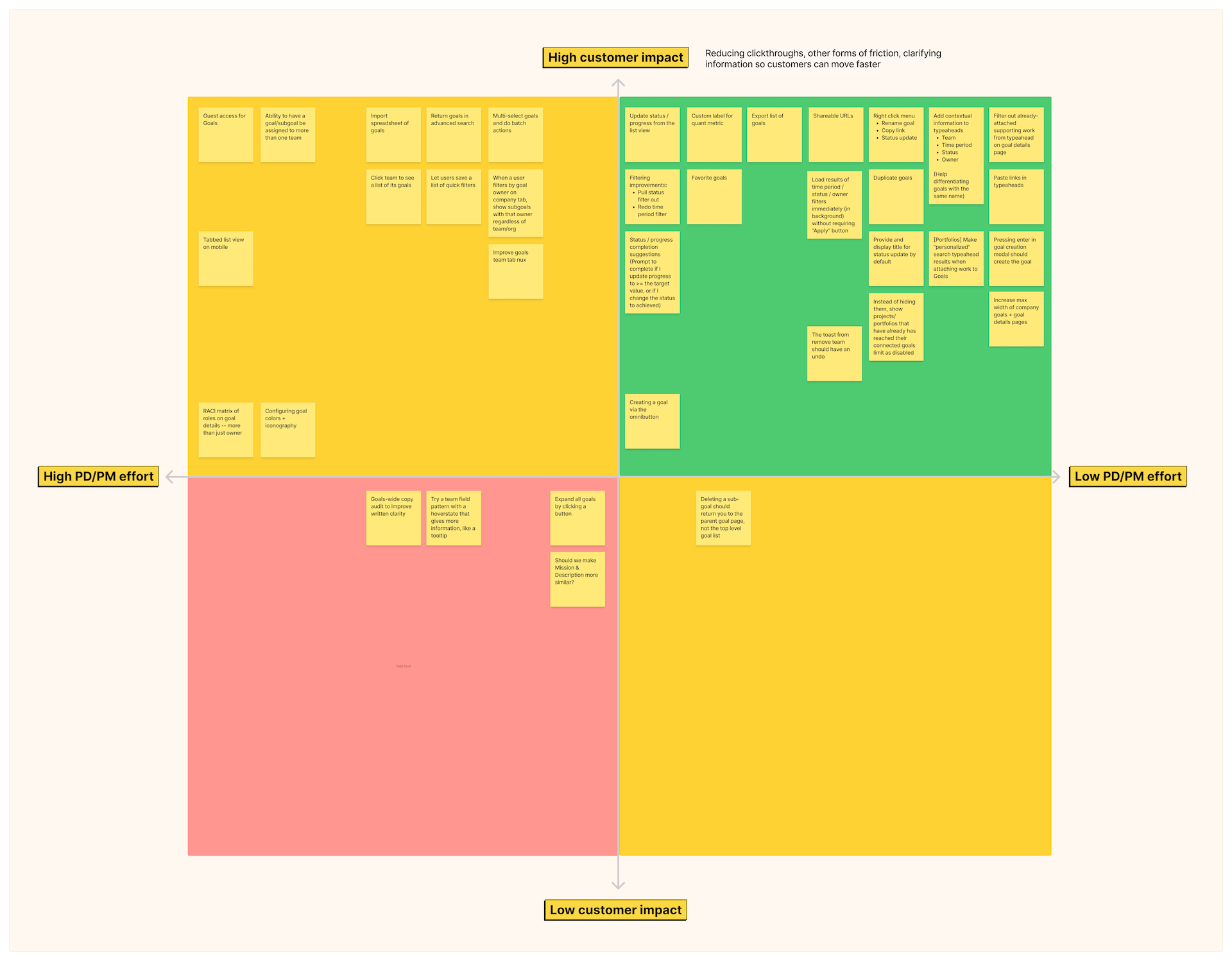 Prioritization matrix for quick UX improvements.
I included some of the smaller ideas from our workshop in a prioritization exercise to create a backlog of the aforementioned improvements. The new part-time designer took the ideas from the finalized backlog and helped us implement them. Meanwhile, I focused on larger tracks of work such as enabling users to calculate goal progress automatically based on project task completion.
Ensuring consistency with a visual design guide
As more designers contributed to the Asana Goals ecosystem in late 2021, I recognized there was an opportunity to create a design guide that would ensure the Goals experience was cohesive. The principles I created for feature prioritization unfortunately did not extend well to visual design. Therefore, I embarked on another collaborative journey to align my three fellow Goals Product Designers around a strong perspective. I invited a Brand Designer to participate so we had non-Product representation.
I started with a lightweight synchronous workshop during which we took a bunch of adjectives and grouped them by how important it was to associate them with Goals. We also discussed anti-adjectives. Next, we gamestormed some fake magazine covers and came up with what we’d like people to say about Goals in 1–2 years from that time. I had participants brainstorm individually, then we came up with a singular cover as a group.
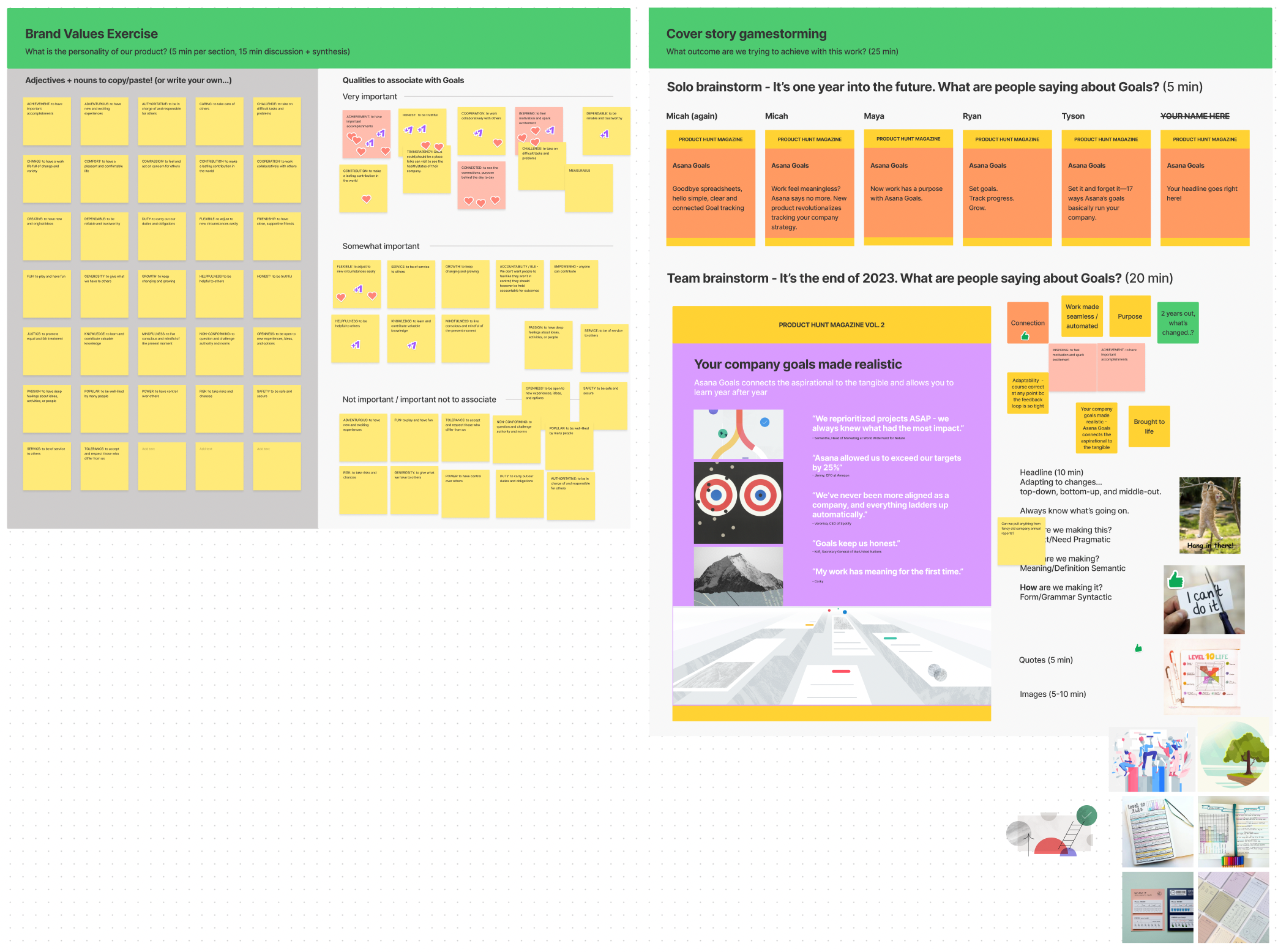 Our in-person brainstorming workspace.
Achievement, connection, and inspiration rose to the top as our three principles. After the 1-hour workshop, I assigned participants homework. I asked them to gather UI inspiration based on the three principles, then assess parts of current experience and explain how they could improve to match these principles. I was very close to the product and had worked on it for nearly two years, so I did not participate in this part of the process. Instead, I decided to learn from the participants who had fresh perspectives.
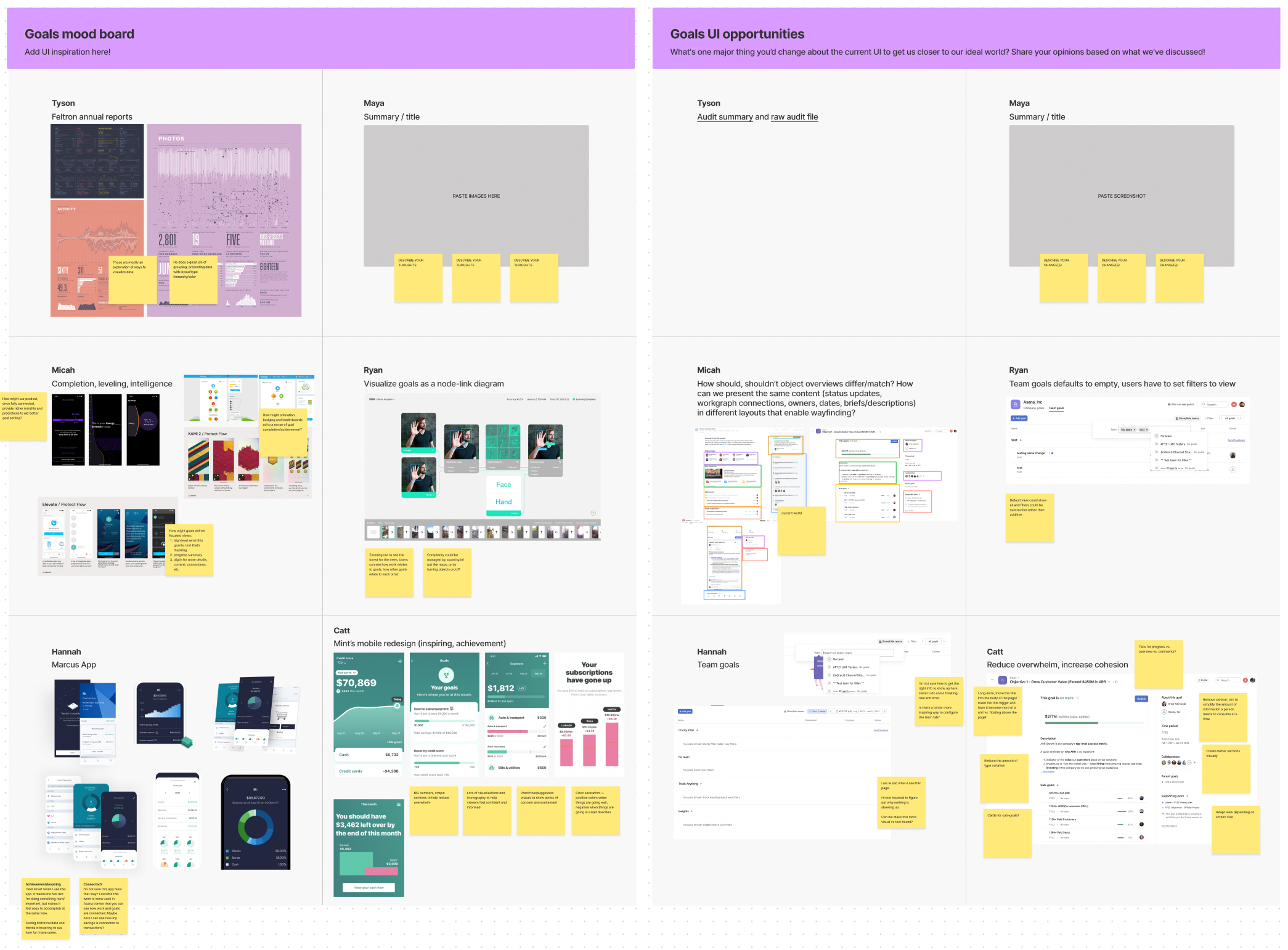 The asynchronous workspace for participants.
After participants shared their thoughts, I met with one of the other Goals designers to parse what we learned into a future-facing design. We started by arranging information in a print format since print has more constraints. The first iteration was very barebones, and we increased fidelity over time.
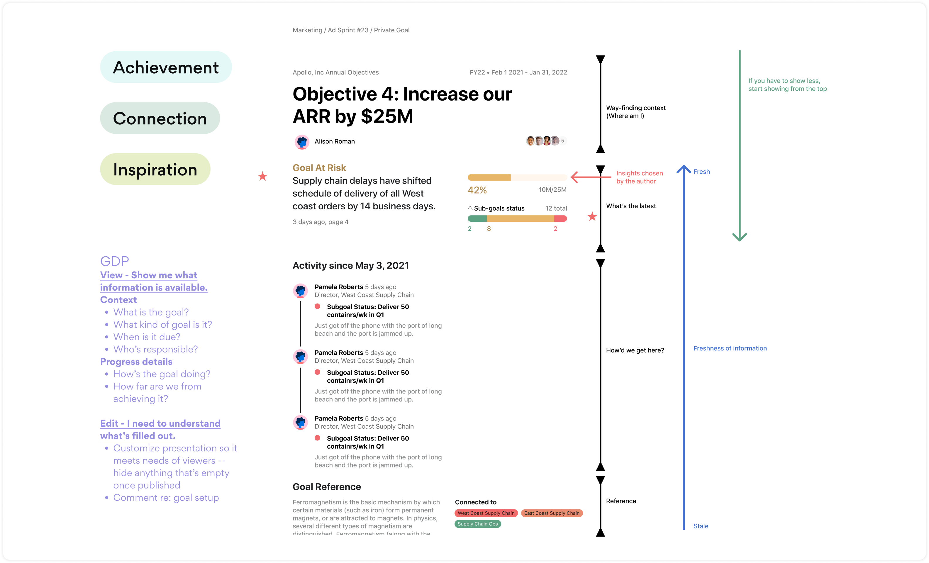 Since the designer and I were remote, we jammed on low-fidelity designs in Figma.
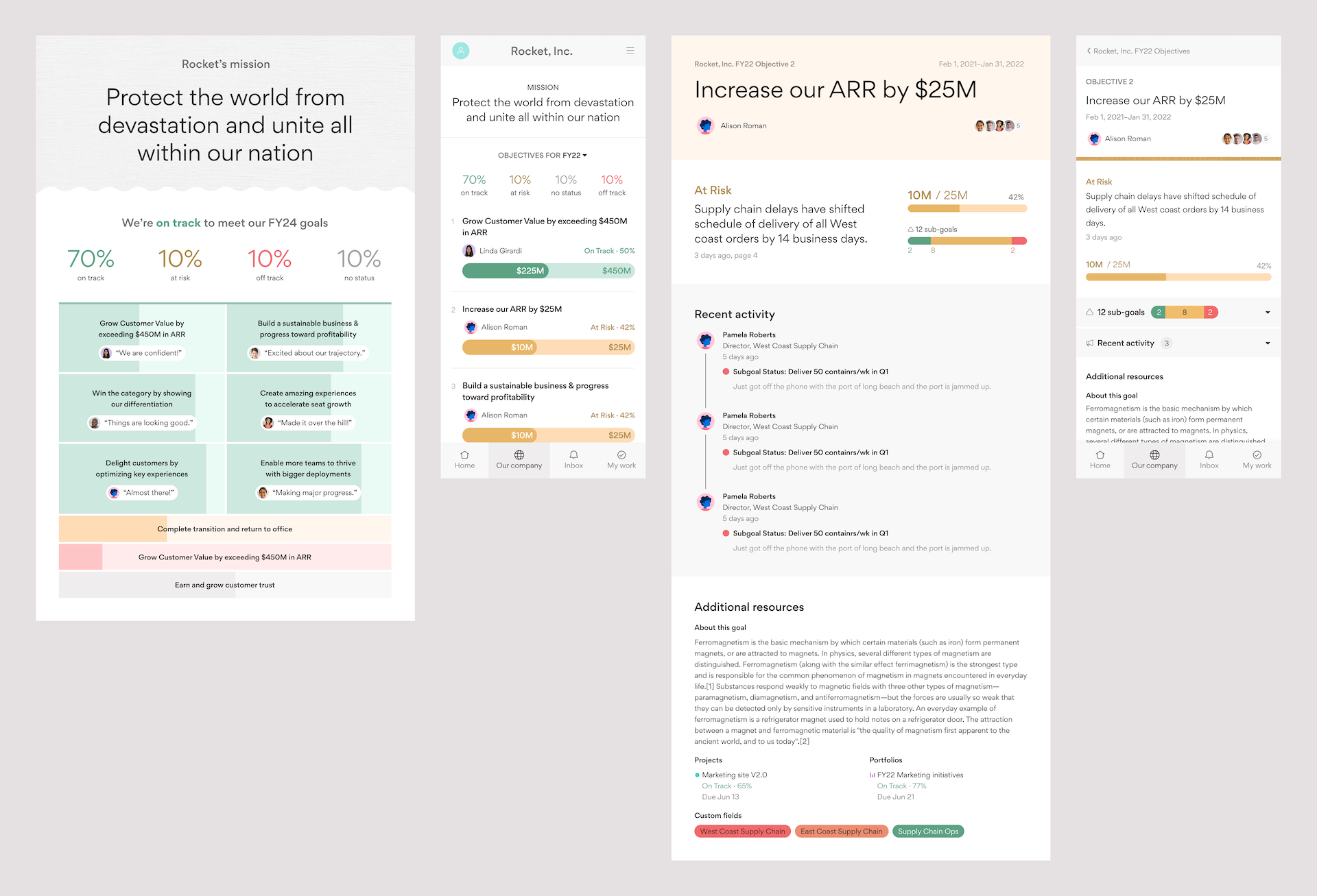 A higher fidelity version of our thinking, but still print-oriented. I added a mobile version to make sure we were thinking cross-platform.
While I was leading this work, I met with the other designer every few days to jam on new ideas. This helped us stay aligned while continuing to deliver our workload. Over time, we refined the designs into something we were both excited about. And others were, too: we intentionally incorporated some of the navigation design thinking that was actively being discussed to help others imagine how that work would impact our product.
 The final visual designs, which are inspired by our principles.
Once we had the designs in a good place, I summarized everything in a Goals Design Guide. I included a high-level overview of our users, our visual design principles, and the experimental UI we created. I also included a section that covered design consistency and outlined the situations in which designers should create a new pattern to best match user needs.
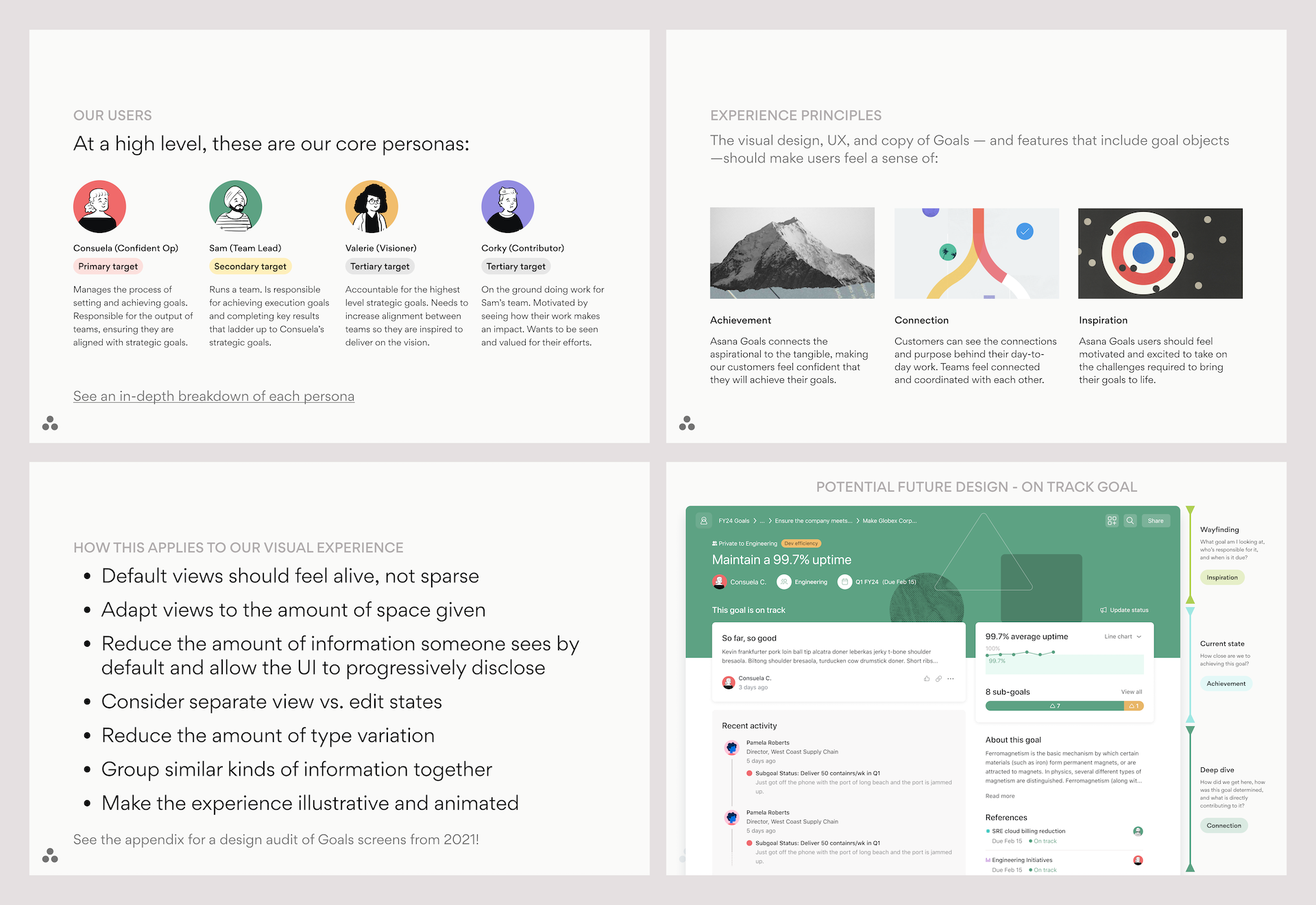 Screens from the 34-page Goals Design Guide.
I shared the Goals Design Guide with the entire Goals team, then presented it at Asana’s Design team weekly meeting to build awareness. The guide served as a reference for future Goals designers beyond the remainder of my tenure. It also helped people who wanted to include goals in their product area, such as search. Finally, it helped folks in other disciplines understand the value of—and the thought process behind—good design.
An exercise in scaling myself
My time at Asana pushed me to take everything I learned at Etsy and turn it up to 11. I am proud that I could contribute so much to an innovative, award-winning product. I look forward to the continued growth of Asana Goals, especially since I still actively use the product.
This batch of work reminded me how much I love teaching, collaboration, and helping teams align. After two years, I moved on from Asana and became the Director of Product Design at All Turtles. I am excited to bring what I learned from this adventure to future large-scale product releases.
Want to talk?
Got feedback, looking to suggest a future writing topic, or want to invite me to speak at your organization? Send me a message and I'll get back to you as soon as possible!