Asana Goals
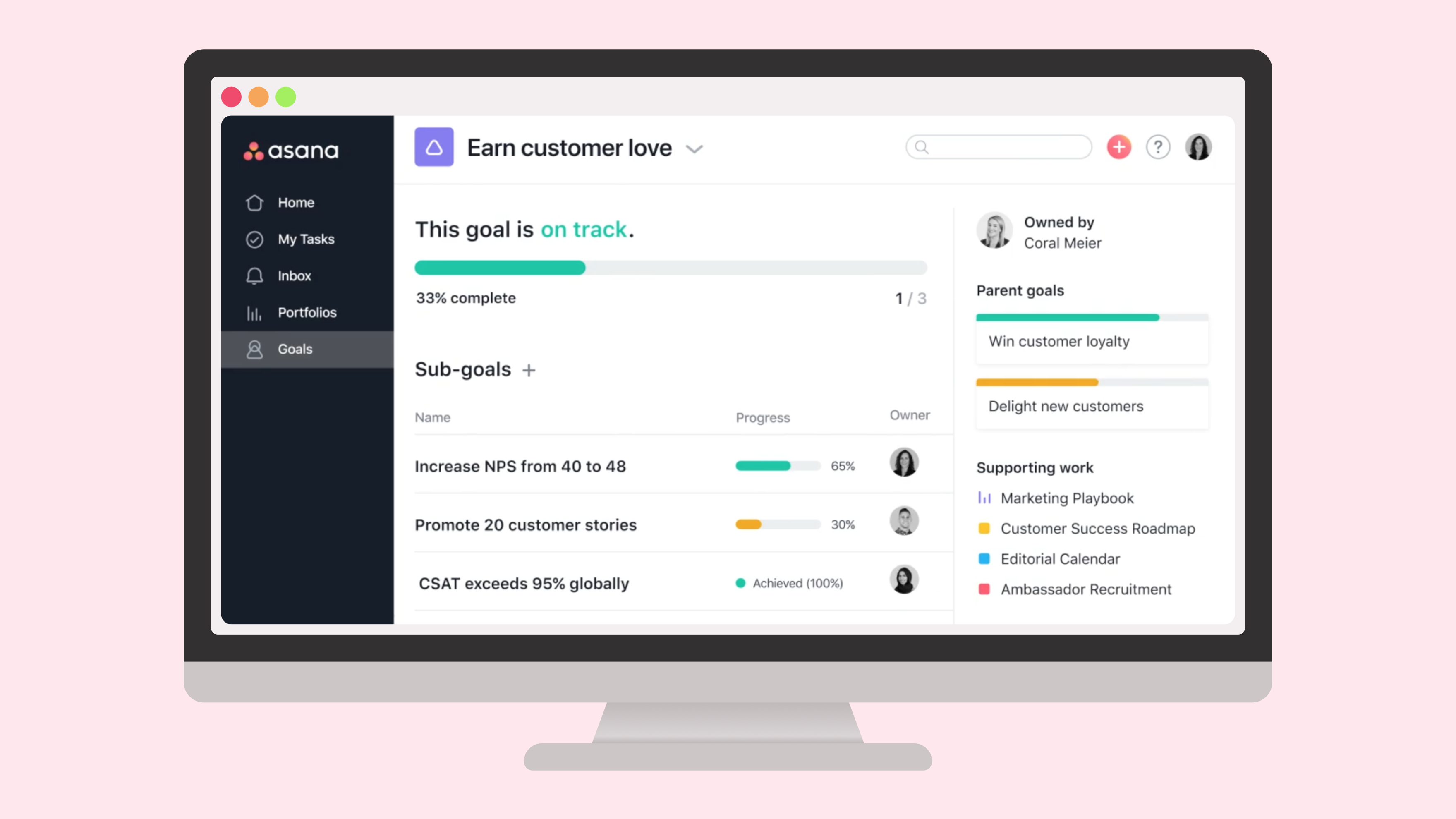
Asana’s mission is to help humanity thrive by enabling teams to work together effortlessly. Most companies have a mission, vision, and goals they want to achieve. However, employees often don’t understand how their work relates or contributes to the future of the company. Over six months, I led the design — from idea to launch — of a new goal management product that aligns workers’ everyday activities and organizational goals.
Role
I led the product design of this project. It was highly ambiguous at the beginning, and the team was initially given a hard deadline of four months to complete the product development cycle. My manager trusted me to determine the MVP and long-term direction for the product. I coordinated efforts across myself, several other Senior+ Product Designers, and Brand Designers. I managed expectations from a variety of stakeholders in collaboration with my Product Manager and Tech Lead.
Discovery research
Within my first two weeks on the team, I began to attend discovery research sessions. The team learned that no one was confident about their goal management processes, even the organizations that were doing it well in our opinion. The most challenging issue organizations faced was the separation between goal management and day-to-day work.
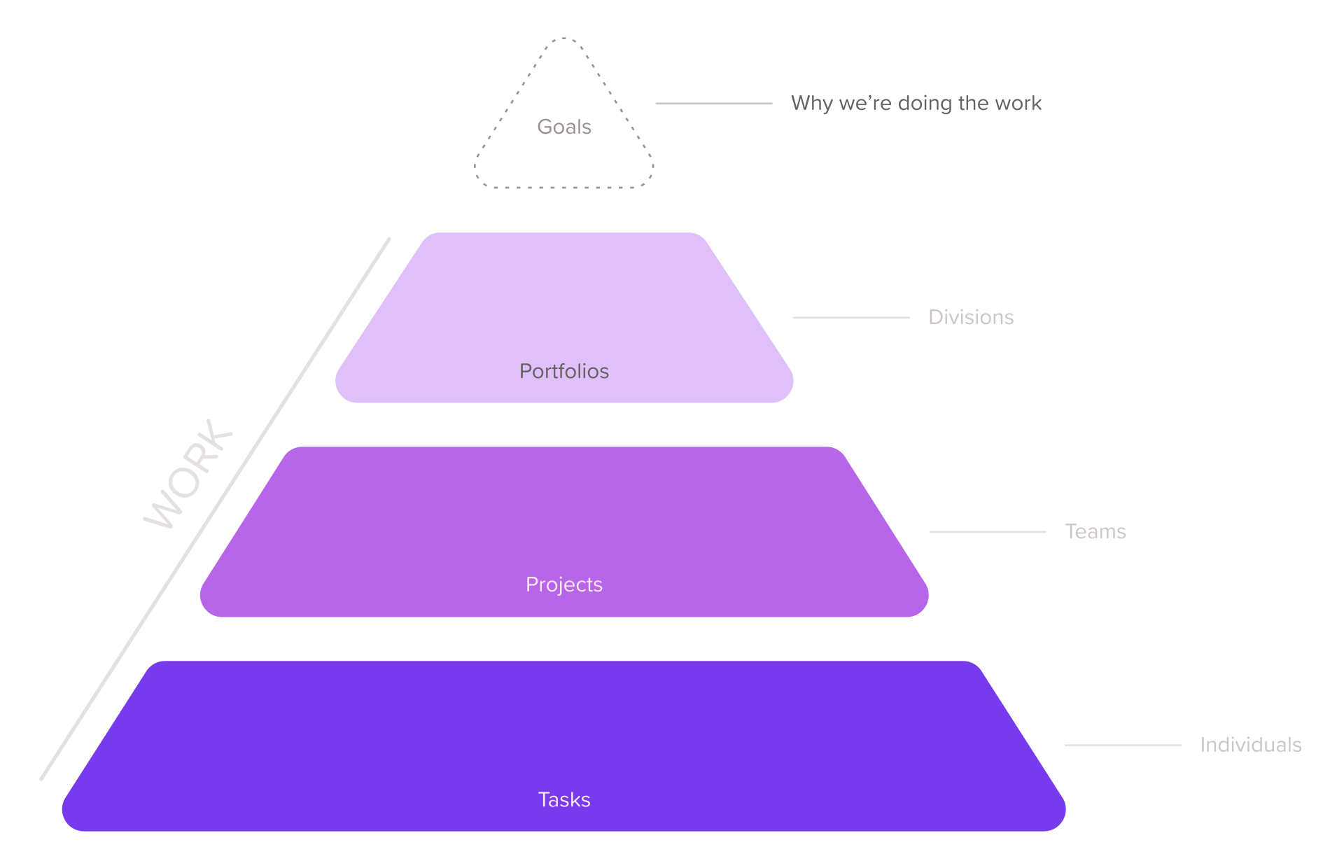
Most companies we spoke with were documenting goals in separate locations from the work. Spreadsheets and slide decks were often mentioned as sources of truth. However, slide decks immediately became irrelevant post-presentation and spreadsheets were forgettable.
Lacking a coordinated set of tools, Directors and Managers struggled to keep goals updated. Team Leads prioritized work based on gut reactions rather than their goals, leading to chronic overwork. Individual contributors, reacting to the chaos, didn’t understand why their work matters. All of this resulted in missed goals and unmotivated teams working on less impactful projects. We aimed to provide organizations with a goal-tracking system tied to daily work that helps drive measurable results.
User need
Goal management crosses a variety of customer types and companies. Our target company had cascading goals that ladder up from teams to the C-level. I organized and facilitated a several-day design sprint that helped the team align on two personas.
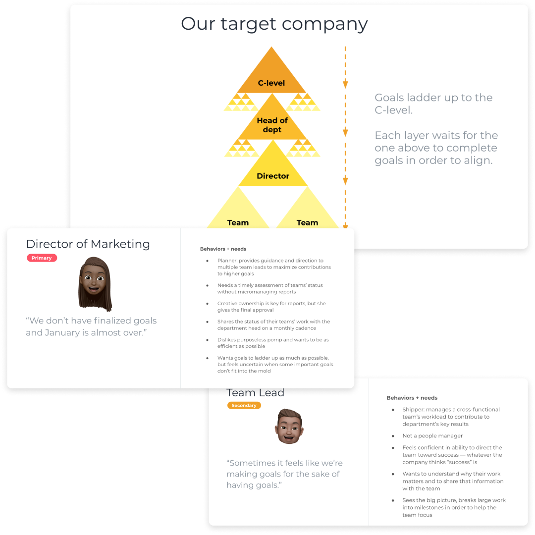 Our initial target company and customer personas.
The main user needs we decided to solve for were:
- As a Director who is responsible for the objectives of an organizational division, I need to know the status of my team’s goals and work so I can maximize our contributions to company-level goals.
- As a Team Lead who manages a cross-functional team’s workload, I need to track the status of my team’s goals so my Director can be aware and intervene if necessary.
- As a Team Lead who manages a cross-functional team’s workload, I need to connect my team’s goals to department and company initiatives so I can prioritize work and motivate my team.
Ideation
I organized and facilitated a 2-day series of design sprint exercises to help the team come up with concepts we could test. During the sprint, we thought about what our customers would think, say, and do at different points of the goal management process. This helped us build empathy for our future customers, especially as people who have previous experience tracking goals at other organizations.
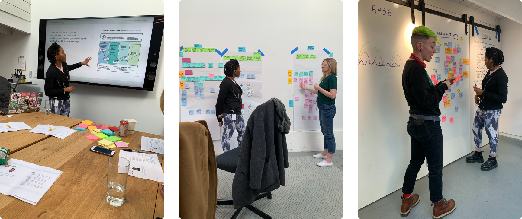 Photos from the design sprint.
Our shared understanding led to a great variety of solutions. I directed participants to sketch one-off ideas as well as full scenarios so we could get a clear picture of how features might chain together to create a full experience. After each participant presented their ideas, I had the team vote to identify which solutions might deliver the biggest value to customers.
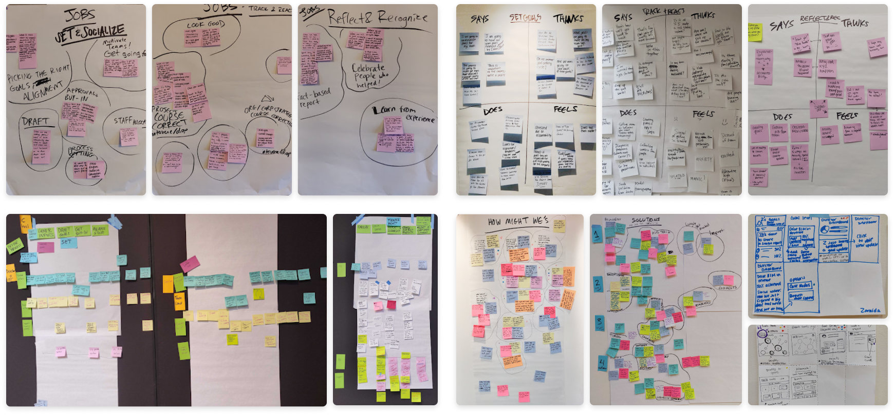 Jobs to be done, empathy and journey maps, how might we’s, solution statements, and sketches.
After the sprint, I spent time documenting what we learned before moving on. This helped me process everything we learned and provide additional insight to the team.
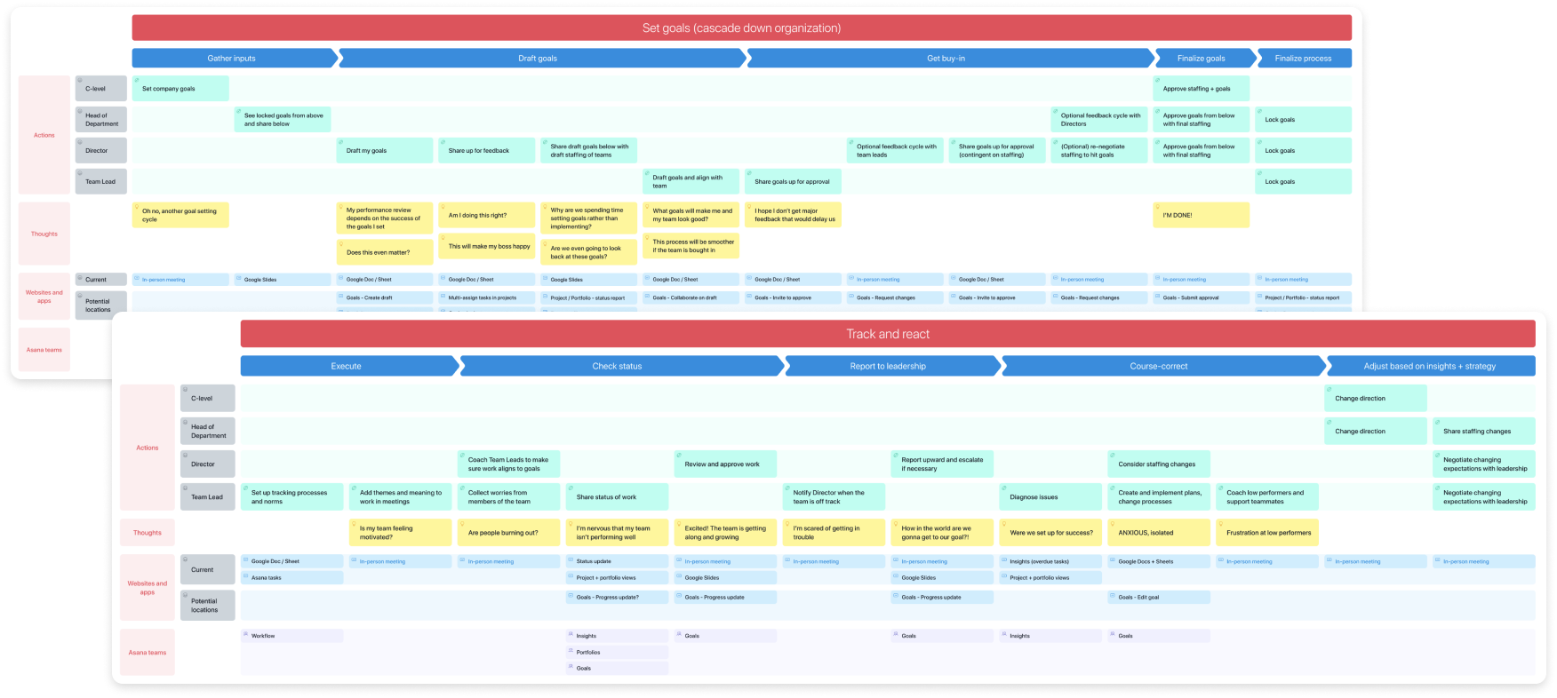 Journey map artifacts I created after the design sprint.
I then turned our sketches into concept wireframes we could test with research participants. Our researcher recommended using the Kano method, which required users to tell us what features they would like, feel neutral about, or dislike including (or not including) in the product.
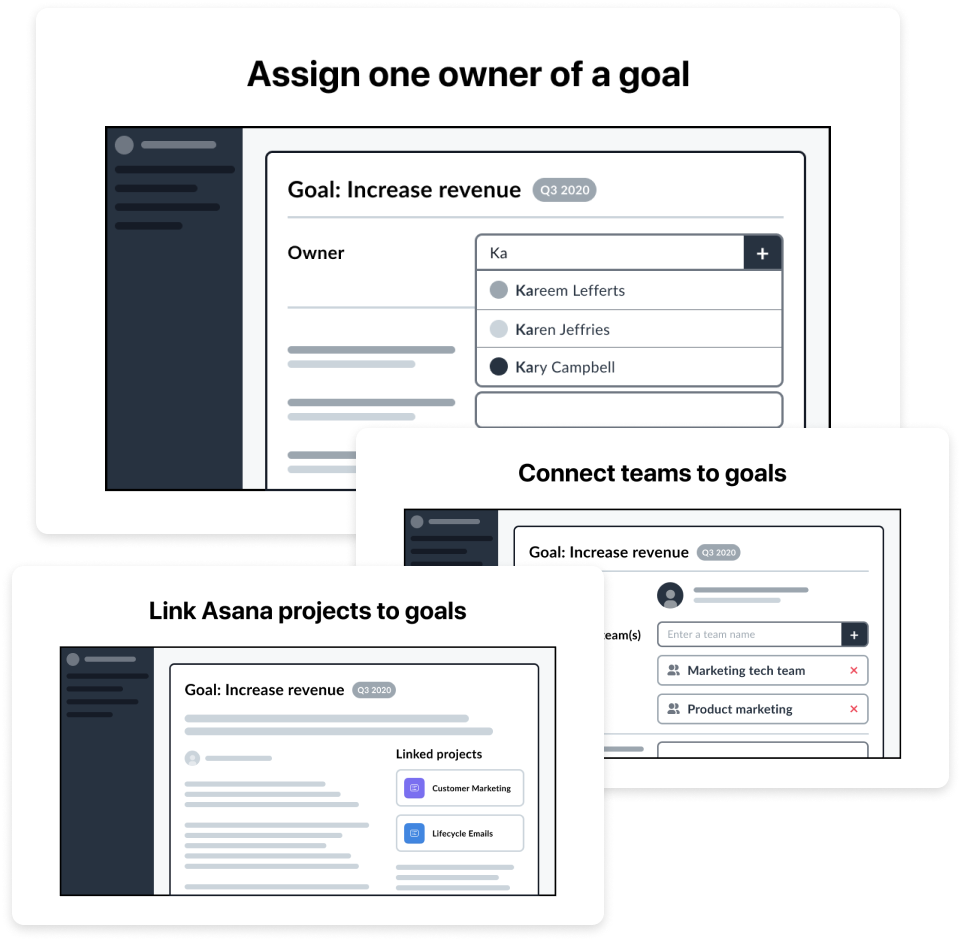 Images from our concept test. We ended up including these in the product.
Customers told us assigning an owner was a required feature. Other features they expected included linking goals to projects and being able to grade goals at the end of a cadence. Nice-to-haves included being able to visualize the connections between goals and import goals from spreadsheets.
Alignment
Research insights helped me, my PM, UX researcher, and Tech Lead determine the scope necessary to meet customer expectations. We aimed to deliver the most value for the least amount of investment. Knowing we had less than four months and a relatively small team, every amount of effort counted.
The team then brought our proposed scope to leadership. I presented a low-fidelity vision of what the customer experience might look like. The deck included what would be in our first launch and highlighted opportunities for future improvement. While leadership was very excited, the MVP scope was much larger than leadership thought it would be when they initially hired the team.
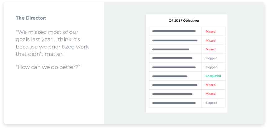 I presented the current state of goal management before sharing our vision.
Our proposal (along with the impending spread of COVID-19) resulted in the team receiving two additional months to complete the release. We still had a hard deadline due to outside constraints, but those constraints shifted so we were able to get more time. Leadership provided additional staffing so we could build everything necessary within scope. The new timeline and increased capacity gave us the definite ability to launch by July 2020.
Designing at a fast pace
We kicked off delivery around late February. Our scope of work required parallel tracks for design and engineering. Since there was a fair amount of back-end work to do, engineers worked on the database side of our experience while I determined the front-end. I documented our plans with user flow diagrams.
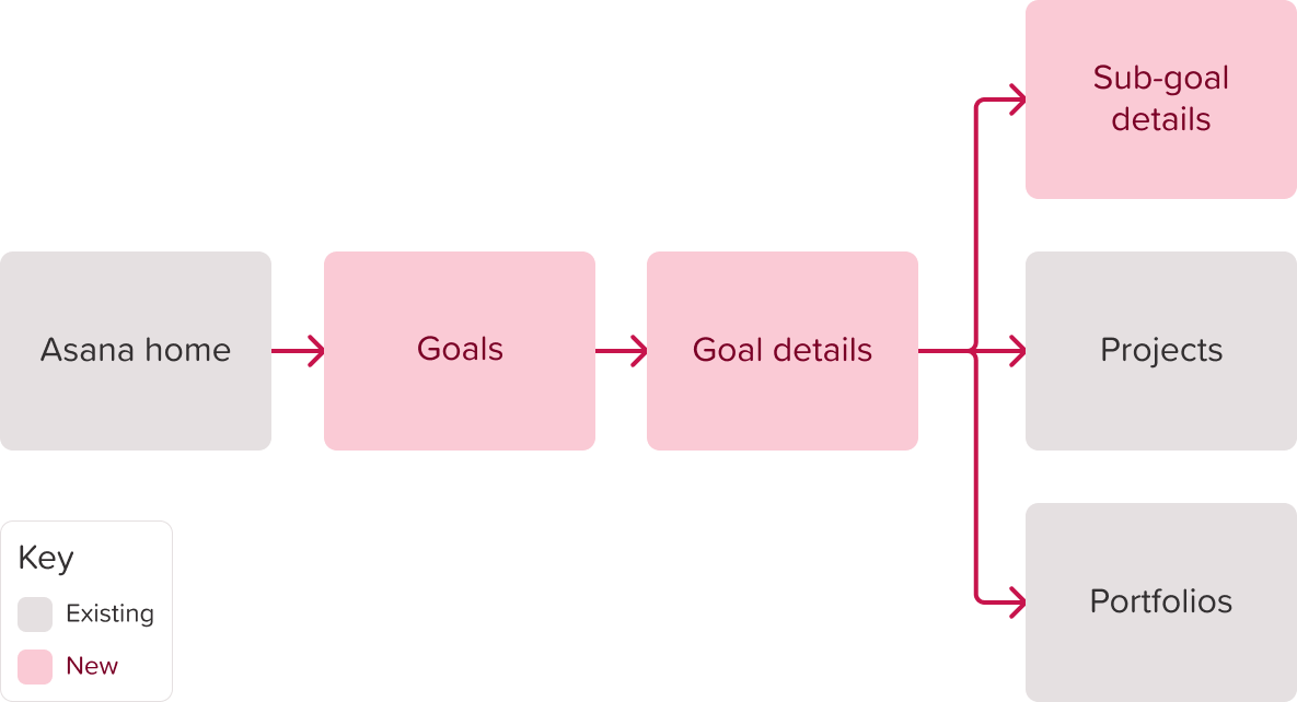 The proposed user flow would add a new page to the navigation and connect to existing areas.
In collaboration with my Tech Lead and User Researcher, I prioritized time investments based on risk and complexity (see more about my thought process in this blog post). We decided it was best to focus heavy amounts of research on two core areas: setting up a company’s cascading goal structure, and progress reporting.
For the rest of the product, we used a combination of existing product insights, discovery research results, and competitive analysis to make decisions. Educated assumptions helped us move quickly and with relative confidence.
Onboarding
Next, I conducted user research on a prototype of the goal creation process via a list view. We also tested different goal detail page layouts to identify the ideal information architecture. Participant feedback helped us prioritize and arrange data on the page in a way that best fit their needs.
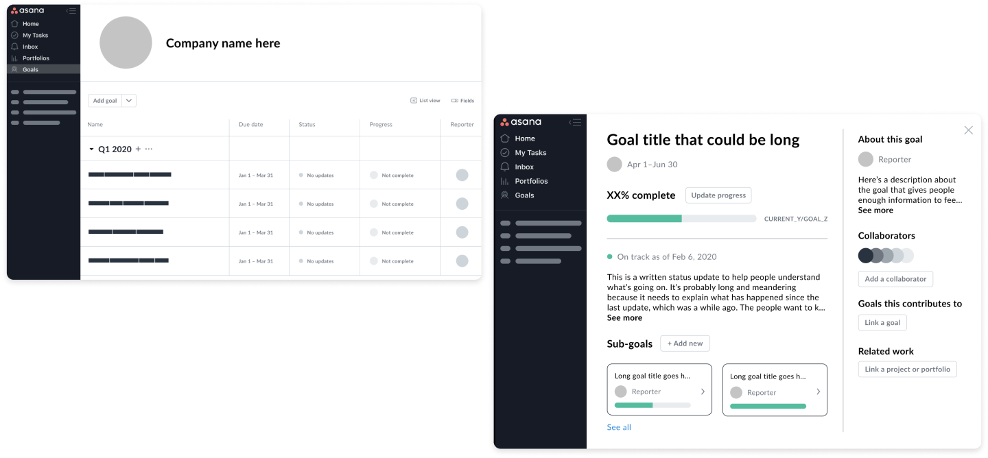 Wireframes of the list view and goal details page.
I then dove into increasing the fidelity of the goal details page. Asana had several existing patterns for viewing details about a work object such as tasks and projects. As someone new to the company who was also working on a new feature, I discussed consistency and cohesion a lot with the broader Design team to align on how exactly Goals should connect to existing patterns. Ultimately, we agreed that goals were larger-scale than tasks. A person looking at a goal would likely be editing the status, progress, or description. They would need to focus on that specific goal, so a full-page experience felt best suited.
 Goal details styled like a task, in an overlay, and as a full page.
Progress and status reporting
While the team built the scaffolding for the list and details pages, I refined my thinking about status and progress. Since Asana already had a lot of past insights on reporting, we mostly relied on that information and our discovery research. Instead of going deep into the product strategy for this feature, I spent design iterations on the visual direction. I started with the largest placement of status and progress on the goal details page.
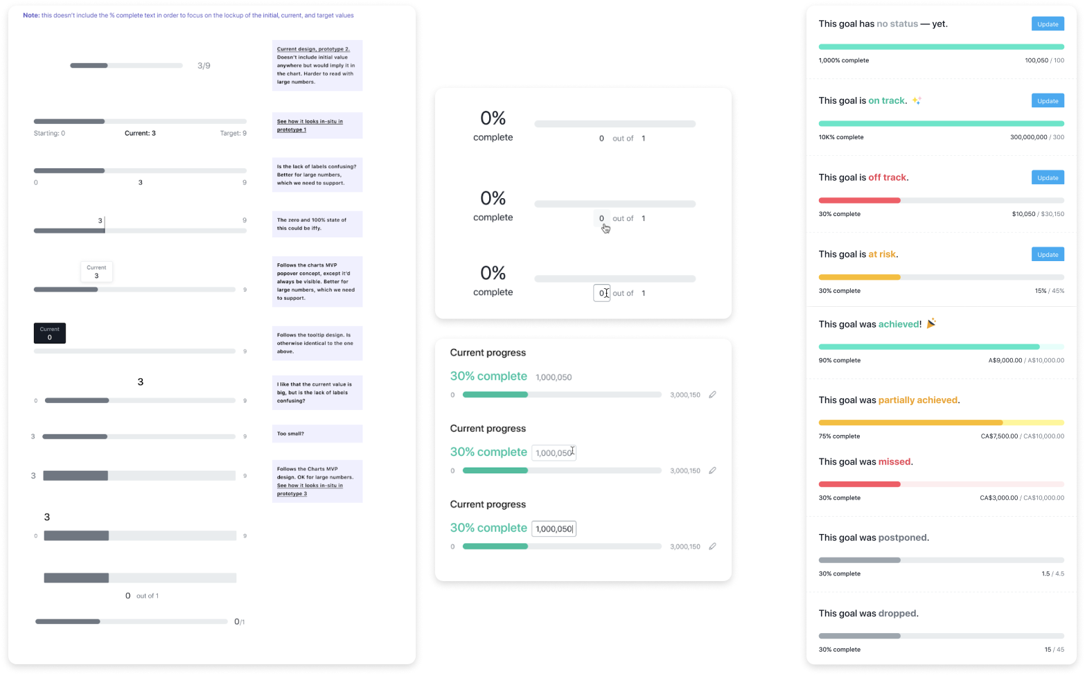 Left: iterations on status and progress. Right: the final designs.
The page also needed an icon to match other headers for objects of this scale. I worked with a Design Systems designer to create goal icons that fit within Asana’s existing iconography.
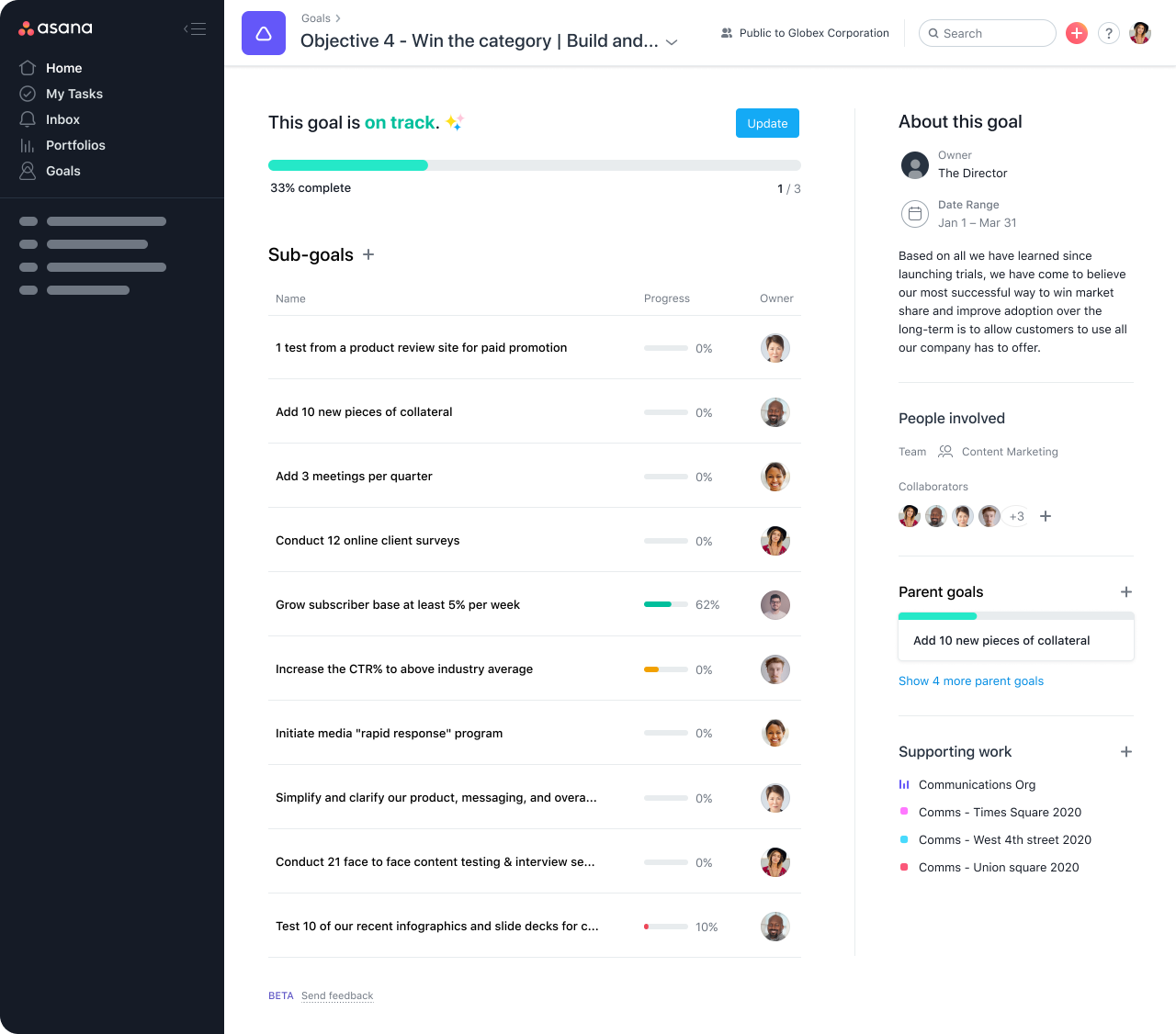 The goal details page with finalized iconography, status, and progress.
Based on the goal details design, I then finalized the color scheme and visual treatment for status and progress of goals in a list, parent goals, and goals linked to projects and Portfolios.
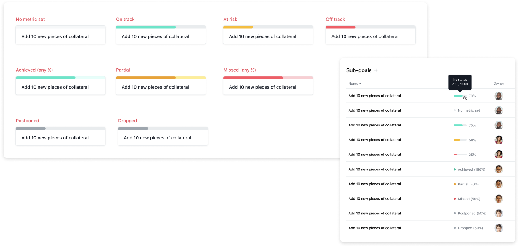 The final UI for progress on cards and in lists.
Since our deadline was still quite short, we had to make a lot of compromises based on engineering capacity. One such compromise was not including written commentary on the status update overlay. I instead focused on creating a simple form that included the robust range of statuses customers could choose from.
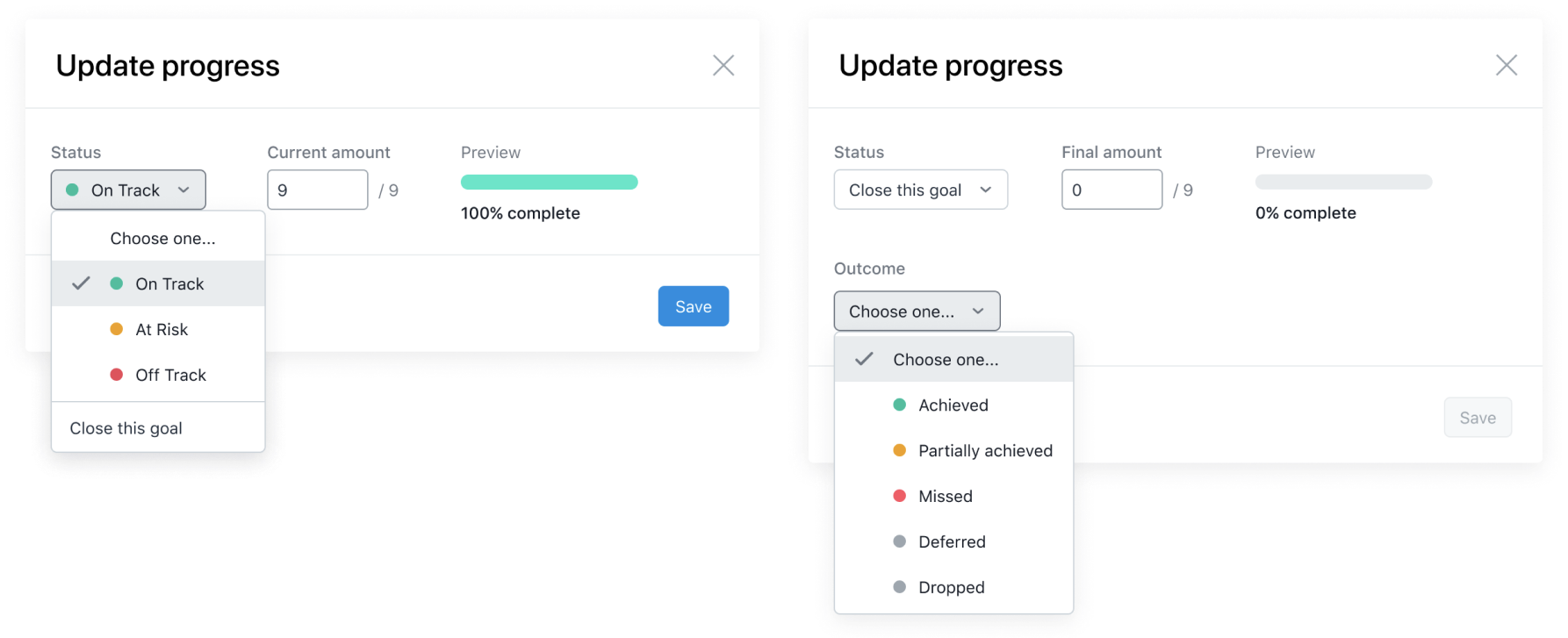 Customers can update their goal progress from this overlay.
I decided to pull the list of outcomes into a separate field since we knew customers might come from two different places to close their goals. If the list of outcomes was merged with the statuses, we’d have to choose a default outcome — that was out of scope.
Finalizing the experience
With the goal details page in a good place for engineers to start building major parts of the experience, I looped back to build confidence in our list view experience. The scope for full-featured sorting and filtering was quite large, so we decided to start by only allowing customers to filter by teams. I quickly figured the best way to treat teams in the UI by generating a ton of ideas around how navigation might work if we needed to reuse existing components from other parts of Asana. Through feedback from other designers and stakeholders, I narrowed down the options to a dropdown with a team icon.
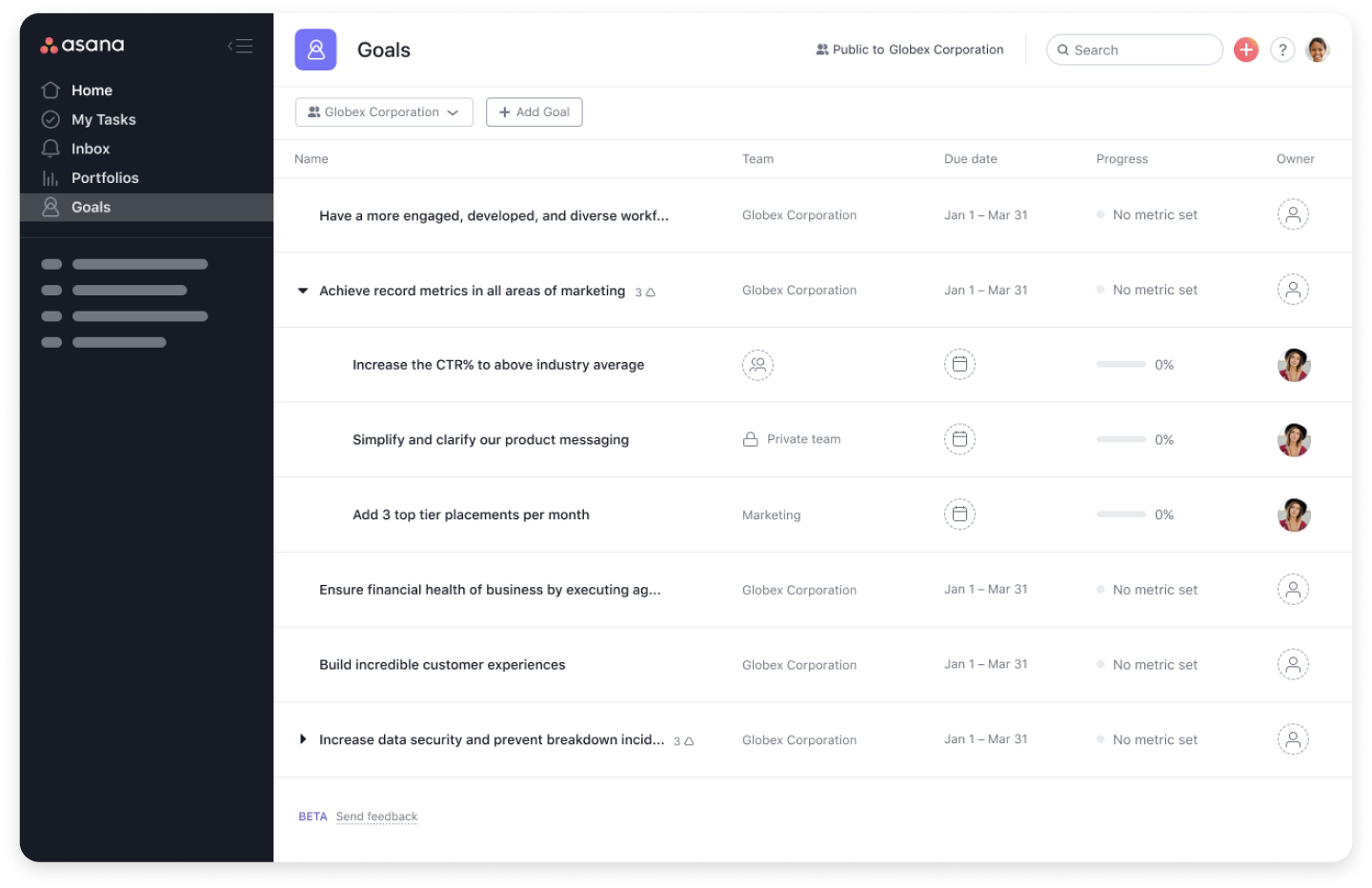 The final list view design.
I also needed to finalize empty states, so I collaborated with a Product Designer who thought cross-functionally about onboarding to align on questions users have when they are onboarding (or considering paying for) a new product. I documented our conversation in a spreadsheet, then ran a workshop with stakeholders in leadership to align on the user flow we wanted to build. This conversation and the documentation that followed led to a larger track of work across other parts of Asana to align on and share customer needs around onboarding and monetization.
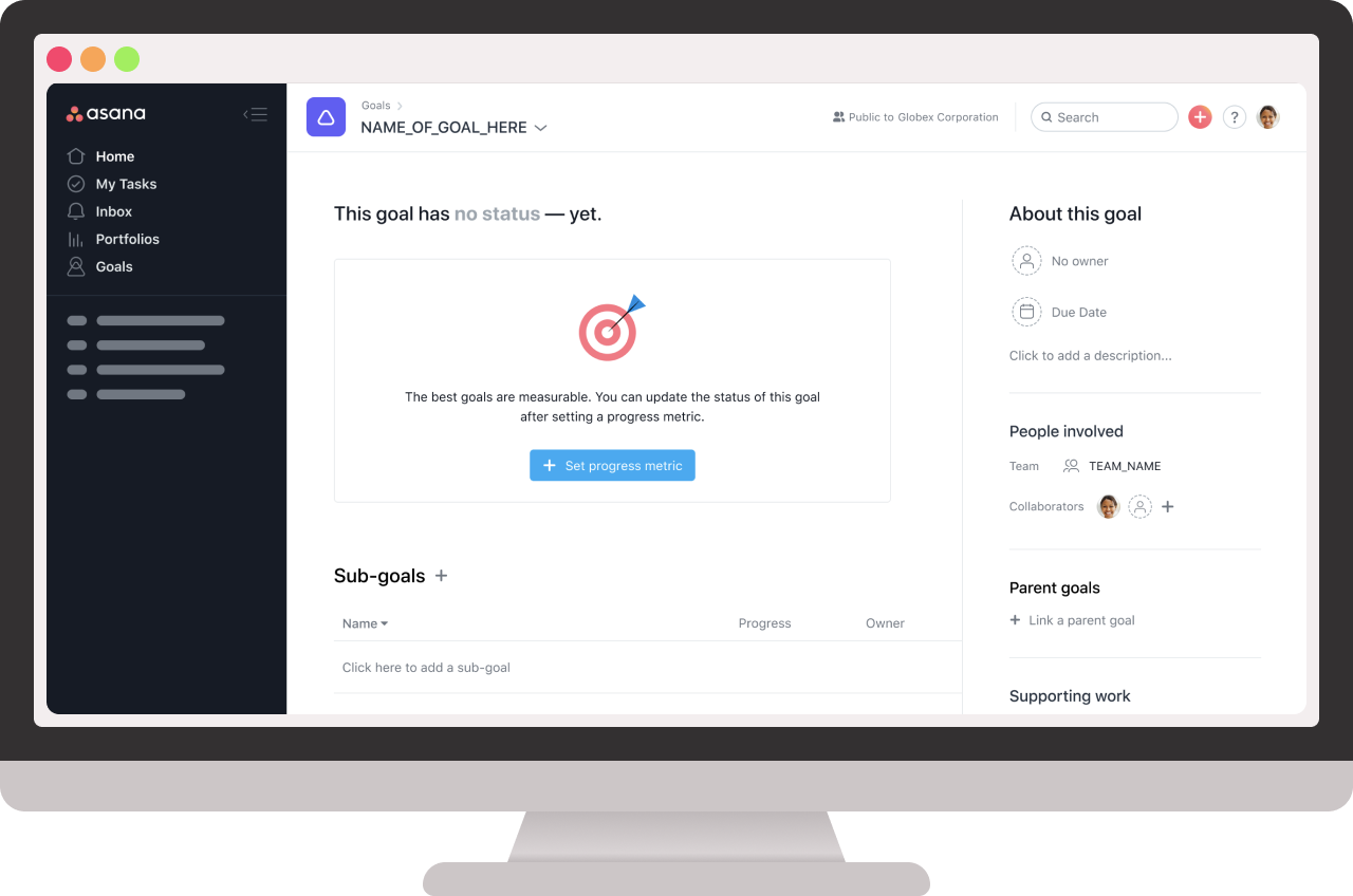 The final empty goal details page.
Brand Designers took the outputs of our conversation and turned them into illustrations. Their illustrations helped draw attention to important actions we wanted customers to perform. I also provided direction that inspired designs they created for the Goals marketing site.
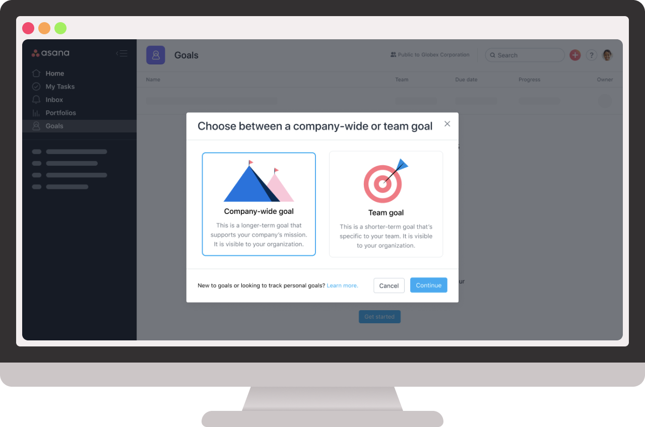 An onboarding modal we added to help customers create the right kind of goals.
We had some time to do a final usability test, so I put together a prototype with our new empty states and two placement options for the dropdown: left of the Add Goal button versus on the right side of the options bar. Our researcher put together several asynchronous tests where each person tried one of the options. The results clearly showed that a dropdown on the left side of the page would be the most usable option. It also helped us confirm what onboarding messaging was necessary to help customers get started with Goals.
 A screenshot of my gigantic user research prototype that featured two types of navigation.
Since Asana Goals was going to be a paid feature, thinking about empty states also required considering monetization. I pulled in another designer who was an expert in monetization. He worked on the actual designs and I mostly provided direction based on what we knew about our prospective users.
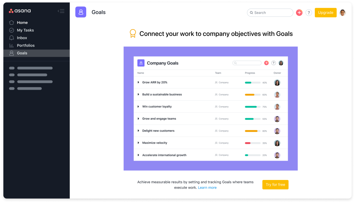 The initial gated experience for users who don’t have access to Goals.
Launch
We launched Asana Goals in July of 2020 and announced the new product area at the 2020 Future of Asana event. Overall success for this launch meant completing the pyramid of clarity, which refers to the connection between meaning (goals) and effort (tasks). Metrics for our new product area — KPIs like adoption, upgrades, and annual recurring revenue — were benchmarked by a recent feature launch of a similar tier.
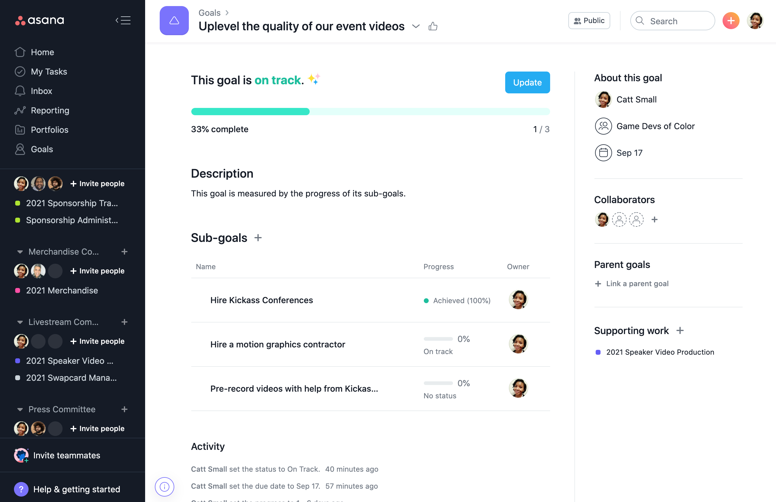 The live experience as of July 2021.
After the launch, we quickly added several highly-requested features as follow-ups. We also began to hypothesize what it means to have healthy goals, not just a high number of goals. Rather than continuing to react to customer feedback without a clear direction, I led the creation of a 2–3 year vision that made us more proactive with our plans for future product updates. I’m excited to see how future product iterations make the experience even better.
Conclusion
By the time we launched Goals, I felt like a long-time member of the Asana design team. This project pushed me in ways that spoke to my growth as a Product Designer. It also was a strong example of the importance of differentiating between consistency and cohesion. More broadly, the organization learned the value of conducting discovery research before scoping and setting launch timelines.
In March of 2021, Fast Company highlighted Asana as the #1 Most Innovative Company in the Workplace category (#15 overall). The reason was simple: “helping teams meet their goals”. While I didn’t join Asana to get recognized in this way, I’m proud to have been a part of something so great that publications celebrate our efforts!
Want to talk?
Got feedback, looking to suggest a future writing topic, or want to invite me to speak at your organization? Send me a message and I'll get back to you as soon as possible!