How to become a public speaker in 1 year – Step 9: Make slides

If you are interested in making a slideshow for your talk, you will need to find presentation software that fits your needs. Some options to consider are Google Slides, Keynote, and Powerpoint. If you want a more flashy or unique presentation, Prezi and Reveal.js, which requires some programming knowledge, might be more interesting. I prefer Google Slides because it lets me edit slides on my phone, tablet, and personal as well as work computer.
Content
Instead of focusing on the design of my slides at first, I usually begin the creation of a new presentation with the content from my outline. This helps me ensure that the information I present is well-organized. I also find that putting content into my slides first prevents me from getting lost in the void of design for design’s sake.
Open your slide editor of choice and paste bullet points from your outline onto slides. If you’re not a fan of words in presentations, you can paste content into the speaker’s notes area instead. If you think a bullet point you plan to cover needs more than one slide, add the amount you think it will require to discuss. By the time you finish adding content, you might have over fifty slides.
Every speaker uses a different number of slides in their presentation. There is no ideal, but I have learned that some audiences stop paying attention if a presentation isn’t constantly changing. If you’d like to cover 1-2 slides per minute in a 30 minute talk, I would suggest having about 40-60 slides in your presentation.
If 60 slides sound like a lot, consider the fact that most seasoned presenters’ slides have a single word, phrase or photo. At most, they have one to four bullet points or a quoted paragraph. Ideally, your slides should be descriptive enough to convey your point to those with different-yet-awesome abilities without overwhelming those who are able to hear and pay attention to your entire presentation.
Content-wise, the slideshow from my beyond tellerrand talk (embedded below) is an example of what you might aim for.
Note that although this deck contains many slides with little content, it is (hopefully) still easy to understand even without me being there to present it.
Visual design
The next thing to consider is the aesthetic quality of your slides. Visuals convey your personality and underscore the points you want to make. Therefore, you must think about who you are, what defines you, and who you want others to see.
Use the “Descriptors” section on page 6 of the public speaking worksheets (or blank paper) and write down the first ten words that come to mind. When you finish your list, circle the positive ones. The visual design of your presentation will be directed by these words.
With your list in hand, visit at least one font website. (Google Fonts, Font Squirrel, and DaFont are just a few) and look through typefaces. Please note that Google Slides can only access typefaces available through Google Fonts. Find several that match the words you chose, then compare the fonts to each other. The “Fonts” section on page 6 of the worksheets can help you keep track of your options. Ideally, pick two that work together while also providing visual contrast.
 Consider lots of combinations.
Next, think about the colors that represent the words used to describe you. Determine which colors you would be comfortable with using in presentations. For example, some say that blue represents trust, green represents positivity, and red represents energy. The “Colors” section on page 6 of the worksheets can help you locate good options. Once you pick a primary color, select secondary and tertiary ones by yourself or use a website like Adobe Kuler to experiment until you find a tri-color combination you like.
Finally, open your presentation program of choice and find the slide master area. Look over the default layouts to understand how slide templates function. If the existing layouts seem nice, add in your fonts and colors.
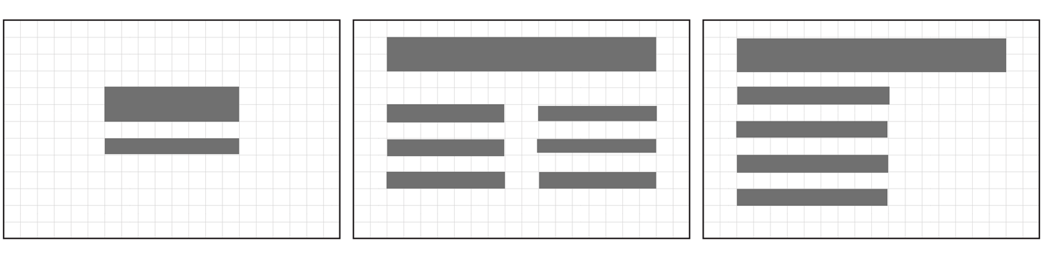 Make sure you have a variety of layouts.
Find yourself wanting to customize your layouts more? Grab some paper (or print page 7 of the worksheets I designed for this series) and draw reusable layouts that might drive the points in your talk home. Once you add those designs to your master slides, they will be ready for use in your presentation. To see examples of custom slide designs, check out some of my presentations on SlideShare.
Next step: Practice often
As a new public speaker, you may feel nervous about going on stage. In the next post, I share ways to prepare for your onstage presentation and improve your speaking style.
Upcoming talks
-
Staff designer: Grow, influence, and lead as an individual contributor
At some point in your career, you'll likely have to choose between senior individual contributor (IC) and design management roles. But what if you don't want to manage others? What if you’d rather continue as an expert contributor? In this talk, we’ll take a deep dive into staff/principal designer roles—a combination of team leadership and in-the-pixels design work—all without any direct people management. Learn how you can advocate for, grow into, and succeed in such IC leadership roles.
Want to talk?
Got feedback, looking to suggest a future writing topic, or want to invite me to speak at your organization? Send me a message and I'll get back to you as soon as possible!