What's wrong with Google's new Hangouts app?
Last week at Google I/O, a new app called Hangouts was released. It was the long-needed conglomeration of Google Talk and Google+ everyone expected long ago, it’s available across devices, and it looks great. But underneath that initial sheen, problems have started to appear – there are several inconsistencies across the Hangouts apps.
Online/offline status problems
The hangouts app shows who’s online on the web and Chrome apps, but not on the iPad or Android ones.
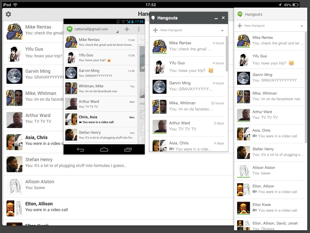
Displaying online users is a pretty crucial function, as it determines who people attempt to talk to and who they ignore. It makes Hangouts less of an instant messaging app and more of a service similar to email or Twitter DMs, which definitely wasn’t the purpose of Google Talk. Additionally, if it wasn’t too clear, here’s how you see if someone’s online:
The small green underline means a person is online. Several people have asked me how to check if someone is online, which means the green underline may not be working very well. And, sadly, its usefulness is negated by the fact that it doesn’t properly appear on mobile devices.
Notifications could be better
Google is generally great at pushing notifications, but there are some problems with notifications on the Hangouts platform. Notifications can be inconsistent, and it makes me wish Hangouts could choose which device needs to receive a chat notification the most immediately.

When I switch devices and reply to someone, I assume that process of opening and replying will trigger a function that redirects messages to the device I’m using. If I’m currently using Hangouts on my Nexus 4, I want to see it there first. And if time passes (say, 30 seconds or so), it can notify my other devices, then once again trigger the notification redirection function once the message is answered. This extra layer of conditional, contextual notifications could help make Hangouts even better. It would also stop my 3 devices from going off at the same time whenever I get a message.
Other design inconsistencies
Besides the inconsistent green underline, there are other inconsistencies such as logo design. It’s understandable that the iPad app and the Android app logos are different because of different requirements, but I wasn’t able to immediately locate the iPad app very quickly. This can delay logging in to attend important meetings. I would suggest darkening the background on the iPad app icon, or even relating it to the Google+ logo color.
![]() The Chrome app icons don’t have quotation marks, but the Android, iPad, and web apps do.
The Chrome app icons don’t have quotation marks, but the Android, iPad, and web apps do.
![]()
The Chrome app’s notification is a very random color instead of the signature green:

And the iPad intro splash screen doesn’t rotate horizontally:
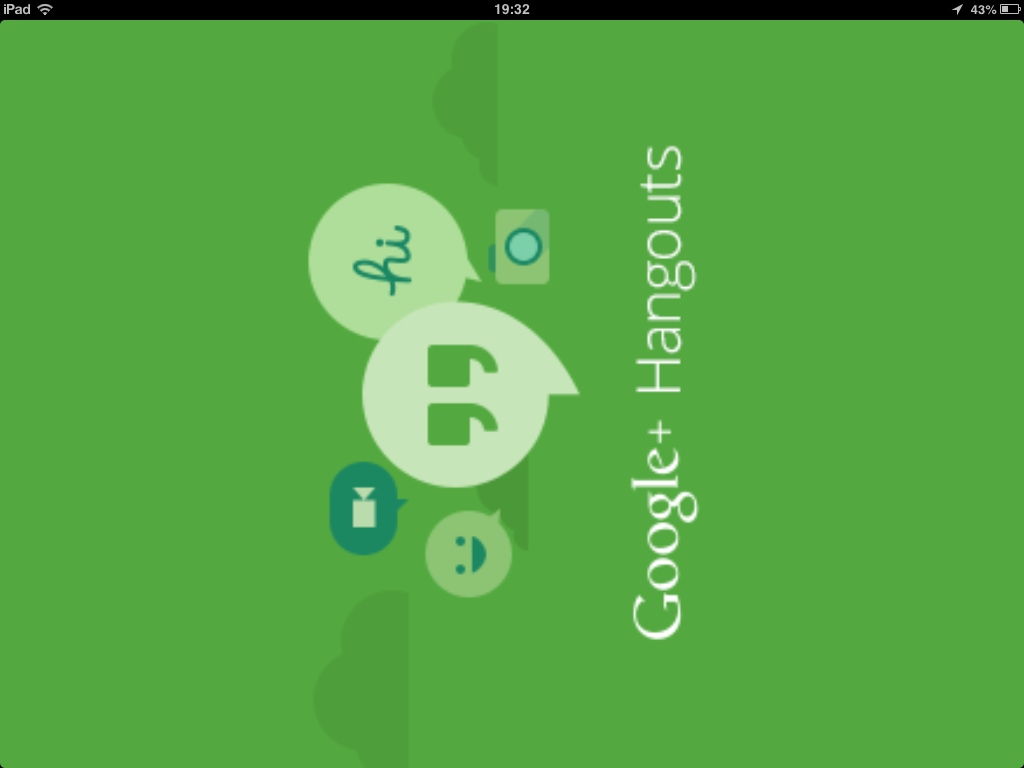 Yikes.
Hangouts is still really, really great
Despite its few design hiccups, I definitely think Hangouts is a great communication tool. I can tell when others are writing. I can enter a hangout with the click of a button. Did I mention how much better it looks than Google Talk? I tip my hat to Google for pushing the envelope and supporting so many platforms. A few minor design issues can be fixed pretty quickly. Go download Hangouts now and experience it for yourself!
Keep up the good work, GOOG.
Upcoming talks
-
Staff designer: Grow, influence, and lead as an individual contributor
At some point in your career, you'll likely have to choose between senior individual contributor (IC) and design management roles. But what if you don't want to manage others? What if you’d rather continue as an expert contributor? In this talk, we’ll take a deep dive into staff/principal designer roles—a combination of team leadership and in-the-pixels design work—all without any direct people management. Learn how you can advocate for, grow into, and succeed in such IC leadership roles.
Want to talk?
Got feedback, looking to suggest a future writing topic, or want to invite me to speak at your organization? Send me a message and I'll get back to you as soon as possible!